Awareness
Brand identity, 2d motion, Art Direction
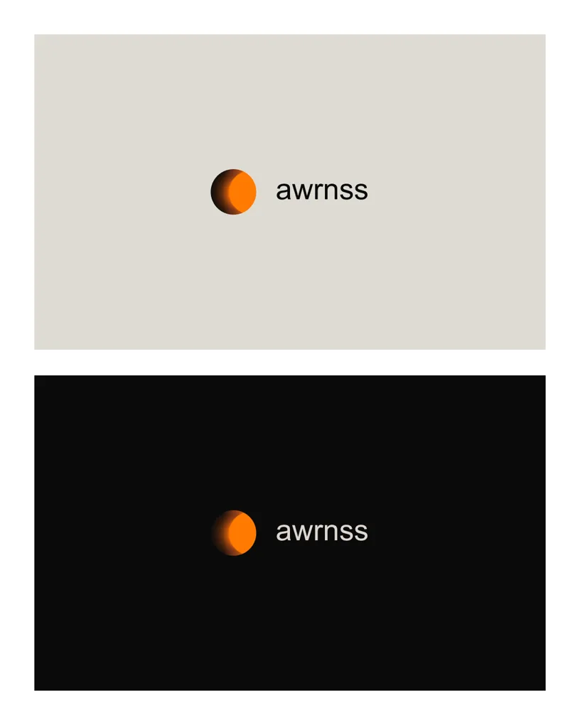
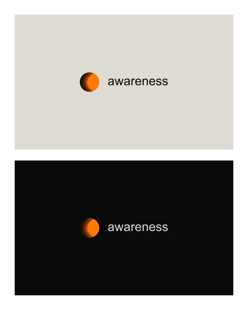
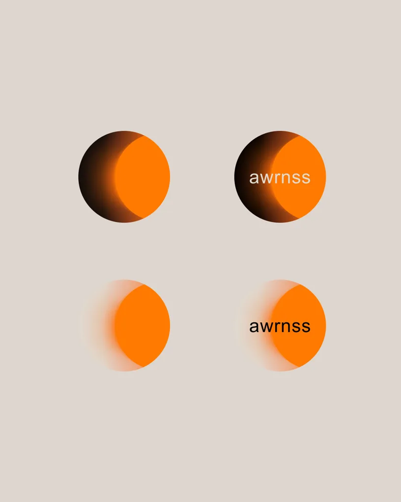
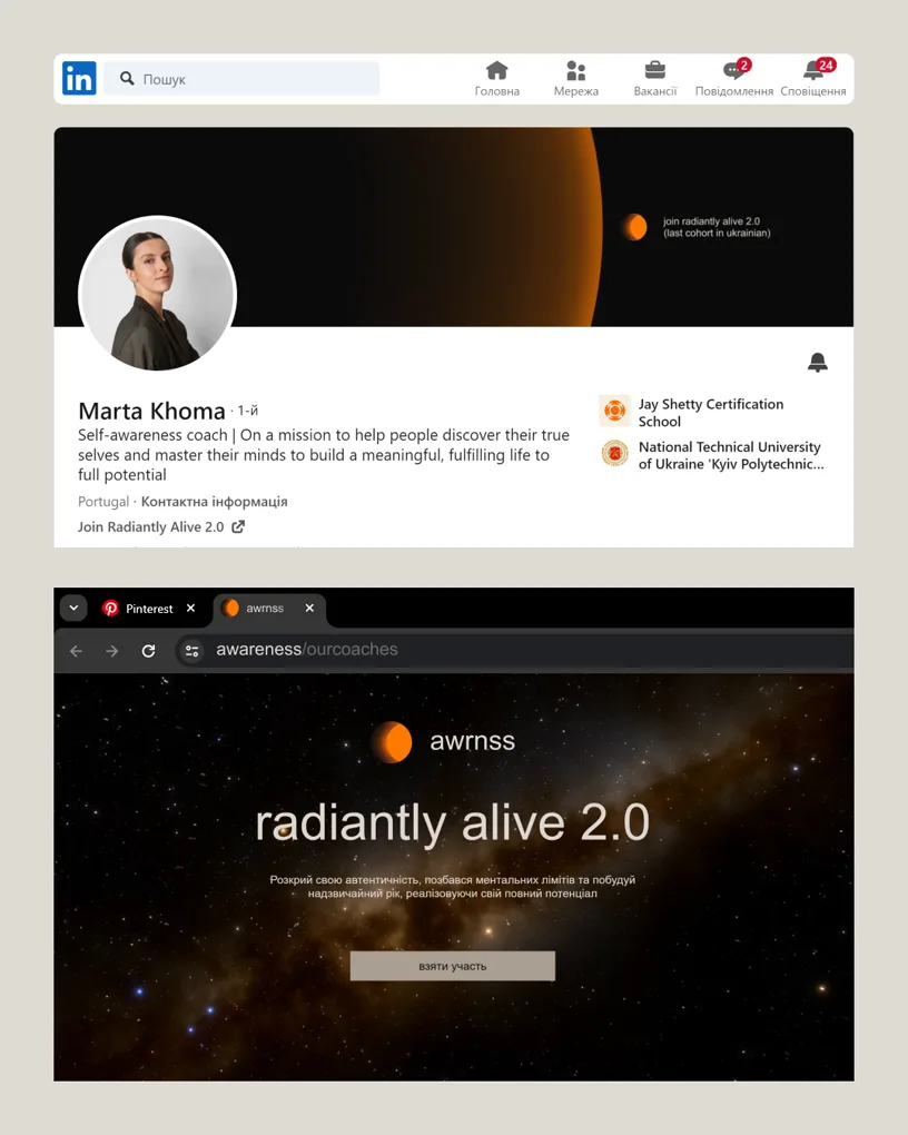
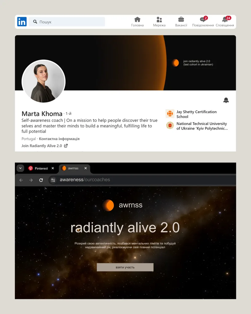
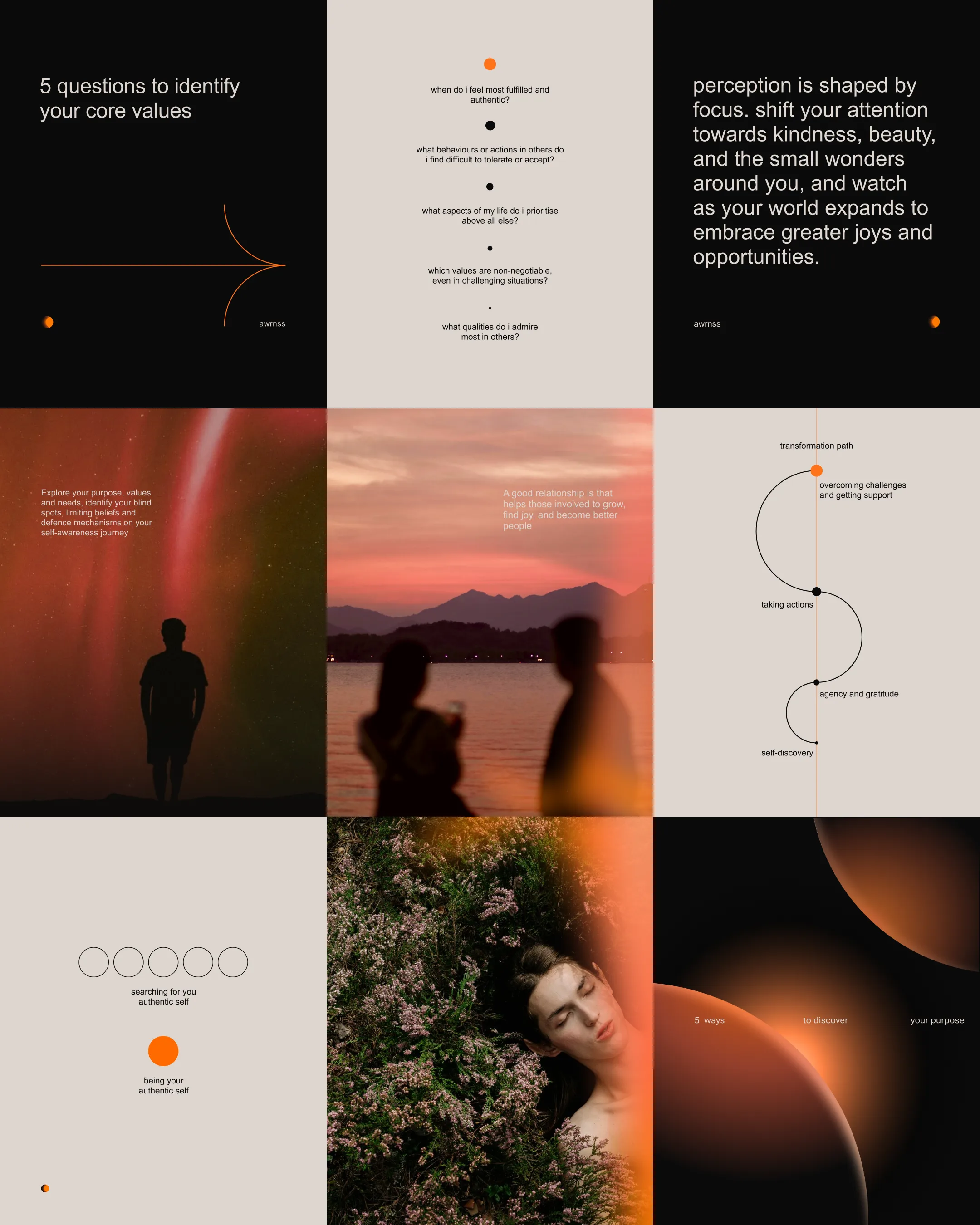
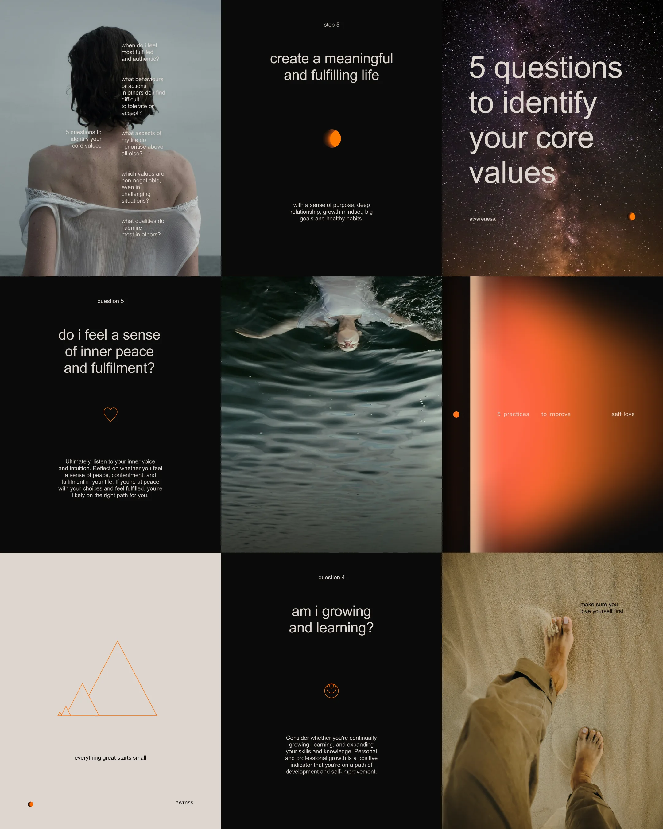
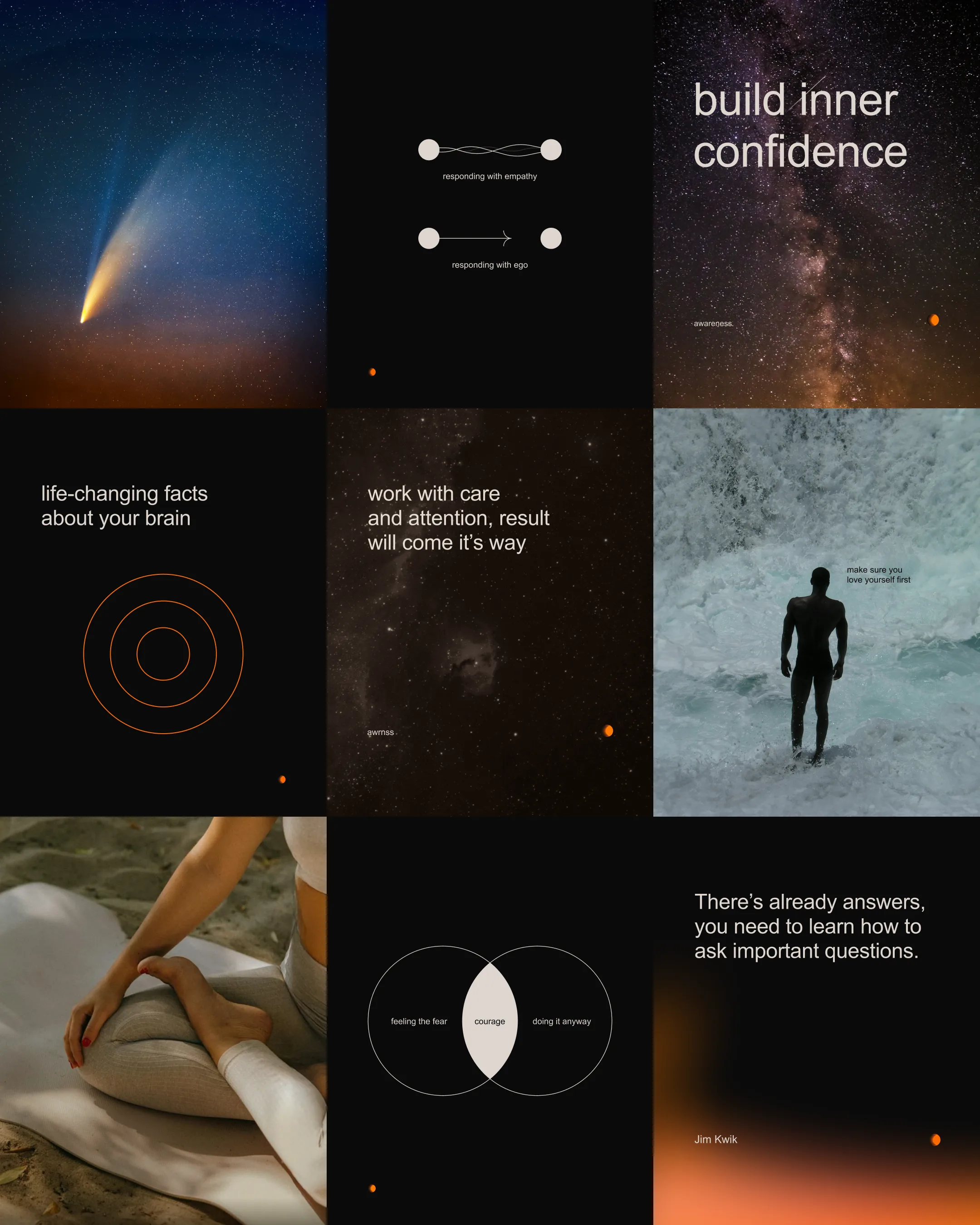
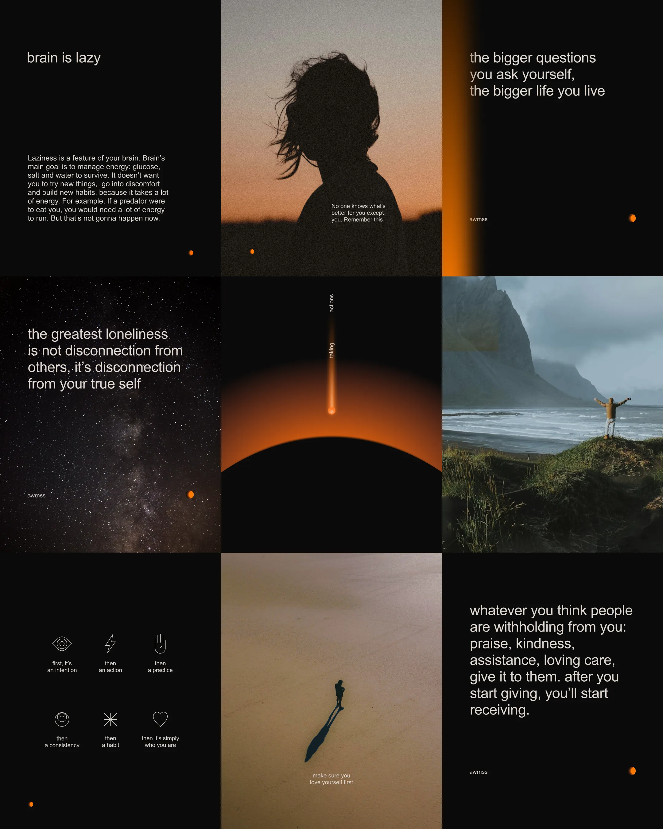
Awareness is a program and personal mission by Marta Khoma. It helps people reconnect with themselves, develop self-awareness, and create a meaningful life free of suffering. Marta believes everyone has a unique gift to share with the world, but an ego often blocks the way. Letting go of the ego removes mental suffering—a state known as enlightenment. The brand’s main symbol depicts the process of enlightenment. Light spread slowly, covering every part of the icon, just like a reverse solar eclipse.
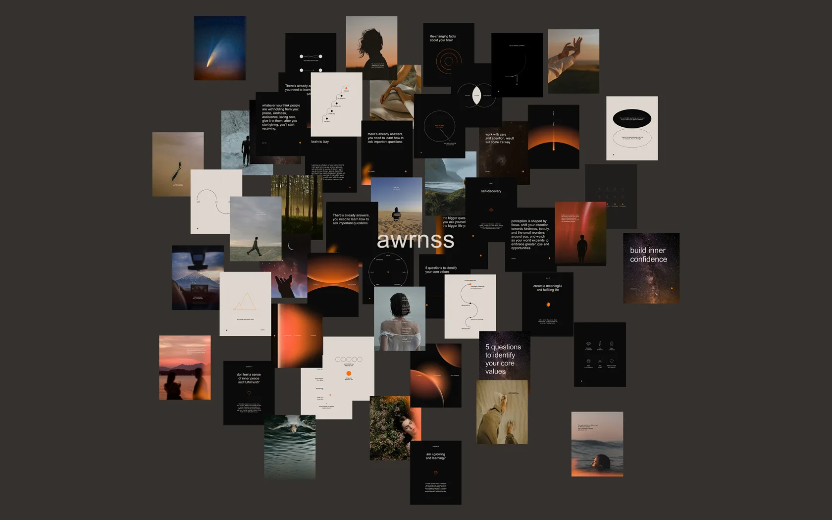
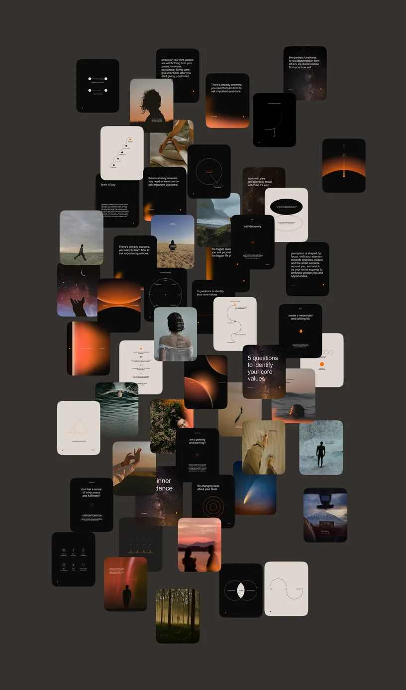
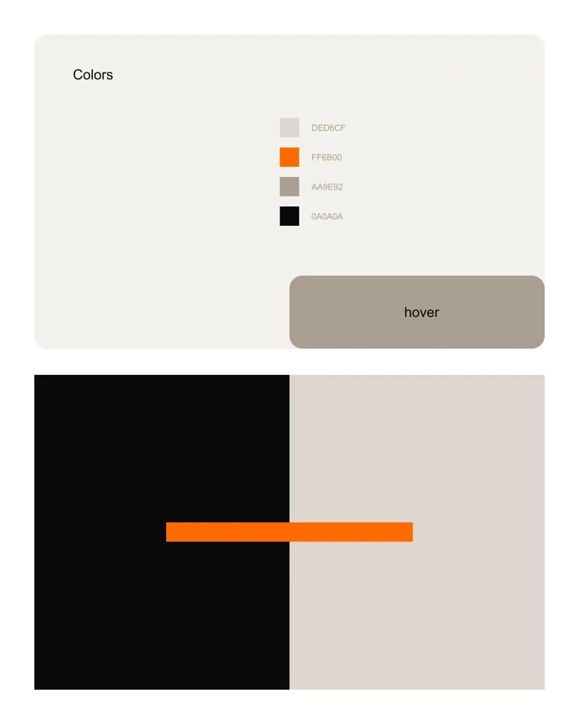
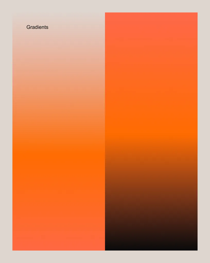
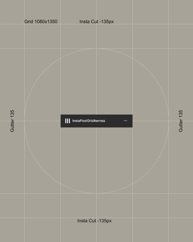








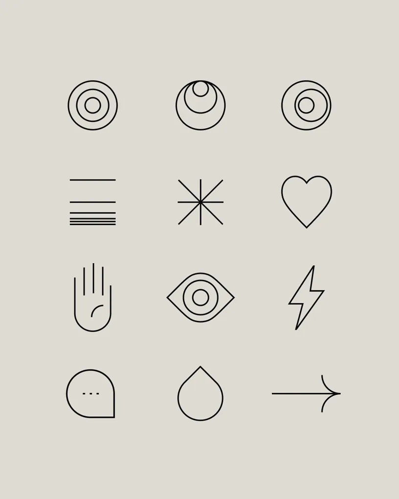



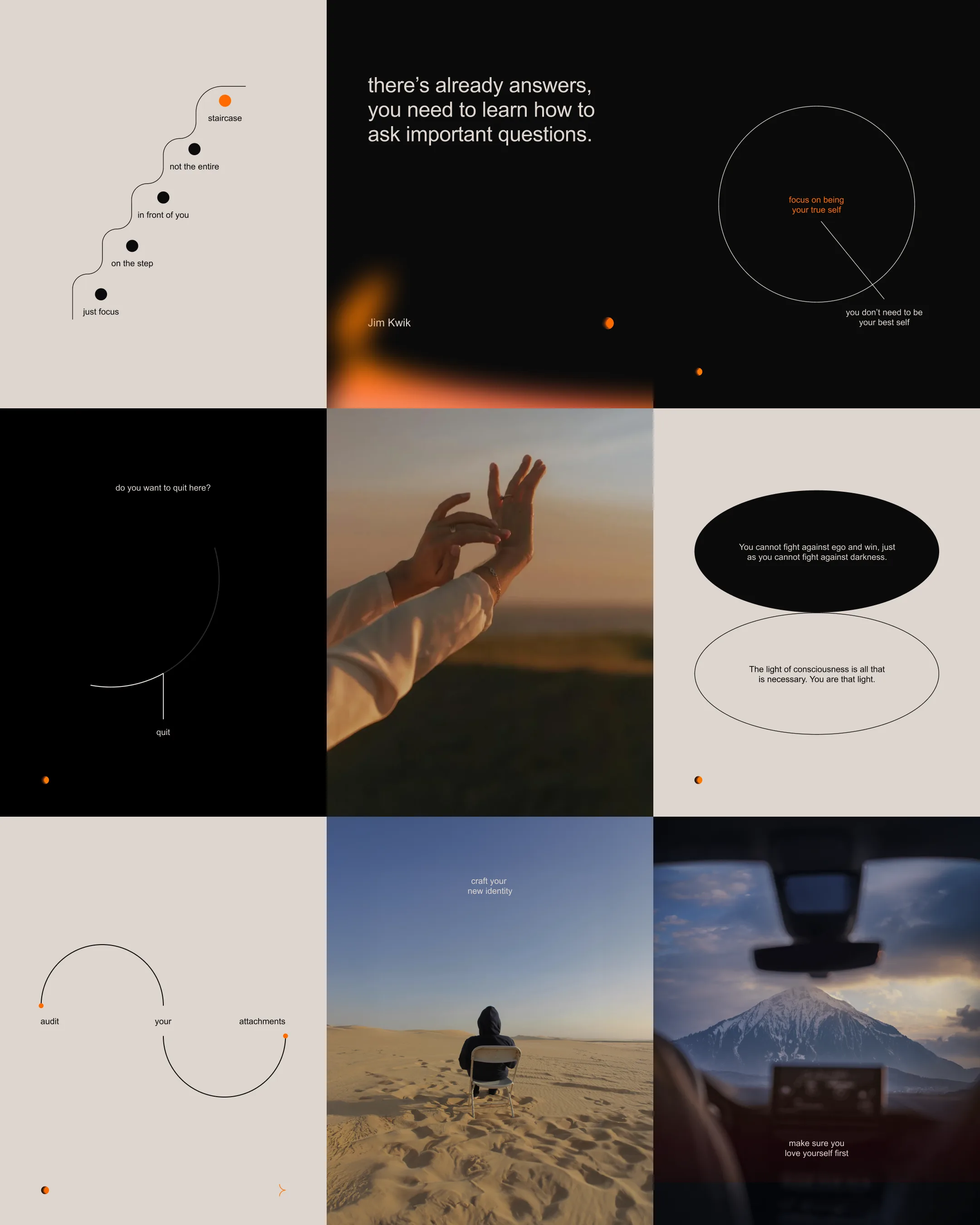
Linear icons are pictographically similar to Egyptian hieroglyphs—understandable but with a mysterious aura. Therefore, they are monochrome, with uniform lines of equal thickness.

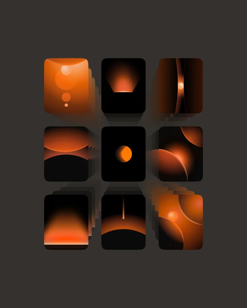
This identity demands a restrained clarity, built on principled content limitations that communicate a coherent, undeniable presence. After all, what is identity if not a vessel for purpose? It serves its function without compromise.
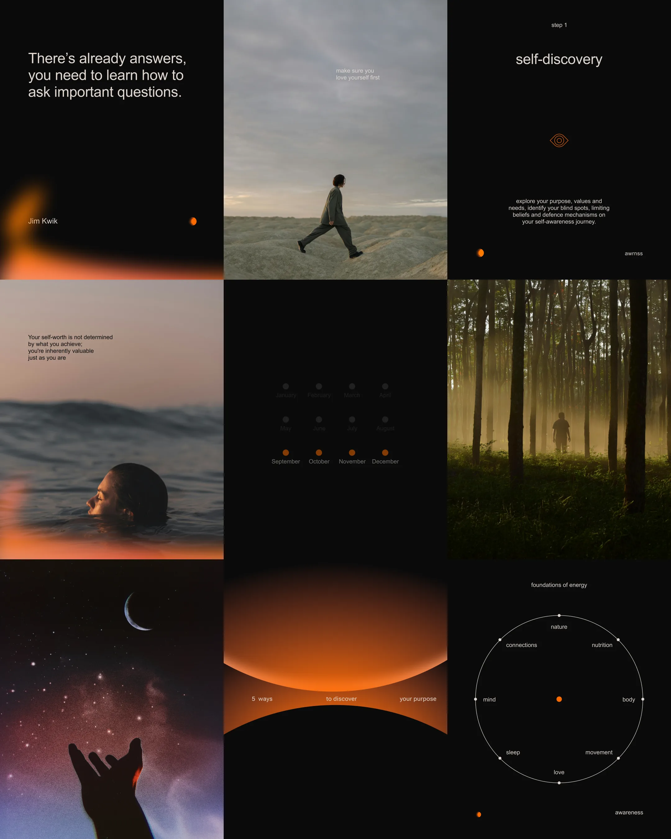
Graphs and diagrams: Space, an enigmatic expanse, is unraveled through the cold precision of data. The human mind, equally vast, remains a shadowed unknown. To navigate these complexities, structure and order are paramount. This is why we rely on linear diagrams — they impose clarity, offer credibility, and transform the obscure into something both accessible and authoritative.
Credits
- Marta Khoma — Project owner
- Alexandra Naidonova — Strategist
- Nastya Pinchuk — Designer
- Mykyta Pluzhko, Olena Nikulina — Art direction and design
More projects