Duomo App
Brand identity, illustration, motion, UI
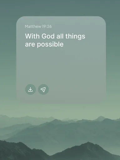
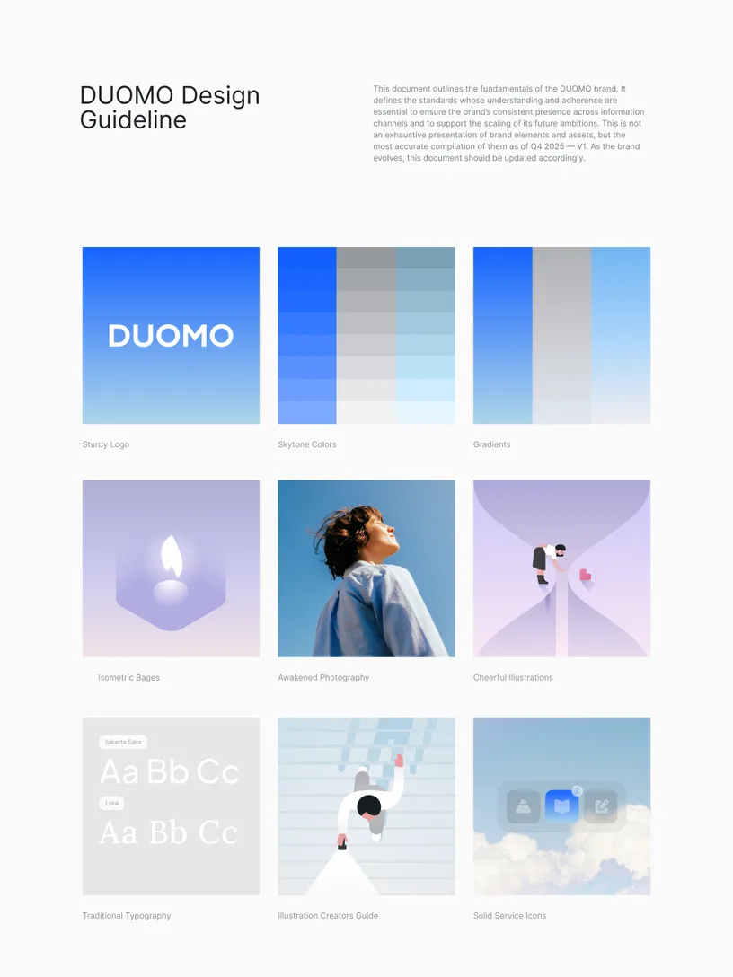
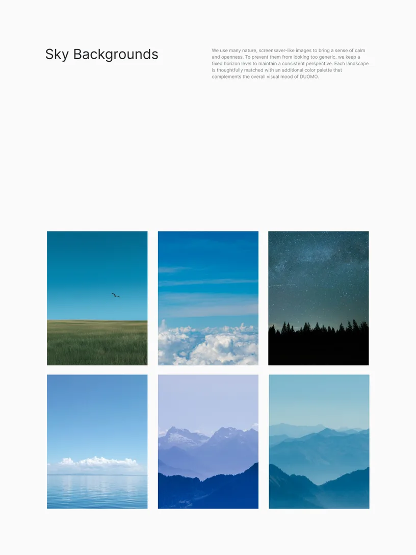
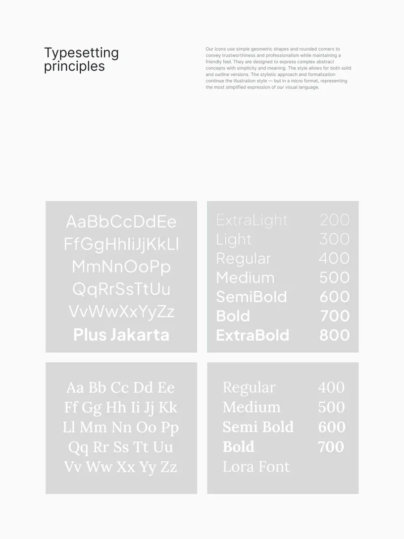
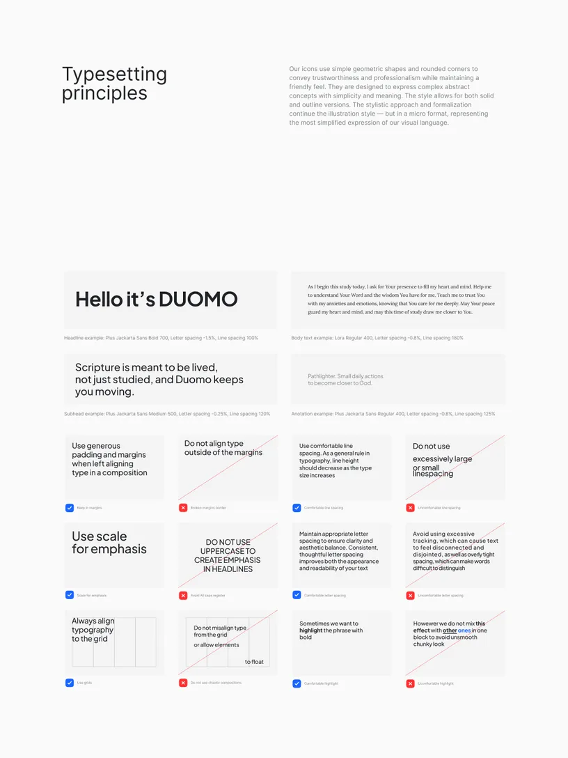
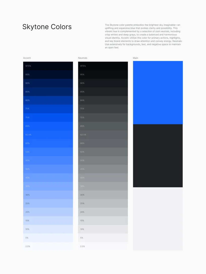
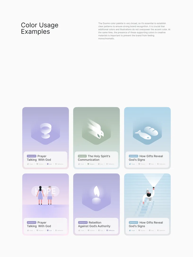
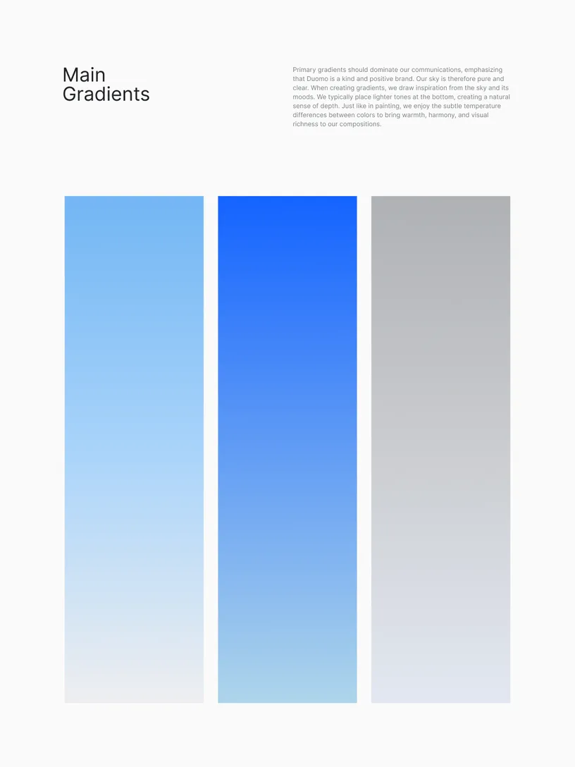
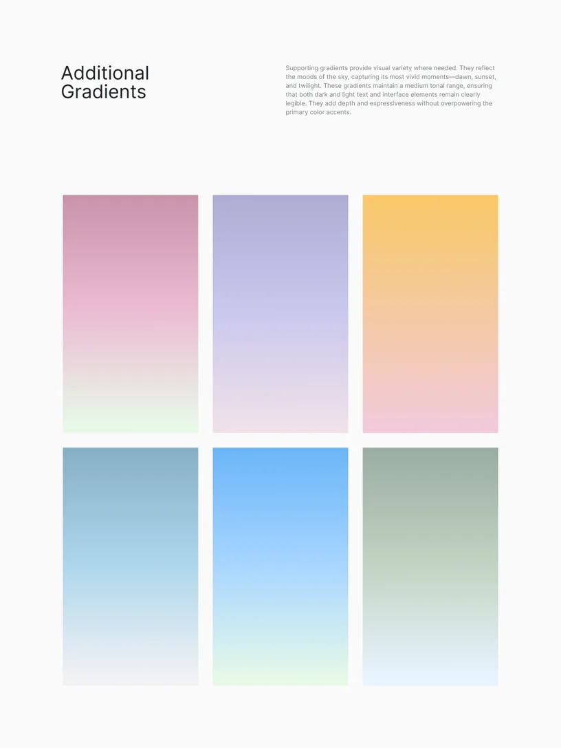
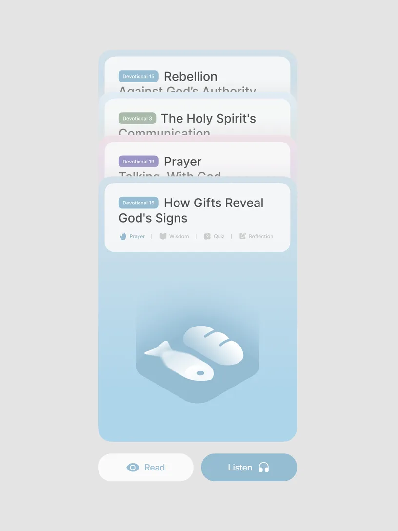
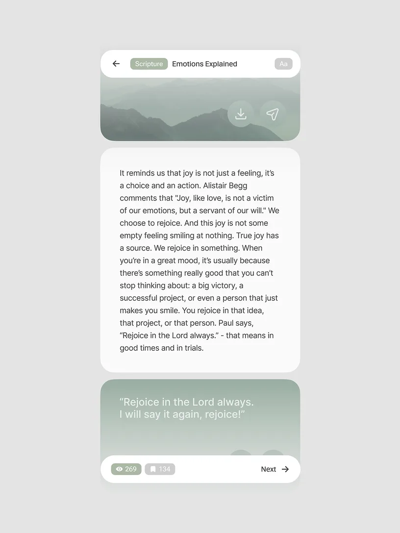
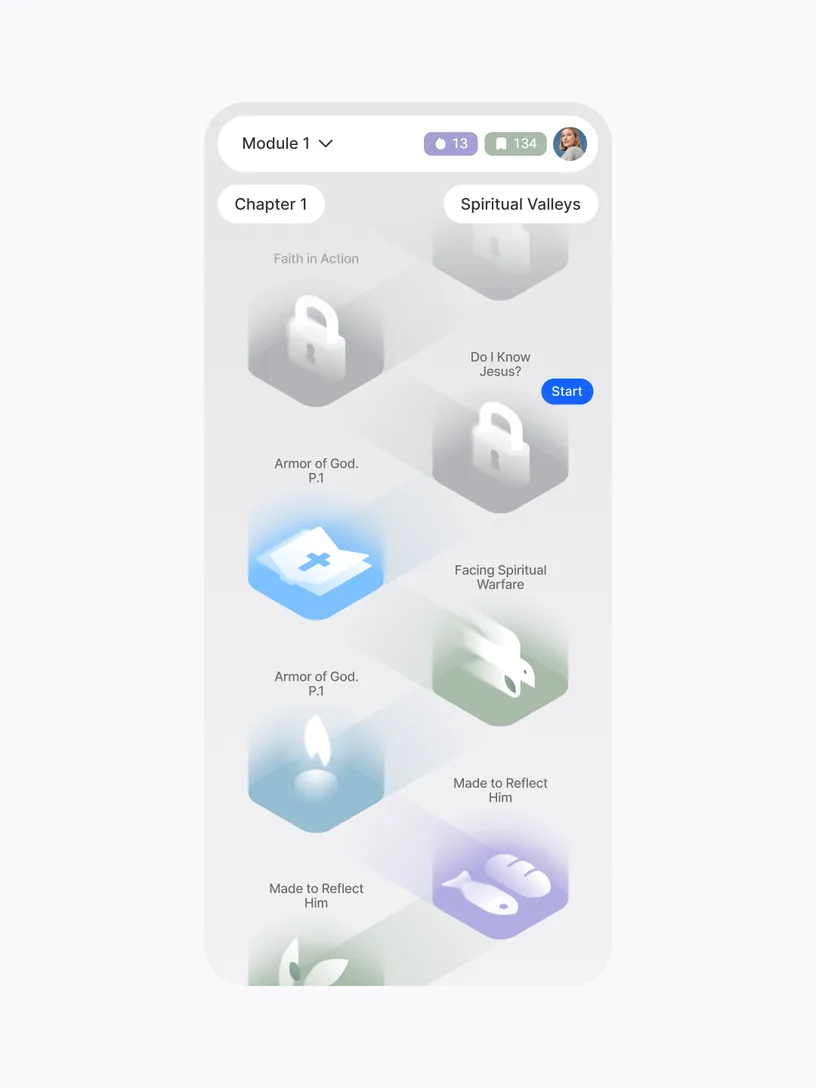
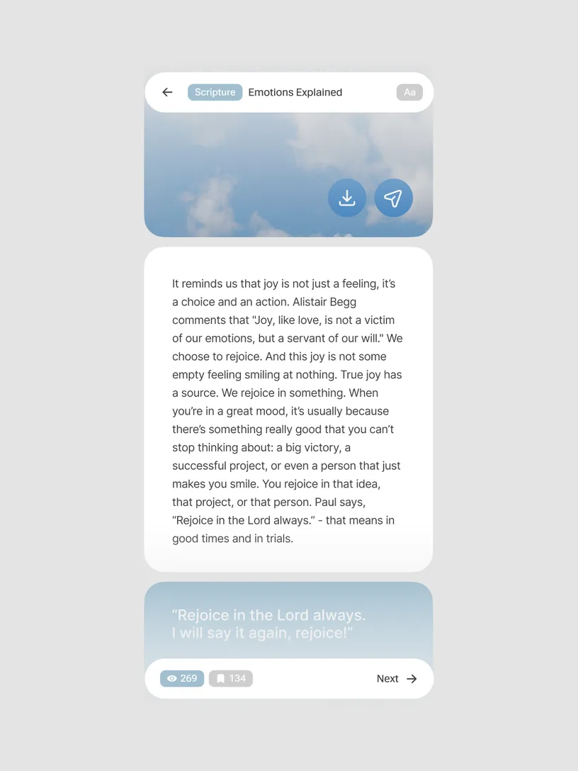
Duomo is a daily path-keeper for spiritual growth, helping people develop meaningful, scripture-inspired habits. The brand identity reflects mindfulness and divine presence through a system rooted in discipline, tradition, and inclusivity. Clear hierarchy, muted colors, and traditional typography produce an orderly system that feels serene and deeply connected to the project's spiritual purpose. Generous white space, airy compositions, and sky-inspired gradients create a clean visual environment that enhances overall readability.
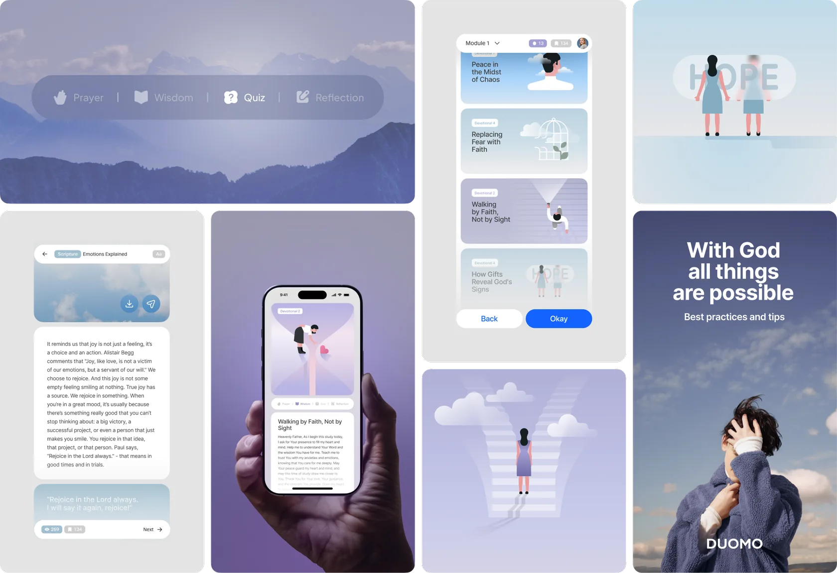
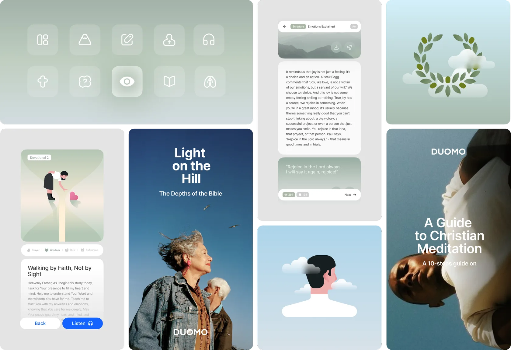
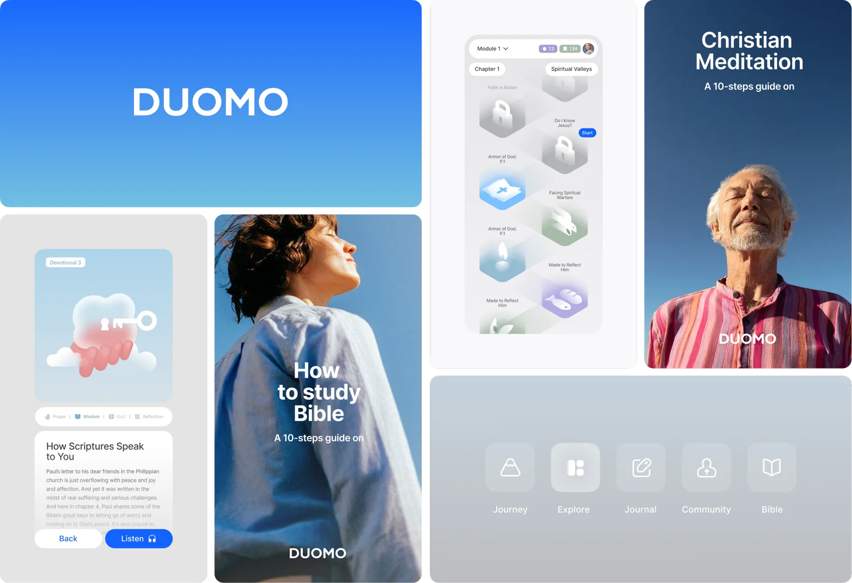
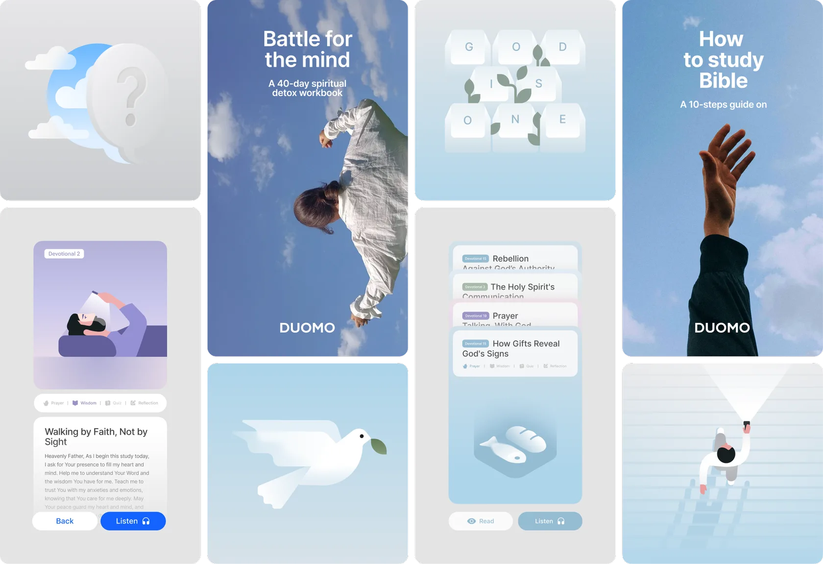













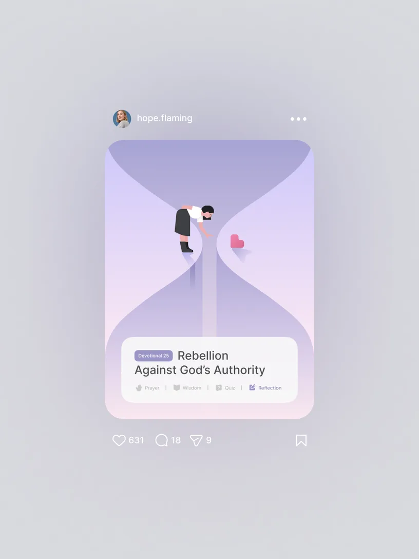
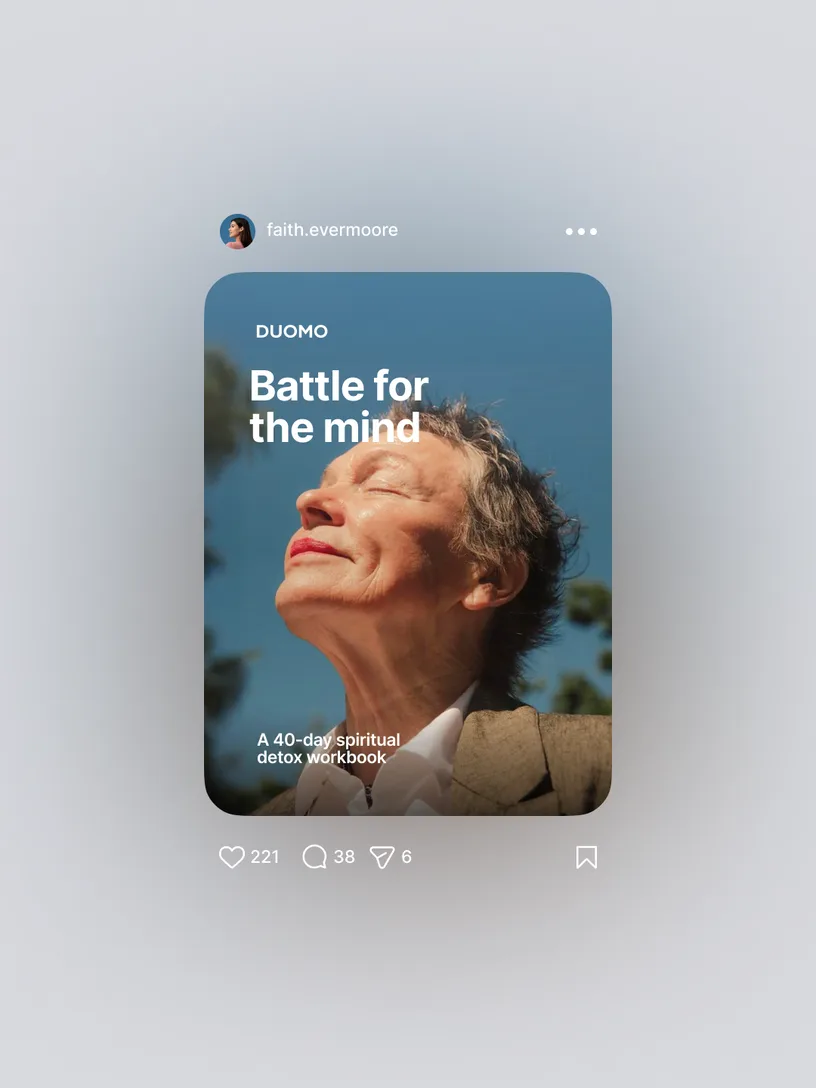

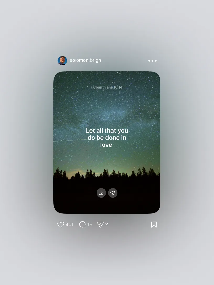

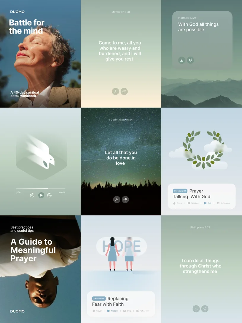
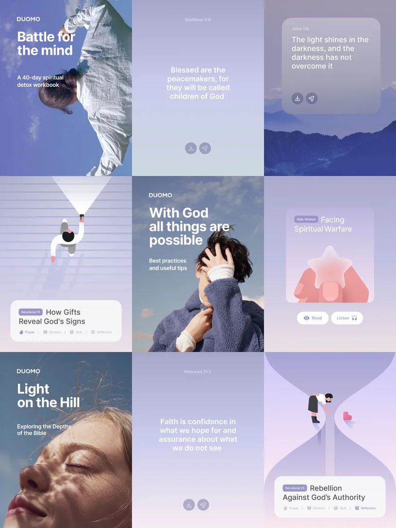
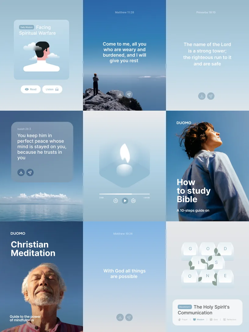
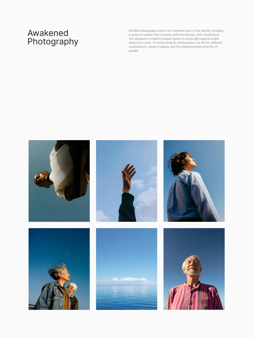
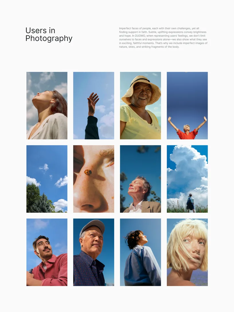
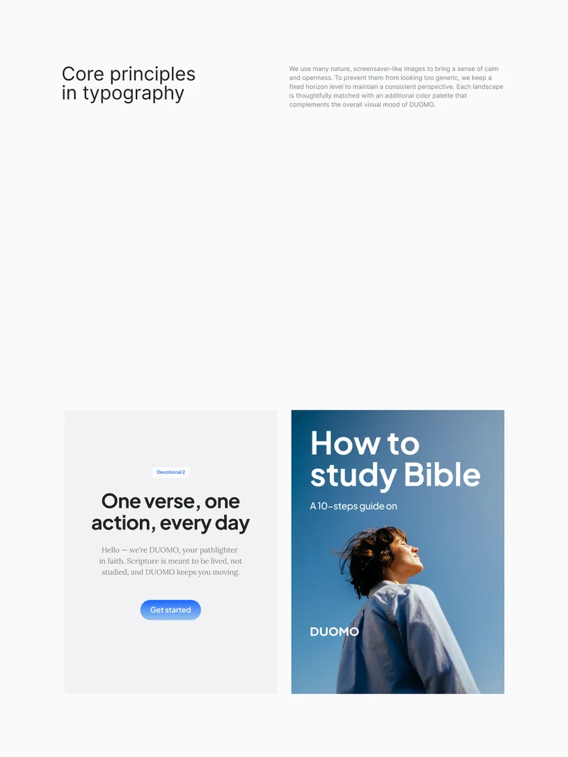
Duomo's Awakened Photography style is an important part of the identity, bringing a sense of realism that contrasts with the minimal, strict illustrations. Our signature is cheerful people figures in sunny light against bright skies and clouds. To avoid similarity and boredom, we aim for different compositions, varied cropping, and the widest possible diversity of people.


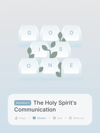
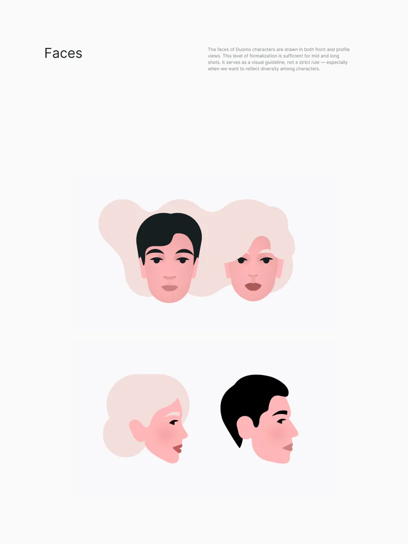
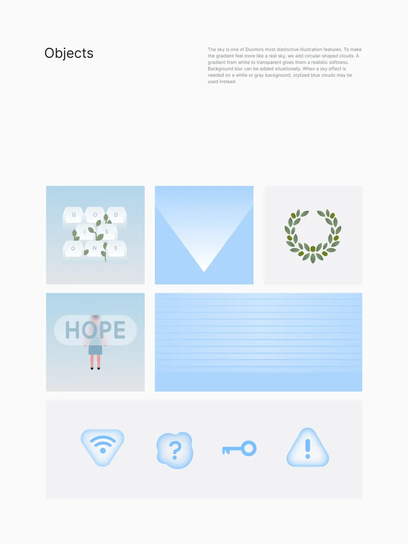
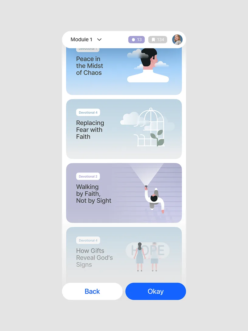
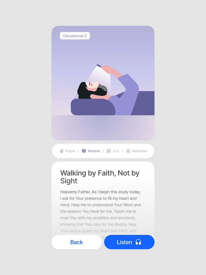
Illustrations follow the same thoughtful tone as Duomo's copy, creating a peaceful and orderly space for exploring the Bible. We show moments of quiet self-reflection, captured with poetic warmth. The figures balance between geometric abstraction and subtle realism, with soft gradients adding depth and clarity to form. We intentionally use simple, clear viewing angles — front, side, and top.




Credits
Thank you Duomo
- Duomo team
- Valeriia Li — Product designer
- Artem Kopanyev — CEO
- Alexandra Naidionova — Brand strategist
- Mykyta Pluzhko, Olena Nikulina — Design, art direction, illustration and motion
More projects