SKELAR
Brand refresh
SKELAR backs consumer tech companies. SKELAR moves fast and means it. There's a particular energy inside SKELAR — urgent, charged, a little loud. The kind that funds companies and doesn't apologize for it. The rebrand started there, not on a moodboard.
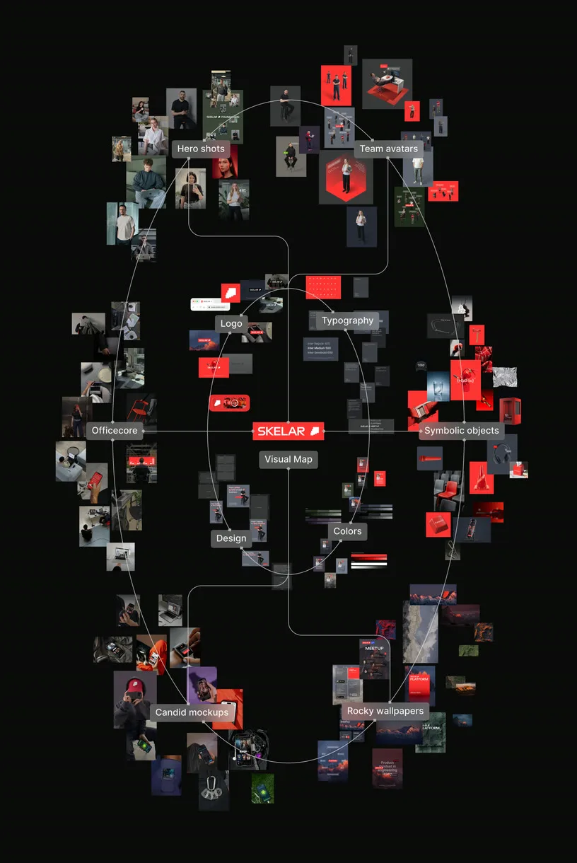
To play at the next level, you have to look like you're already there
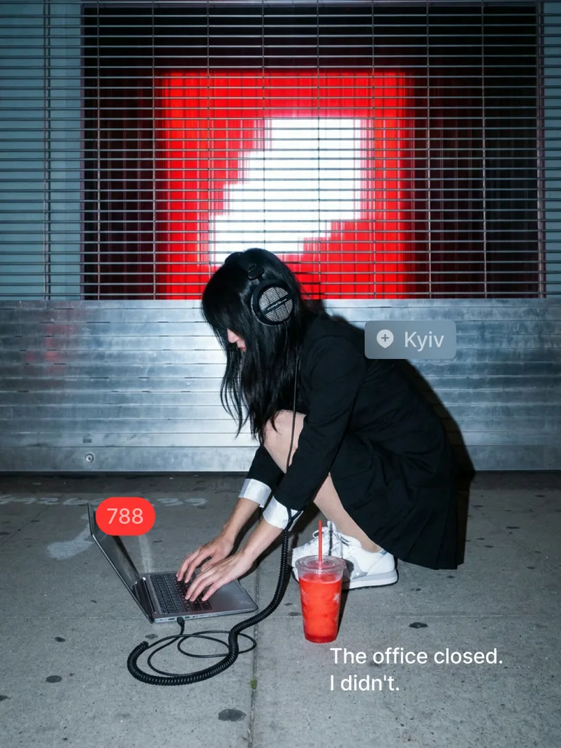
The culture was always there — anti-corporate, fast, built around real people with real ambitions. What was missing was visibility. We made it legible. We closed that gap by working from the inside out: capturing the texture of SKELAR life and building a visual language around it. The new brand doesn't describe SKELAR. It performs it.
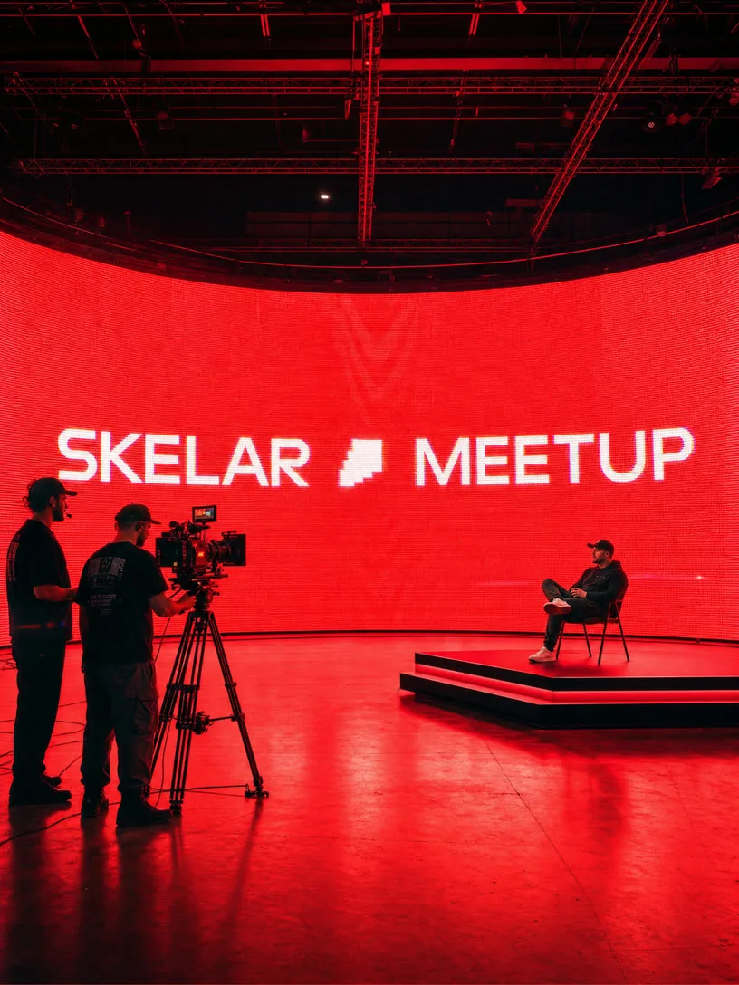
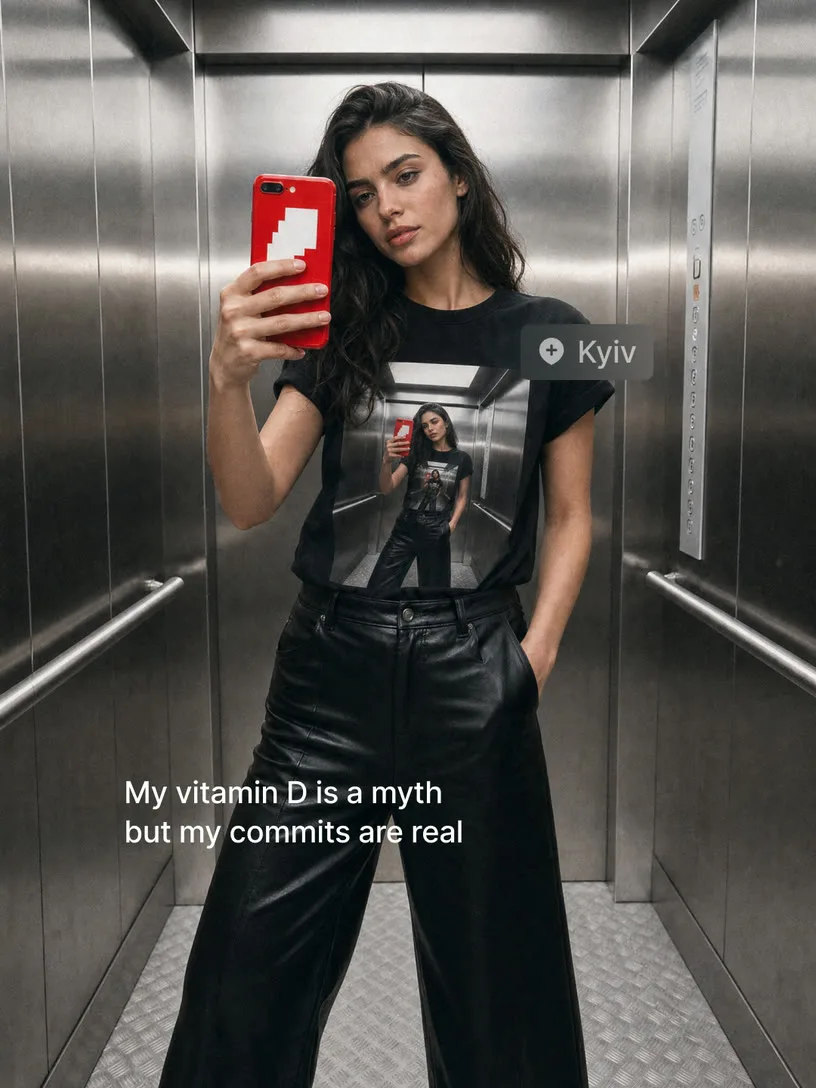
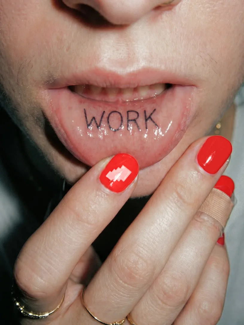


Maximum freedom × maximum consistency
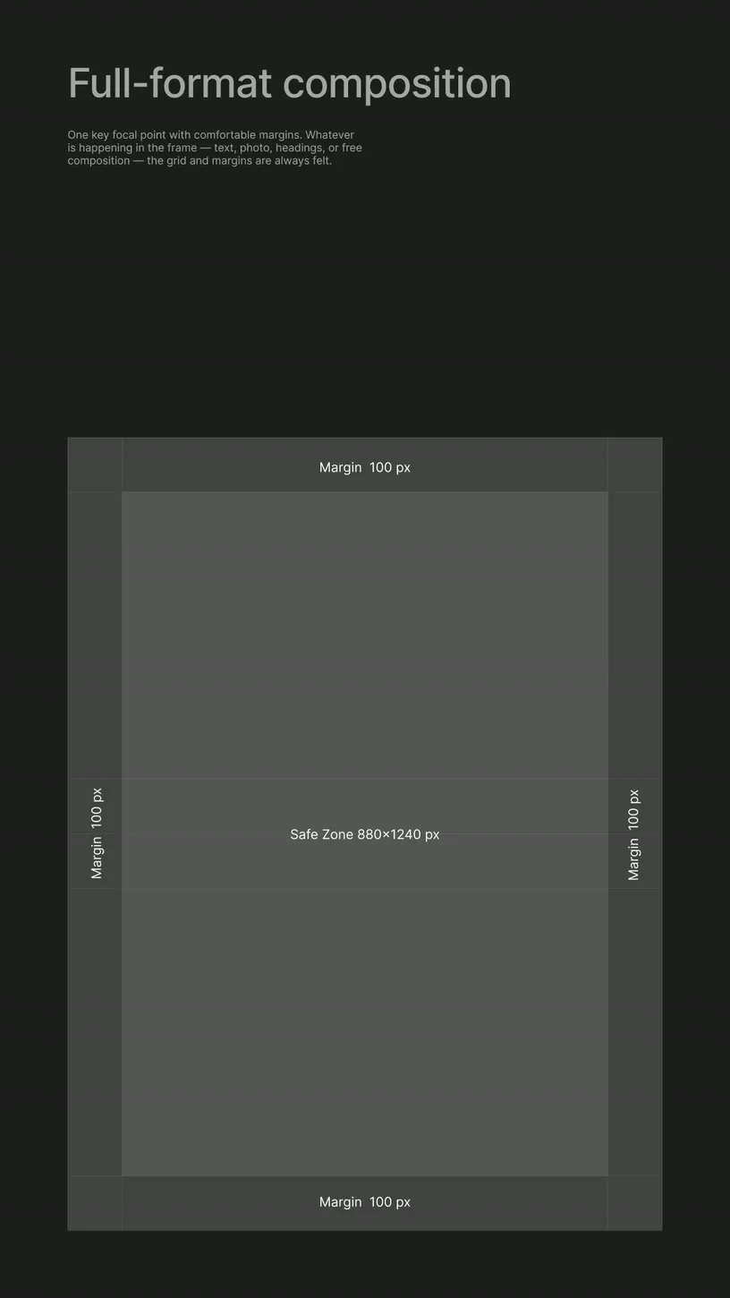
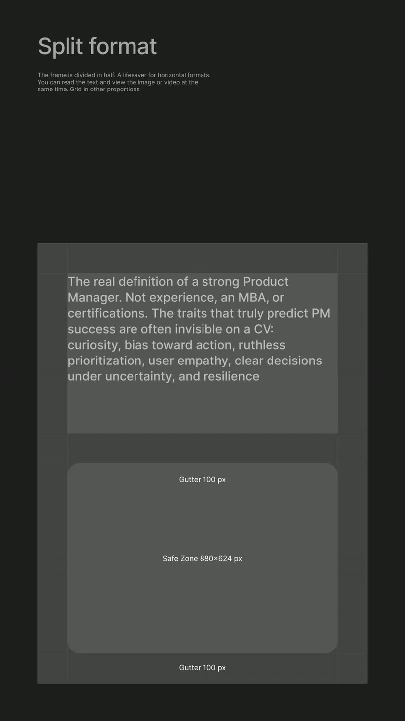
The two are not in conflict — if the system is built right. We locked the logo rules, defined the brand umbrella, and created clear constraints around what can and can't change. Within that frame: a flexible visual language that survives contact with real teams, real timelines, real content volume. A system that any team member can use correctly without asking for permission.
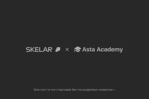
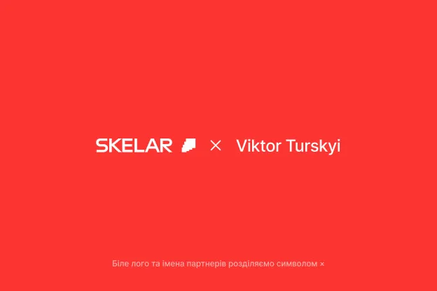
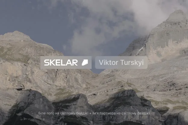
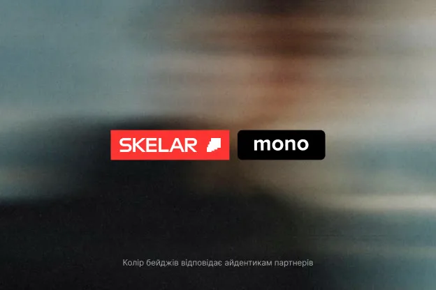
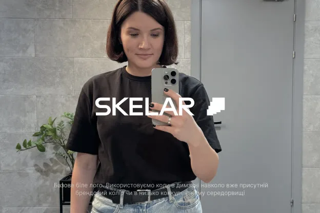
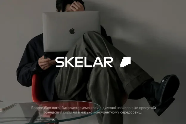
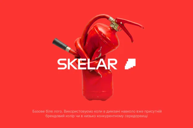




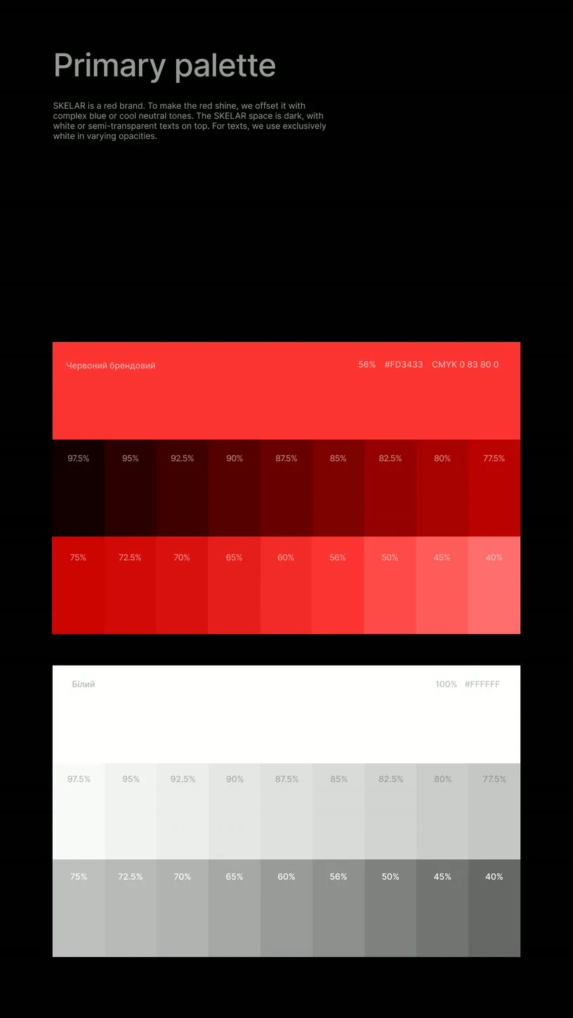
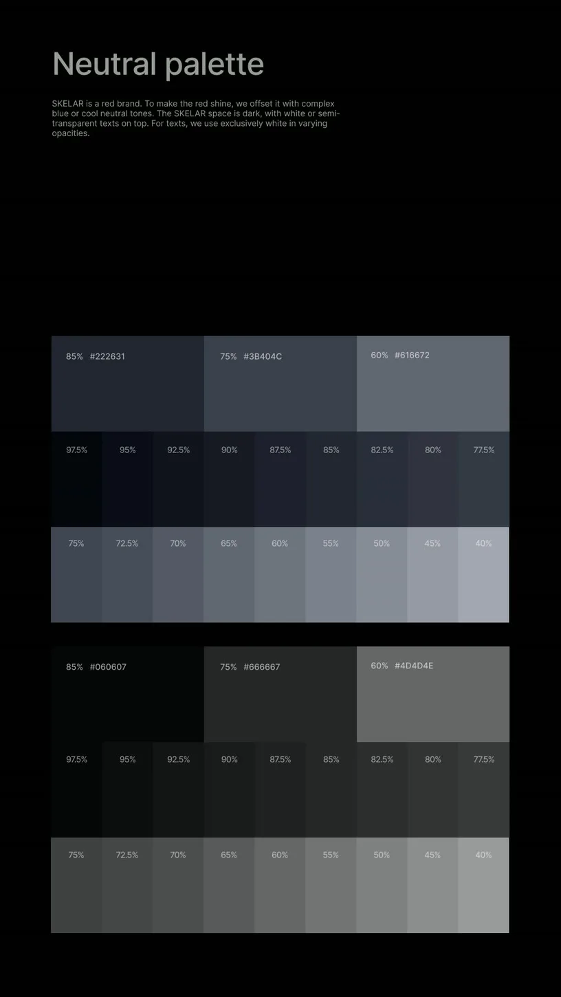
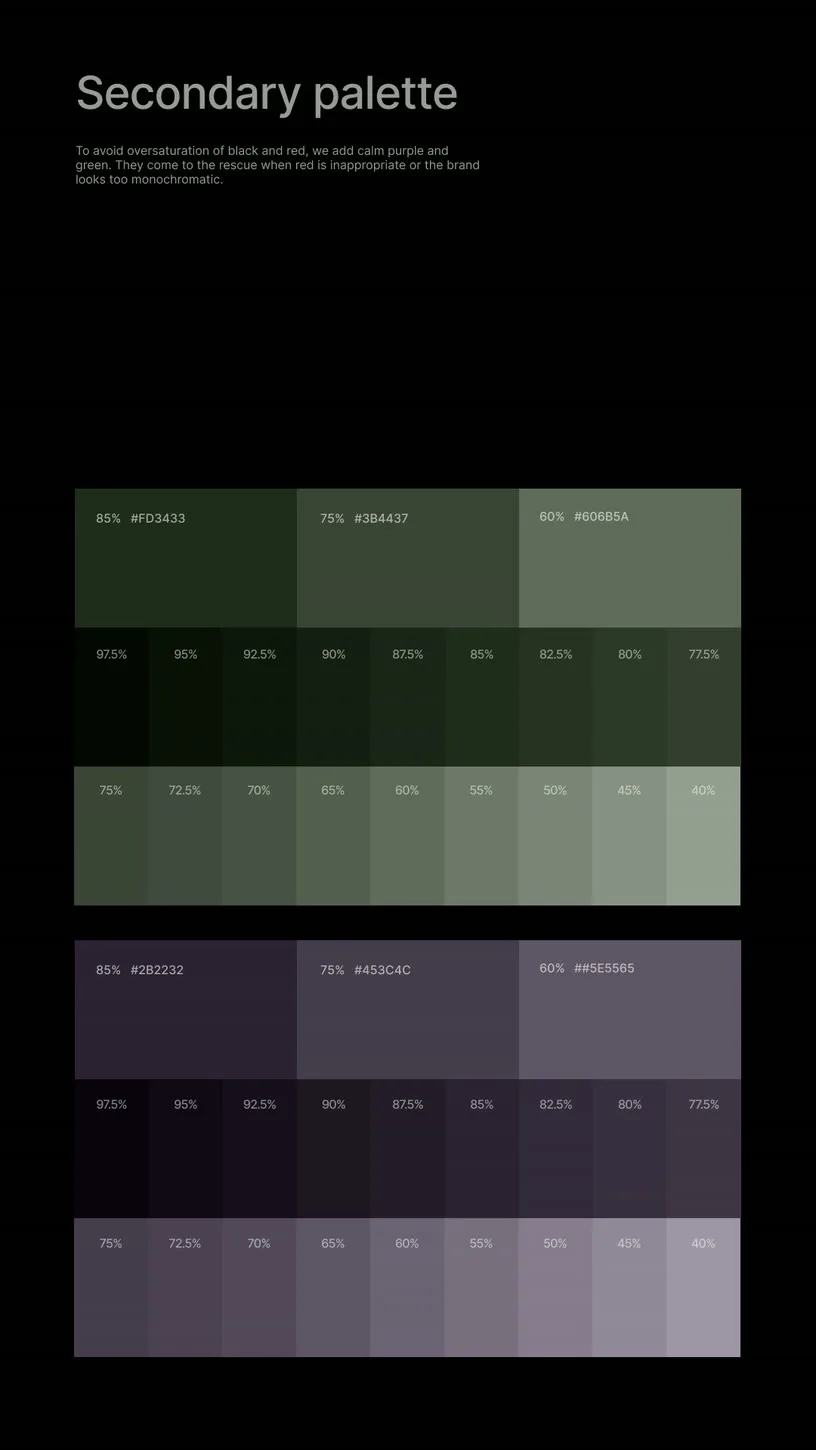
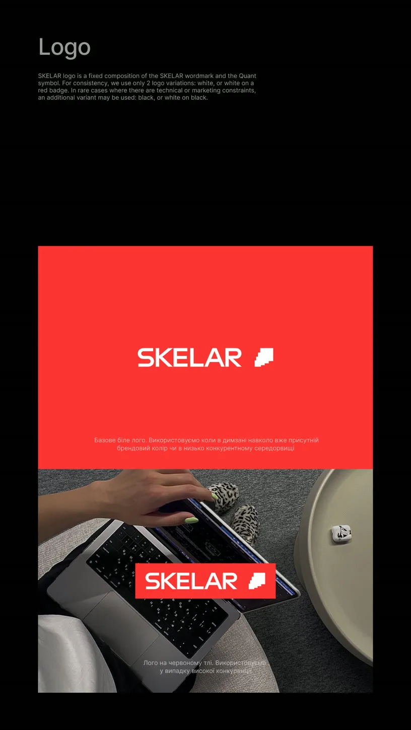
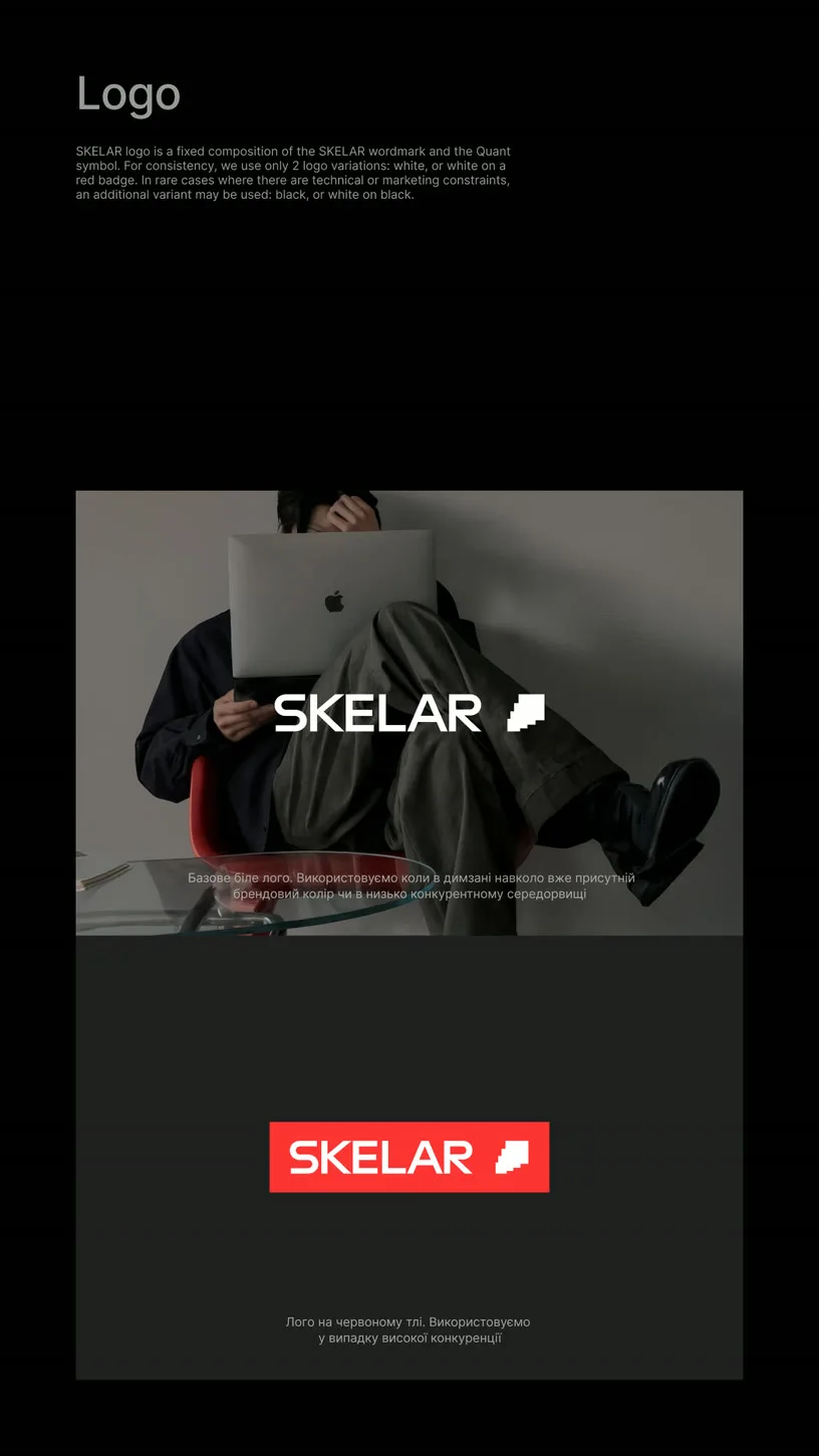
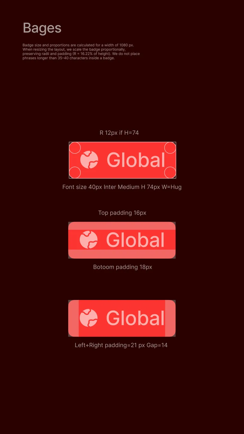
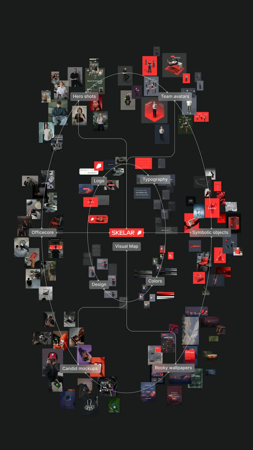
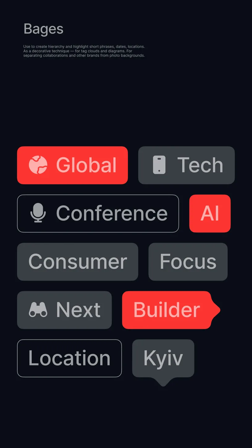
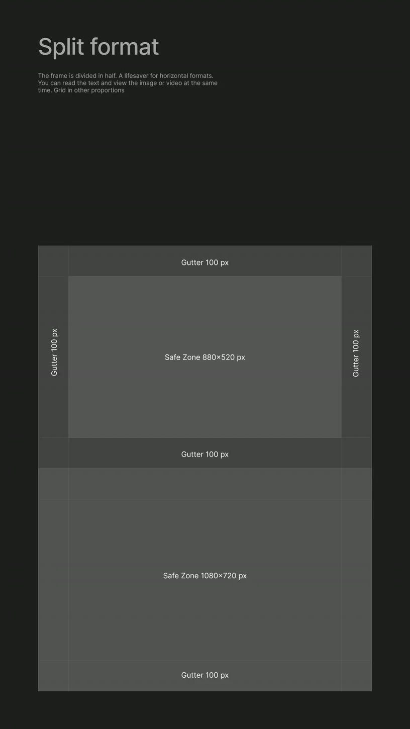
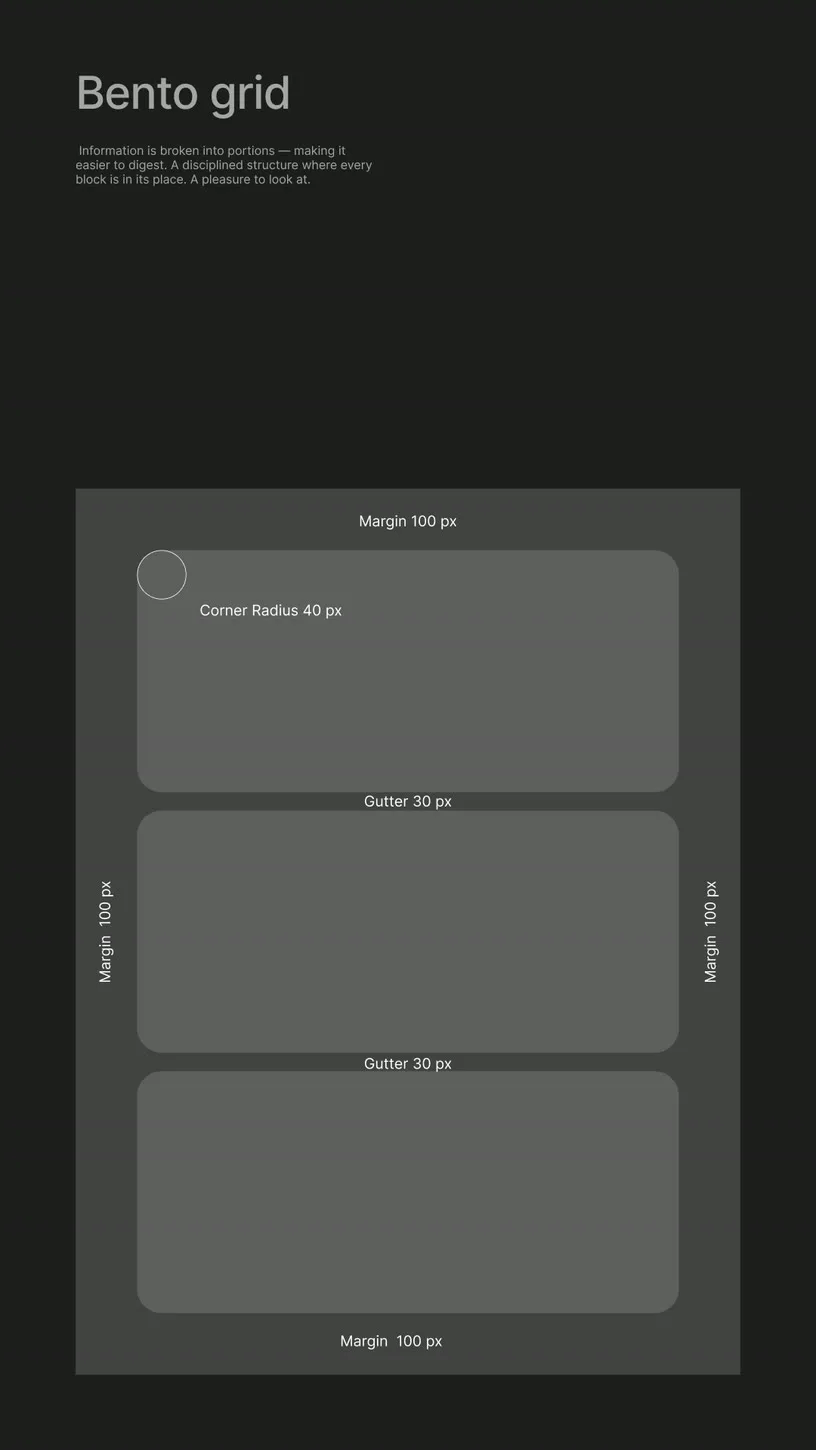
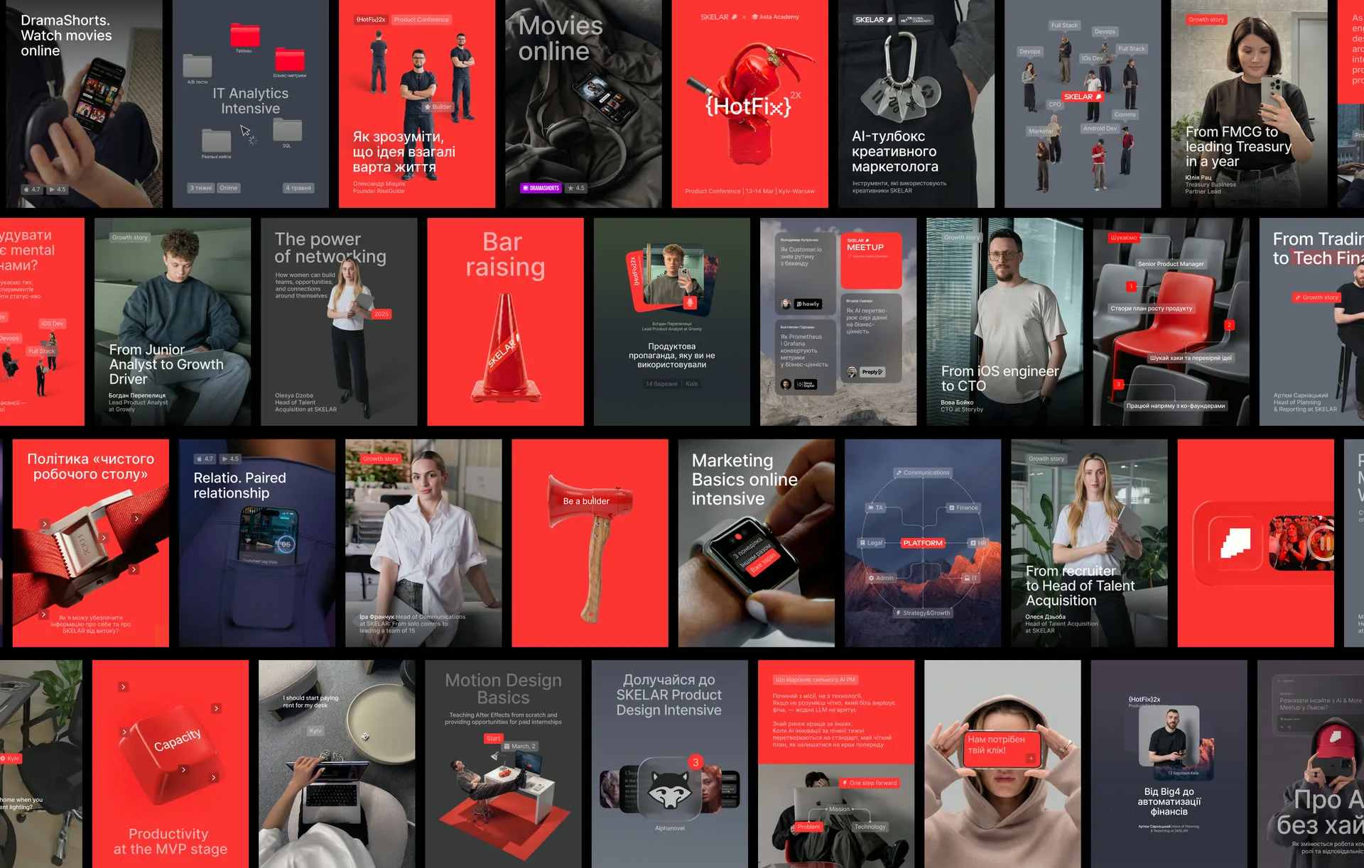
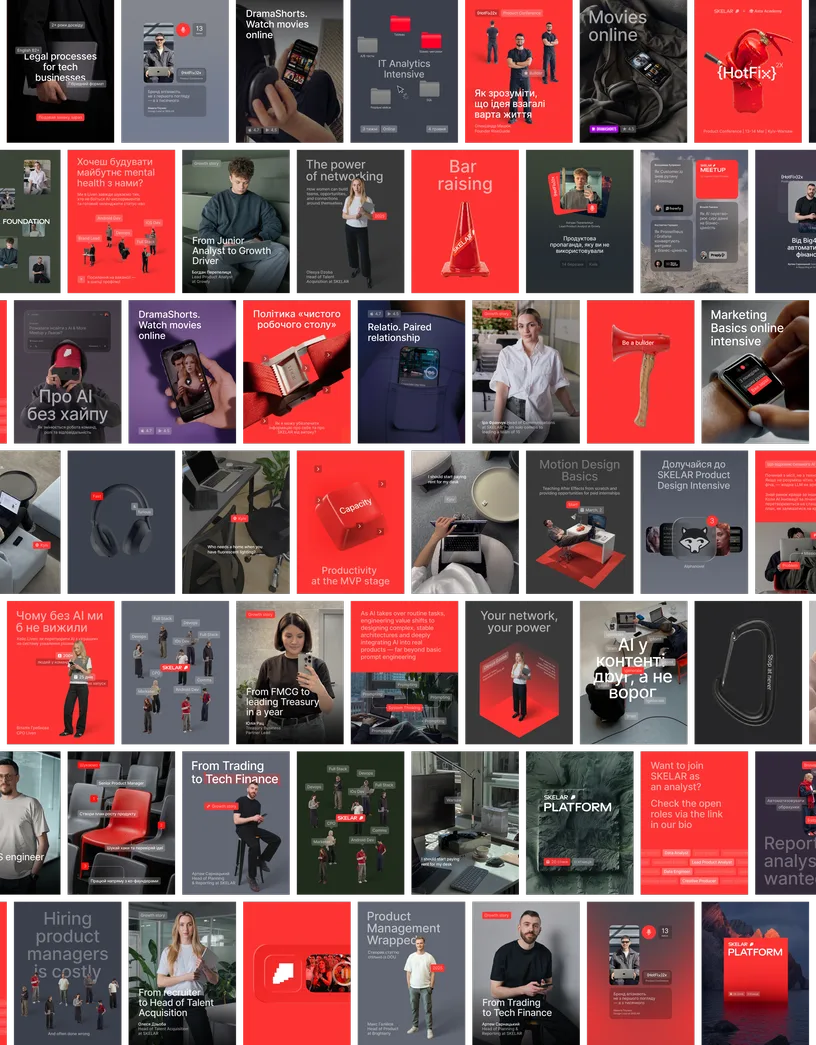
A content system, not a content problem
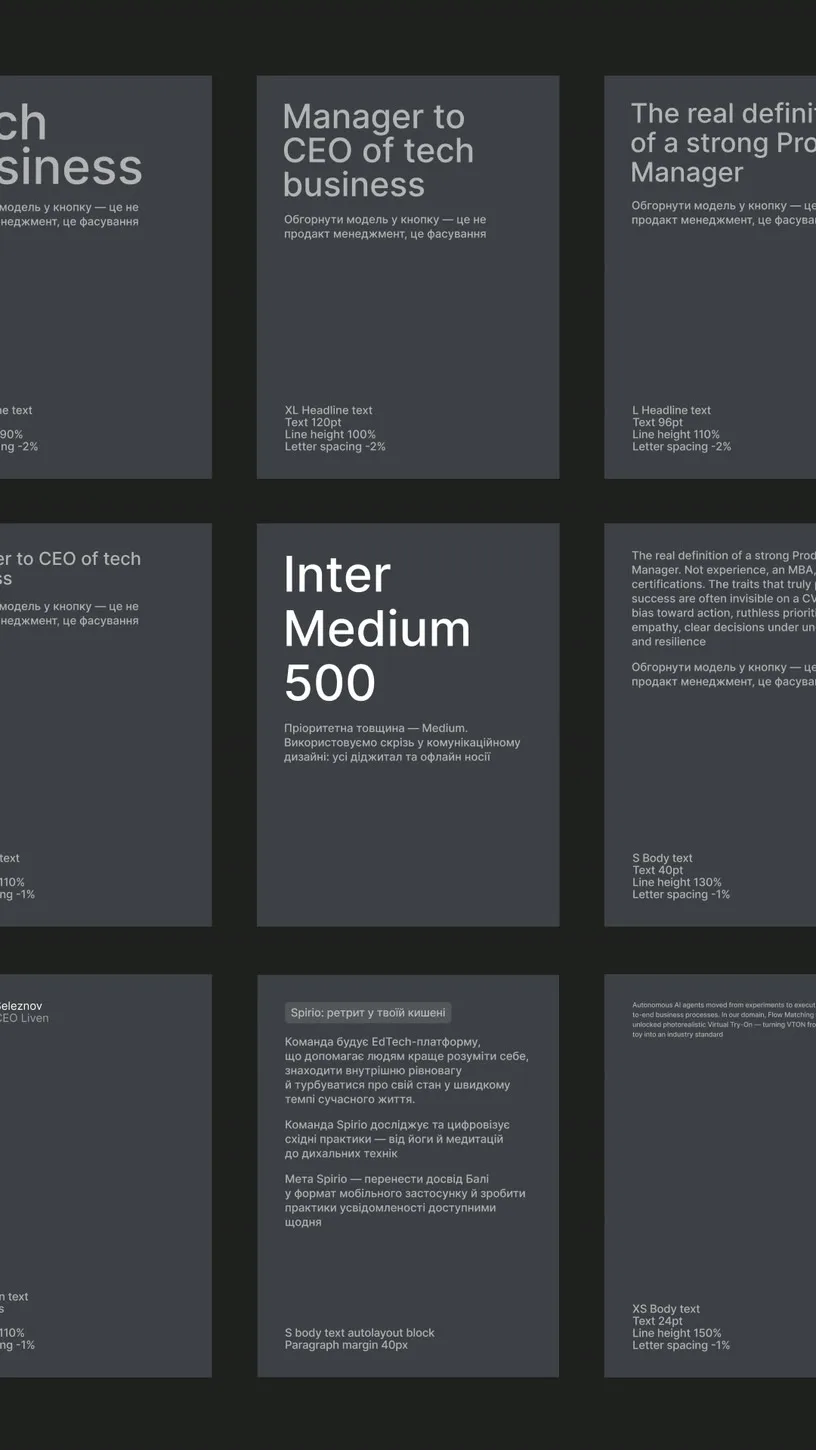
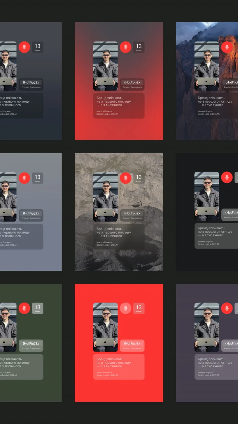
One framework. Zero guesswork. We didn't hand over assets. We handed over a way of seeing — one framework, organized into visual categories, each solving a specific communication need. Teams needed content constantly, across channels, with clear vision for what to make and how.
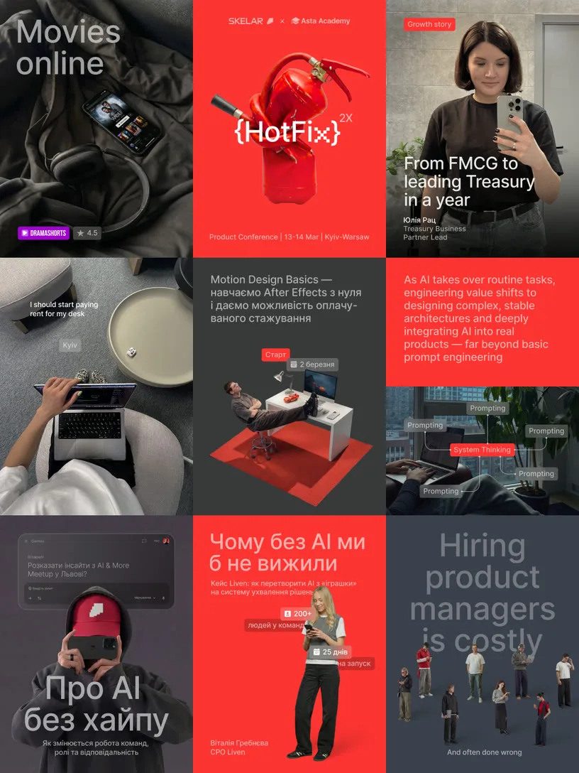
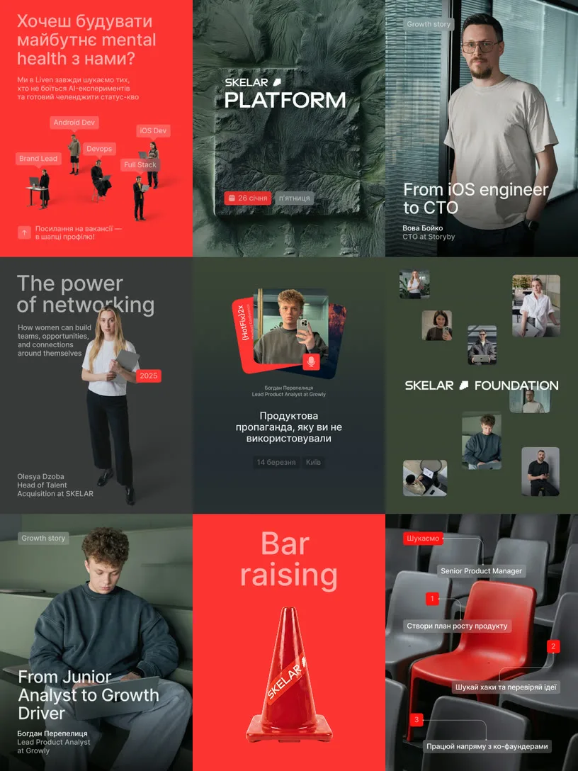

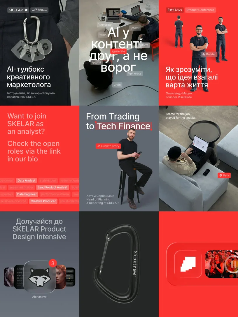
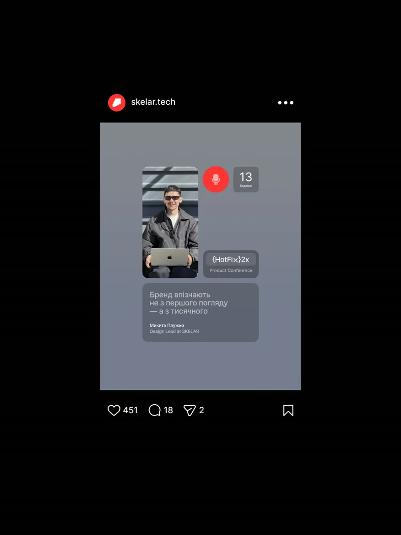
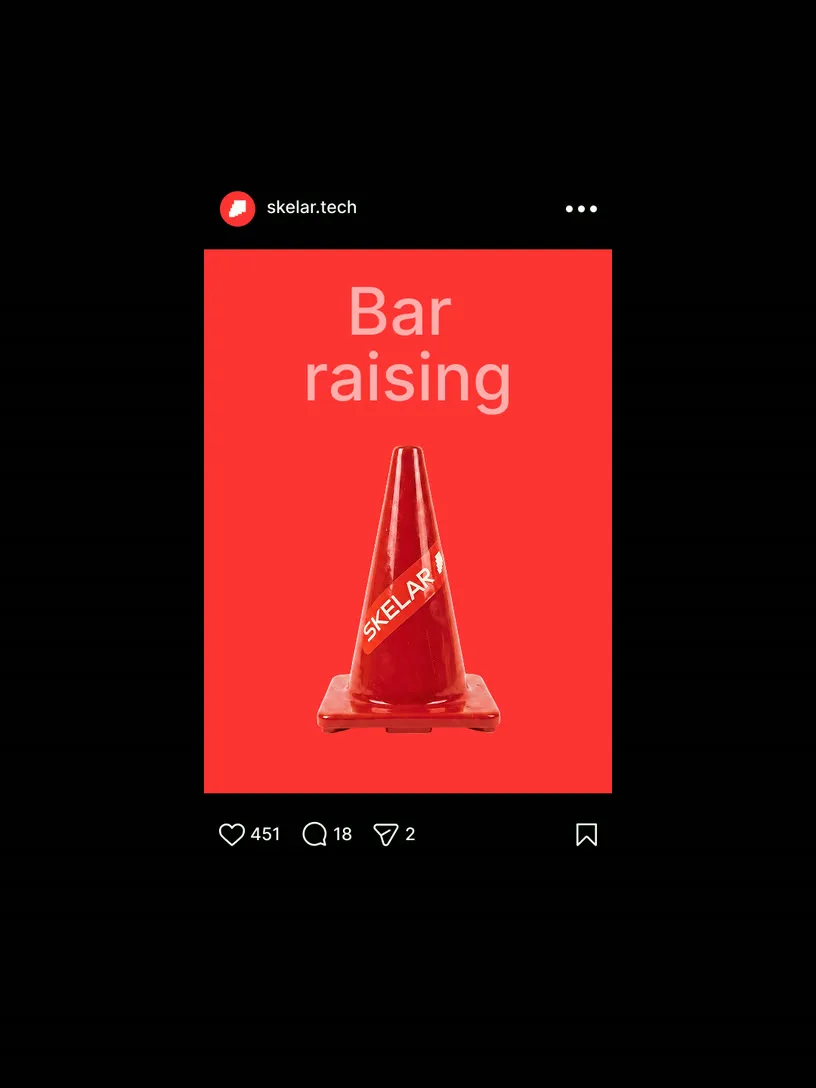

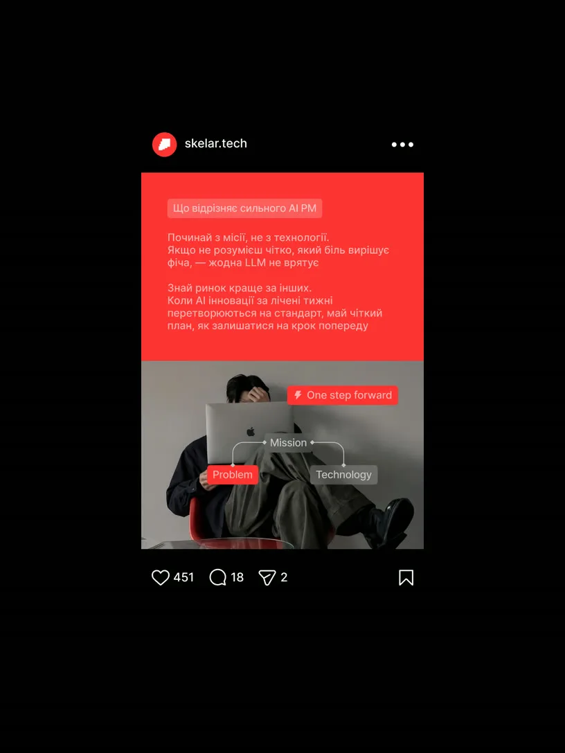

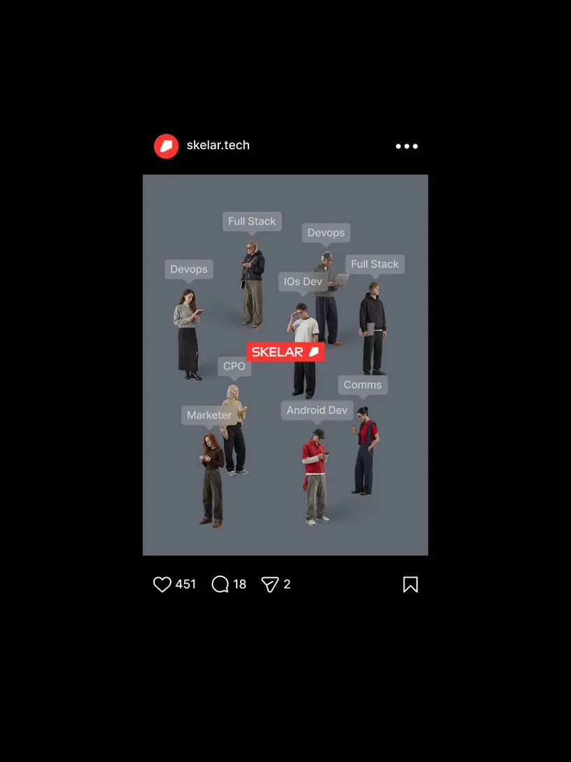
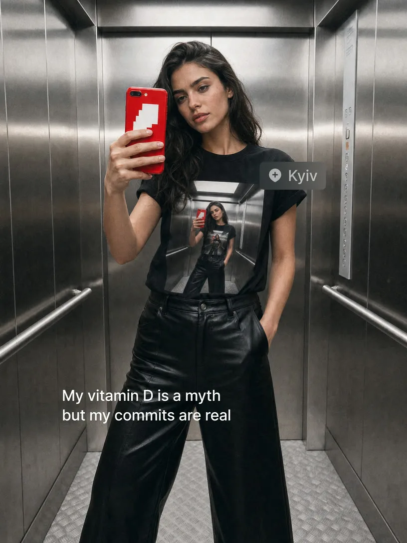
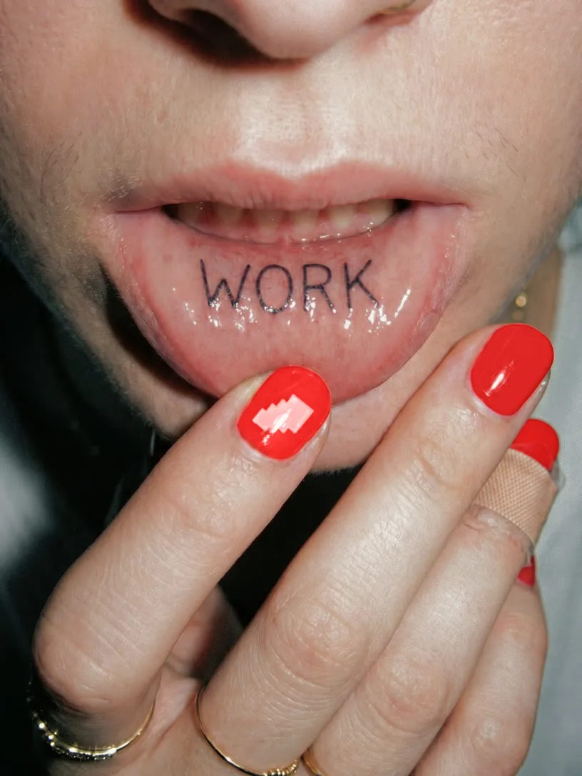
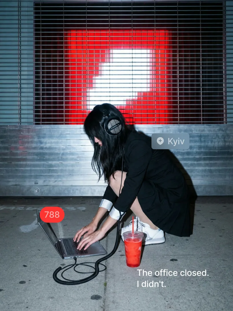
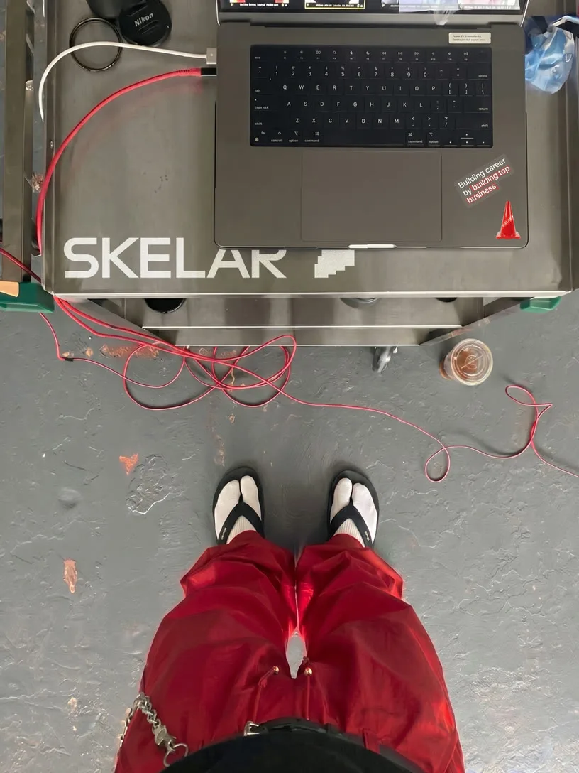
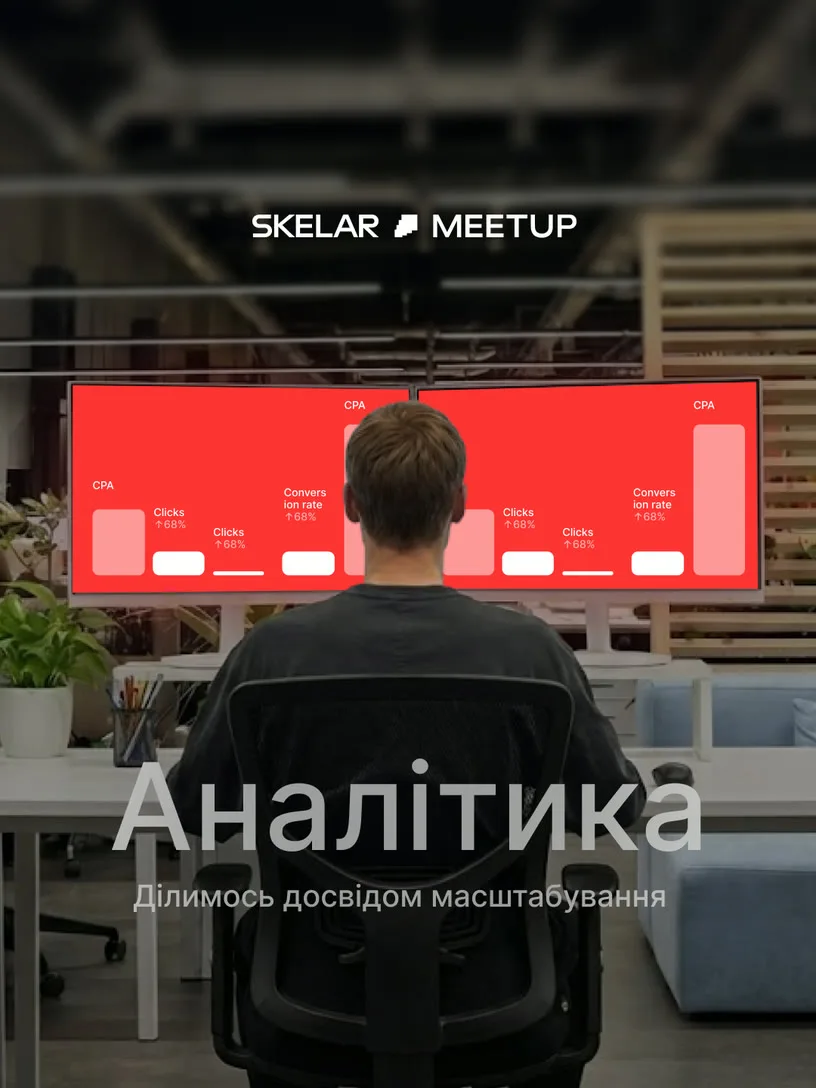
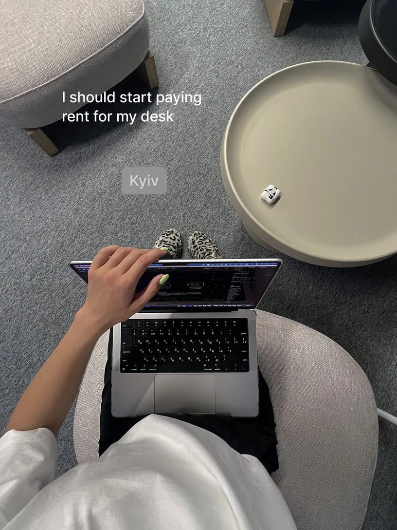
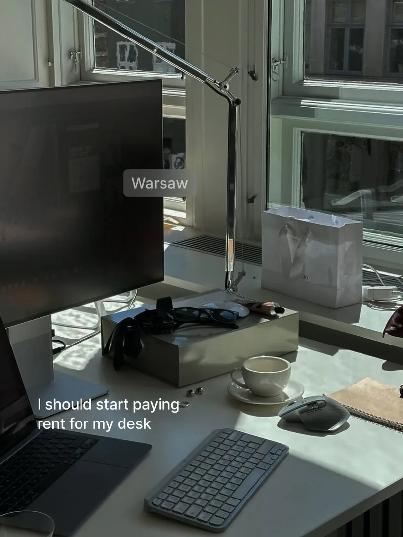
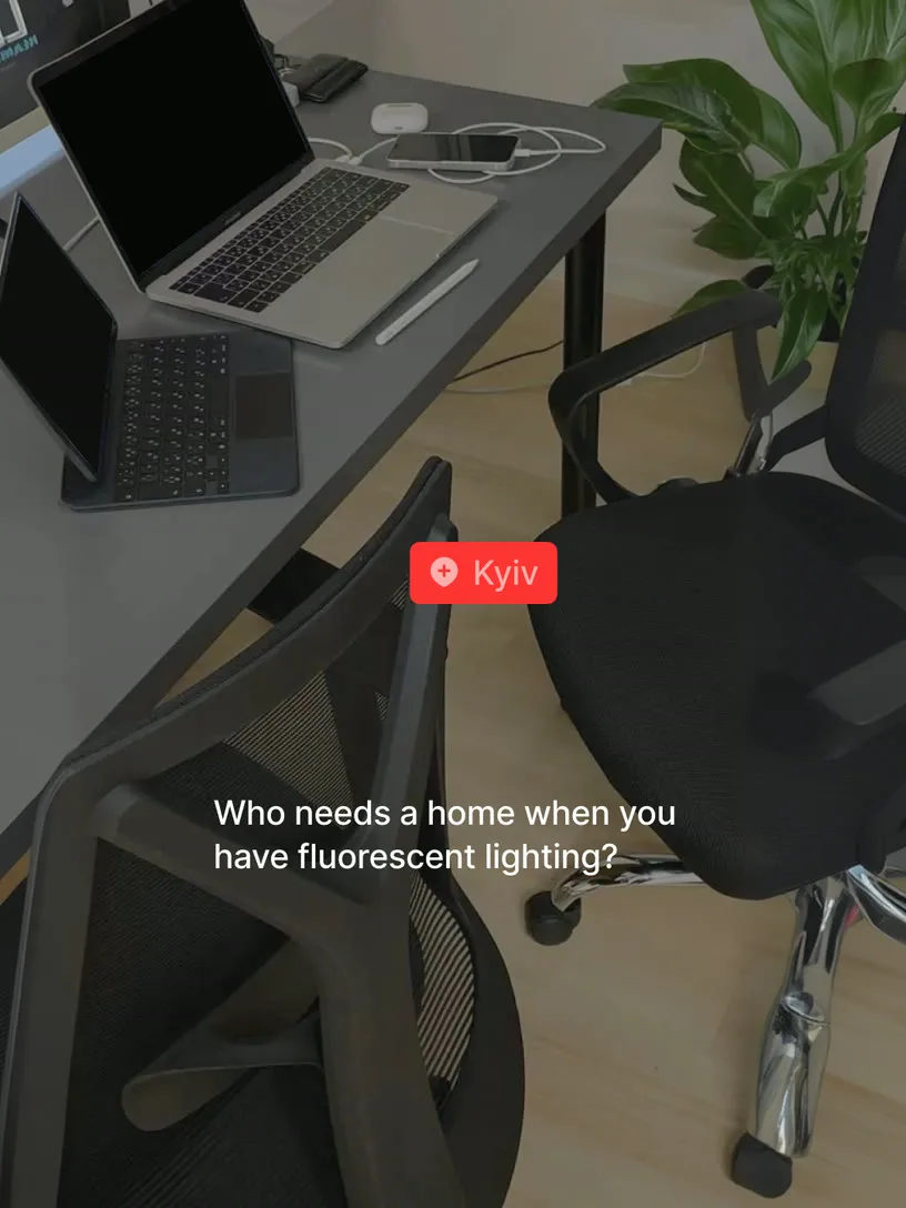
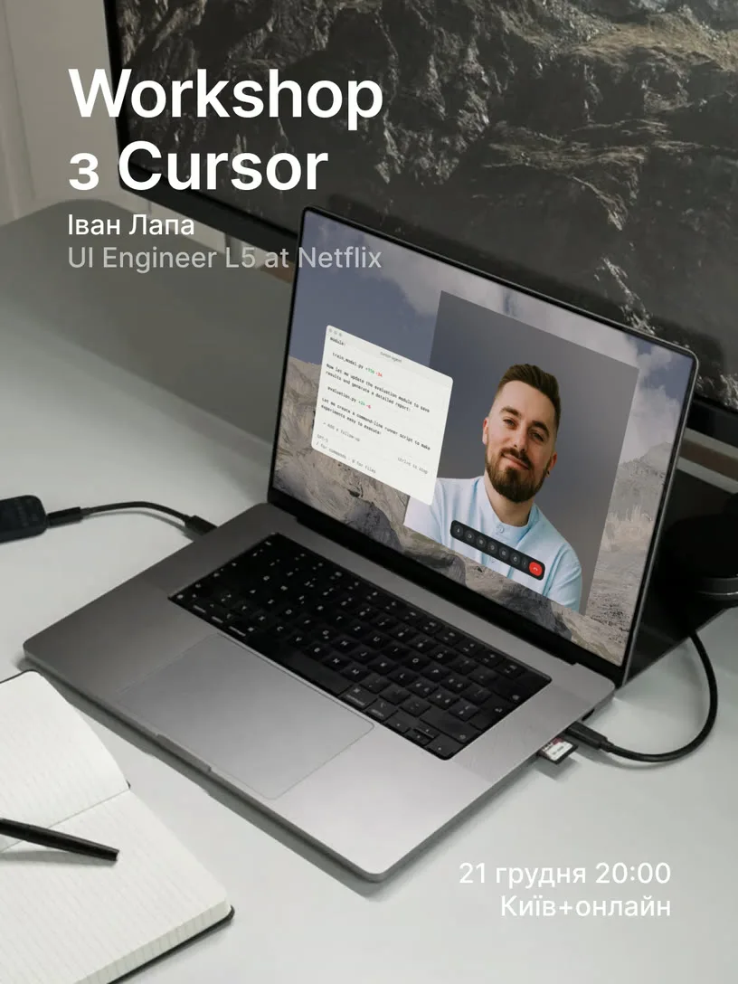

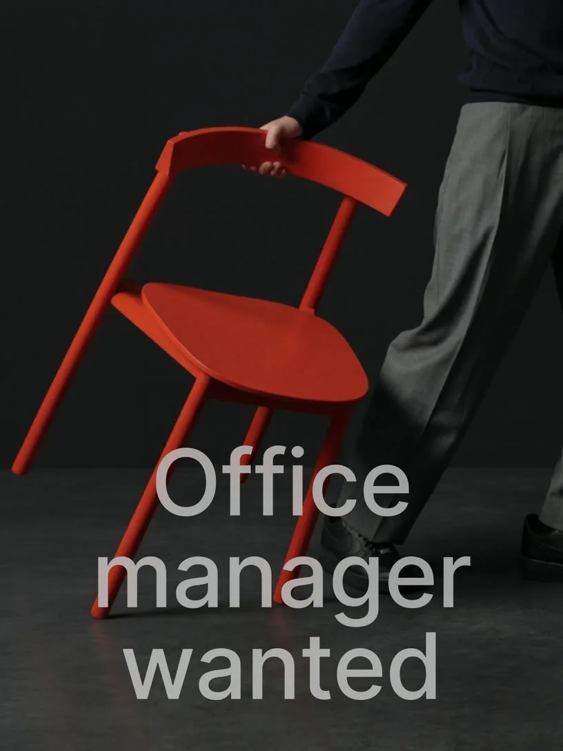
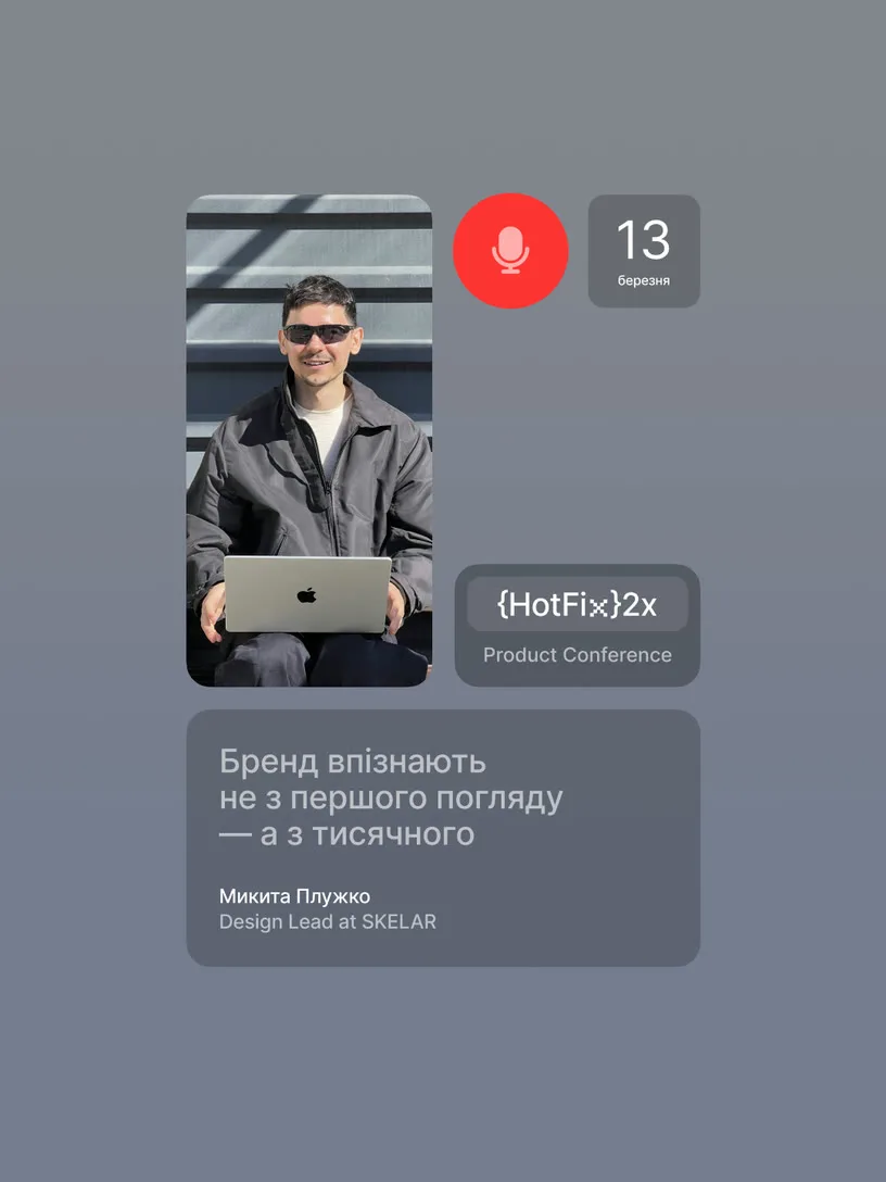
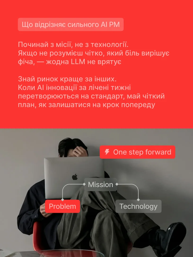
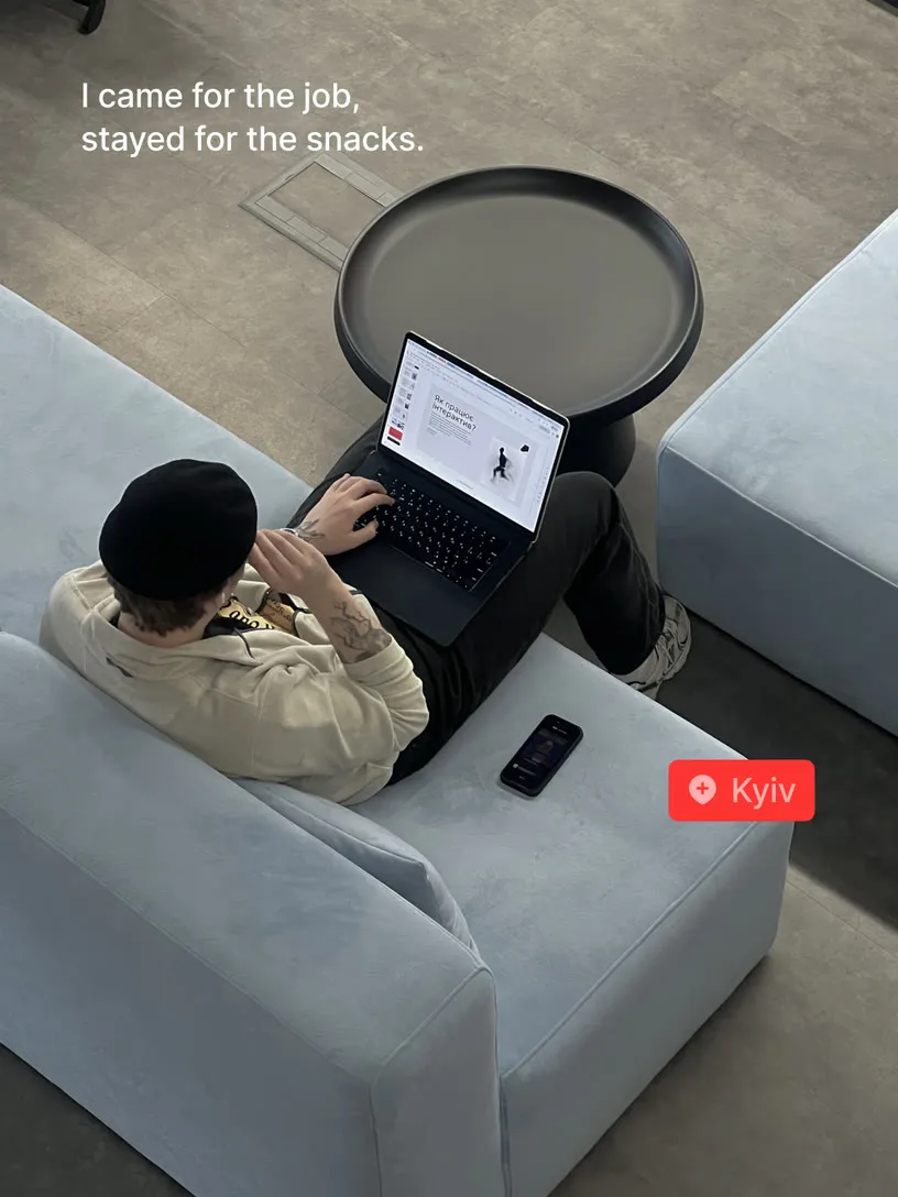

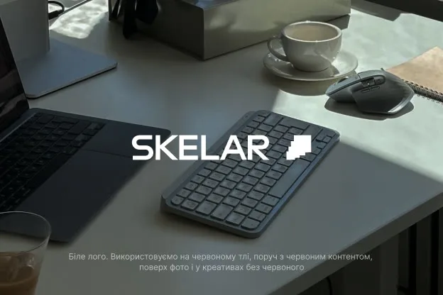
Officecore photos
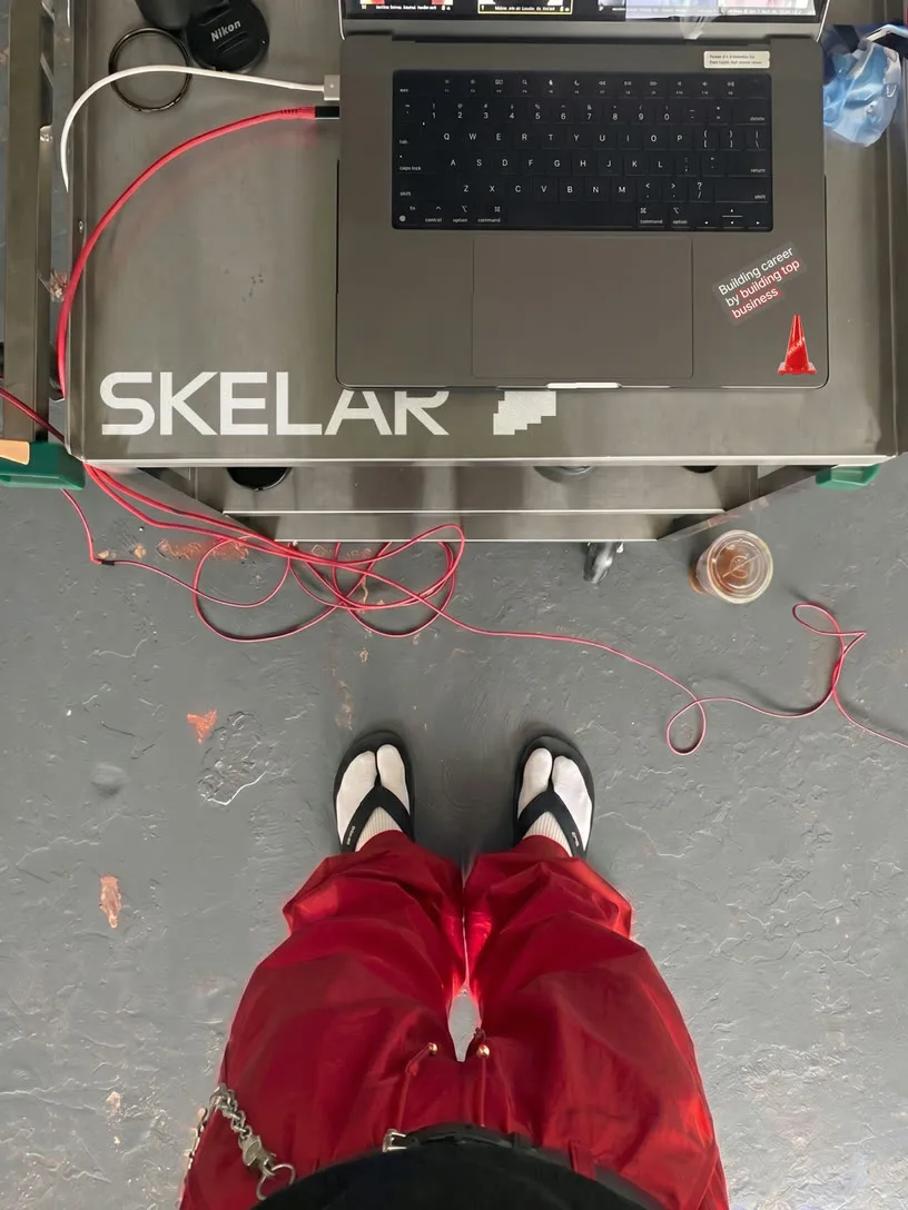
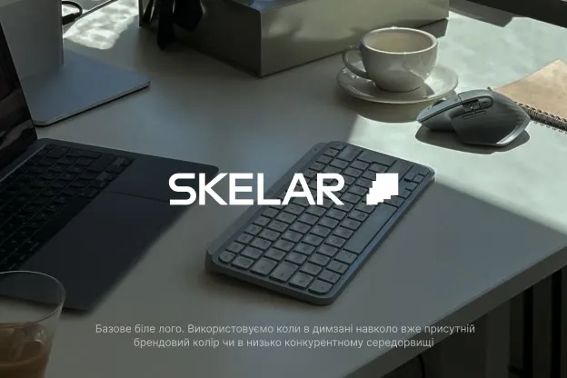
Documentary-style photography, slightly imperfect, intentionally so. The subject unaware of the camera, natural light, candid, a little chaotic on purpose. This is how you show culture without explaining it, without asking anyone to pose for something they already live.

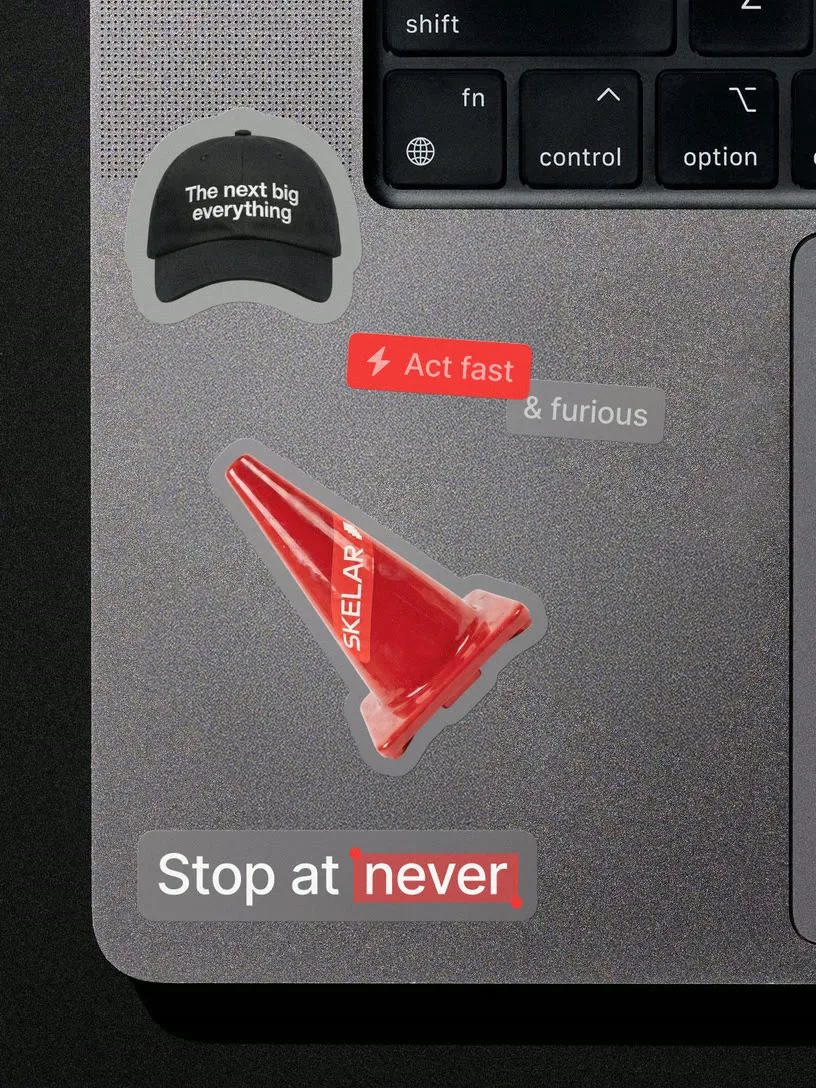
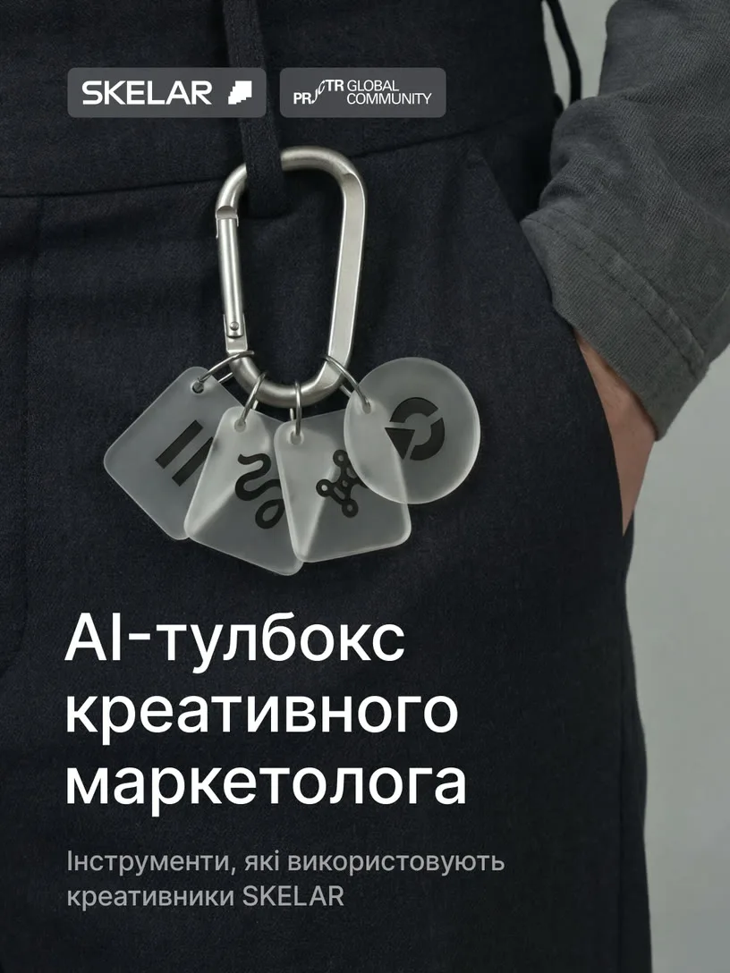
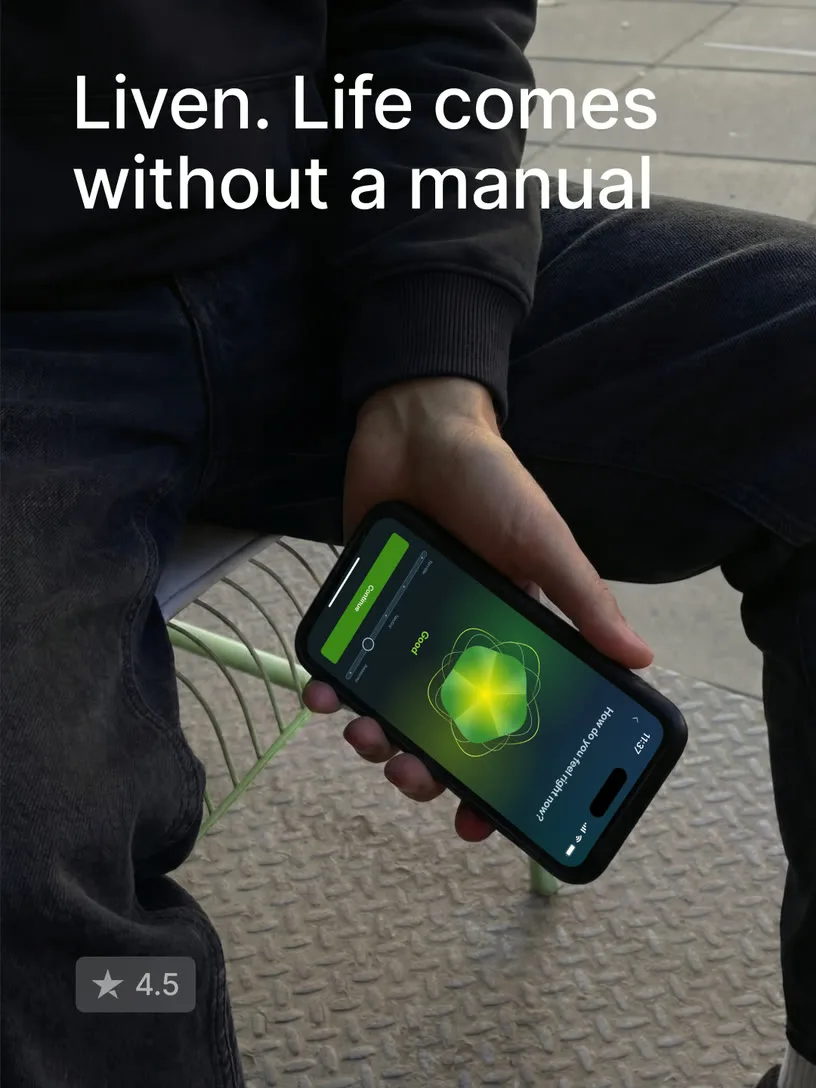
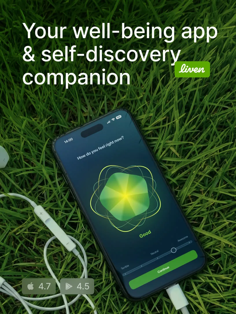

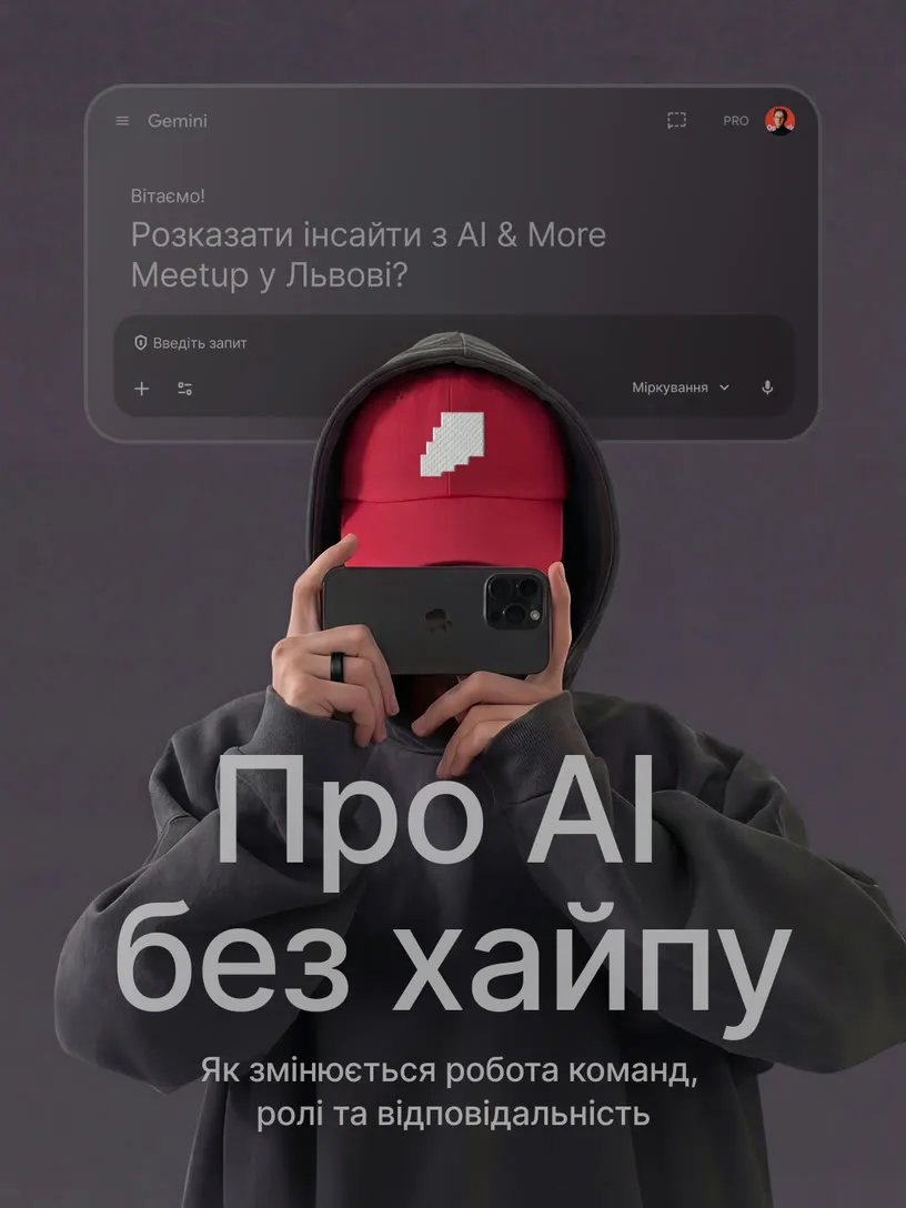





Candid mockups
Millions of real users, real devices, real moments of use — captured mid-life, not staged. These aren't product shots. They're proof. The brand lives where the products do: in the hands of the people who chose them, at a scale that speaks for itself.
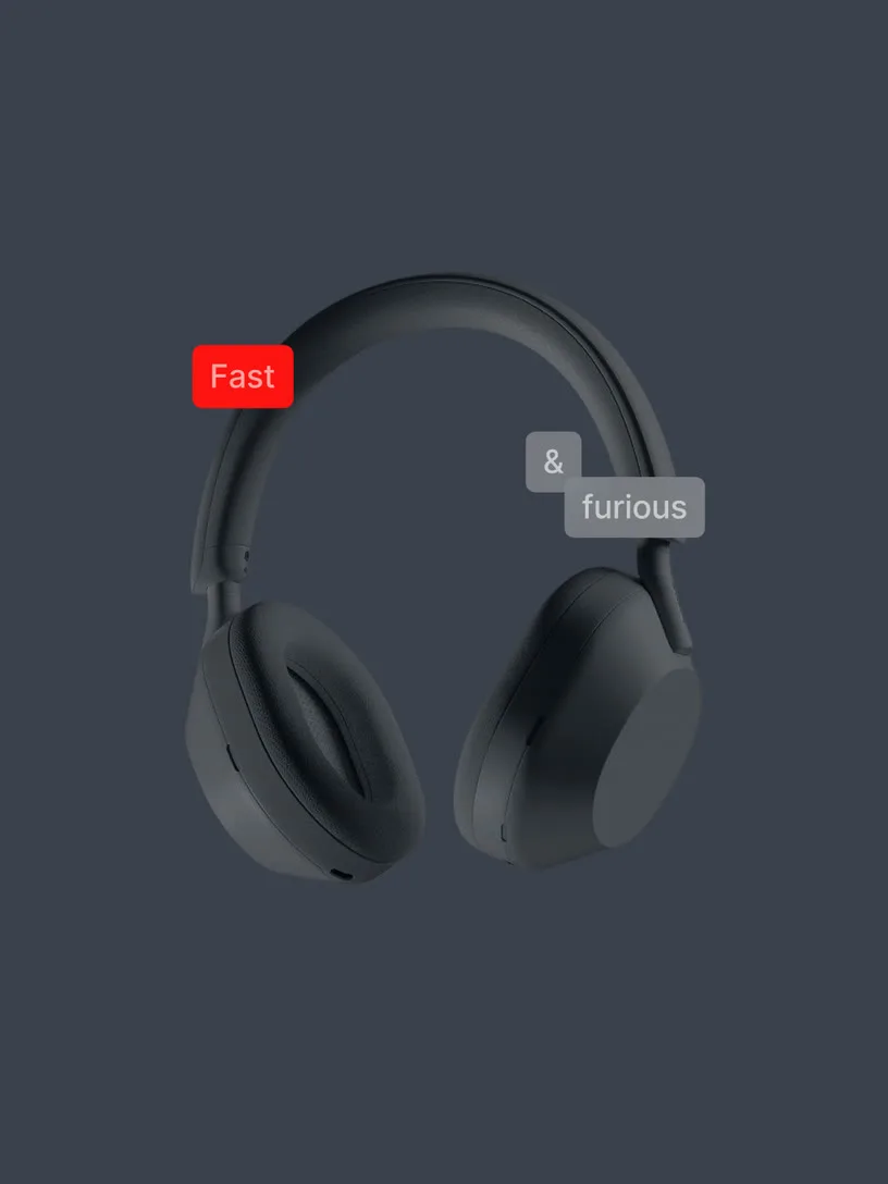

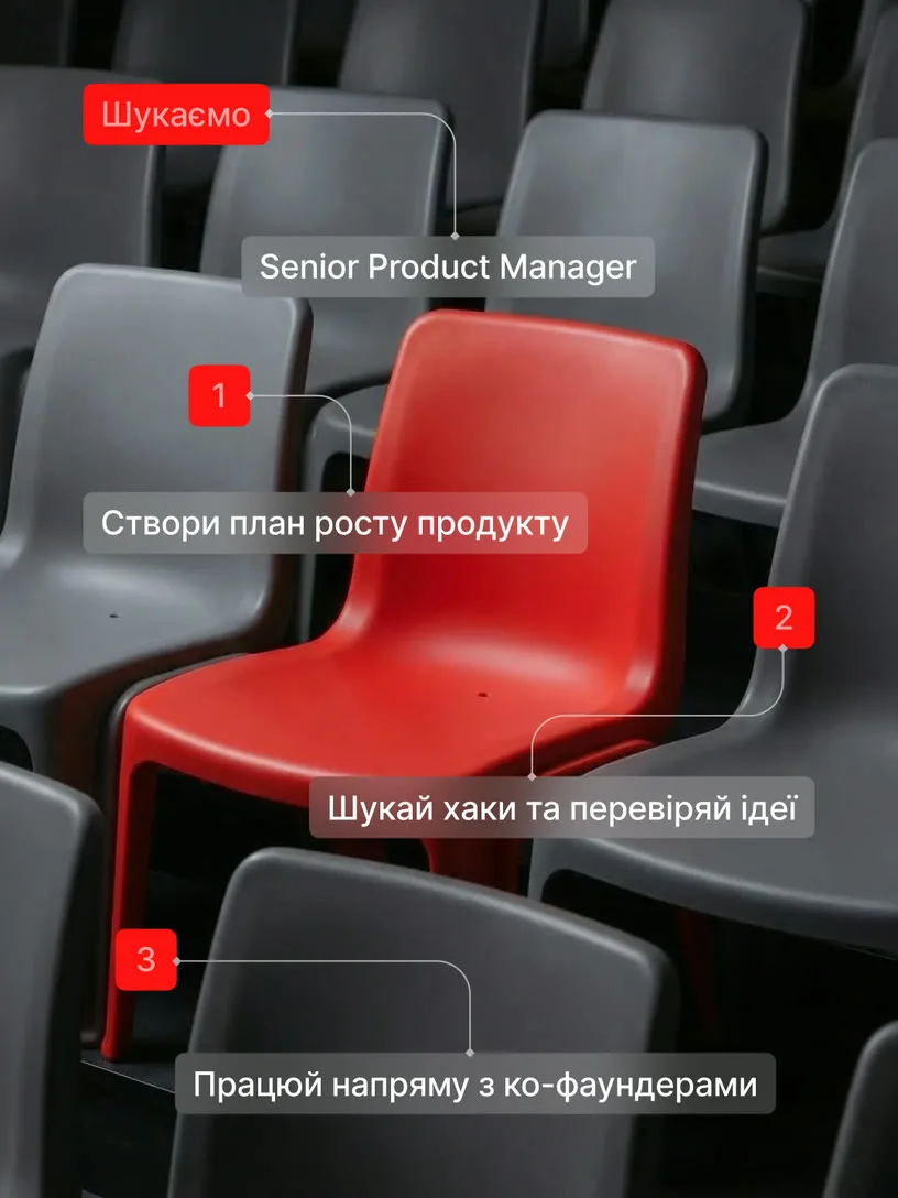

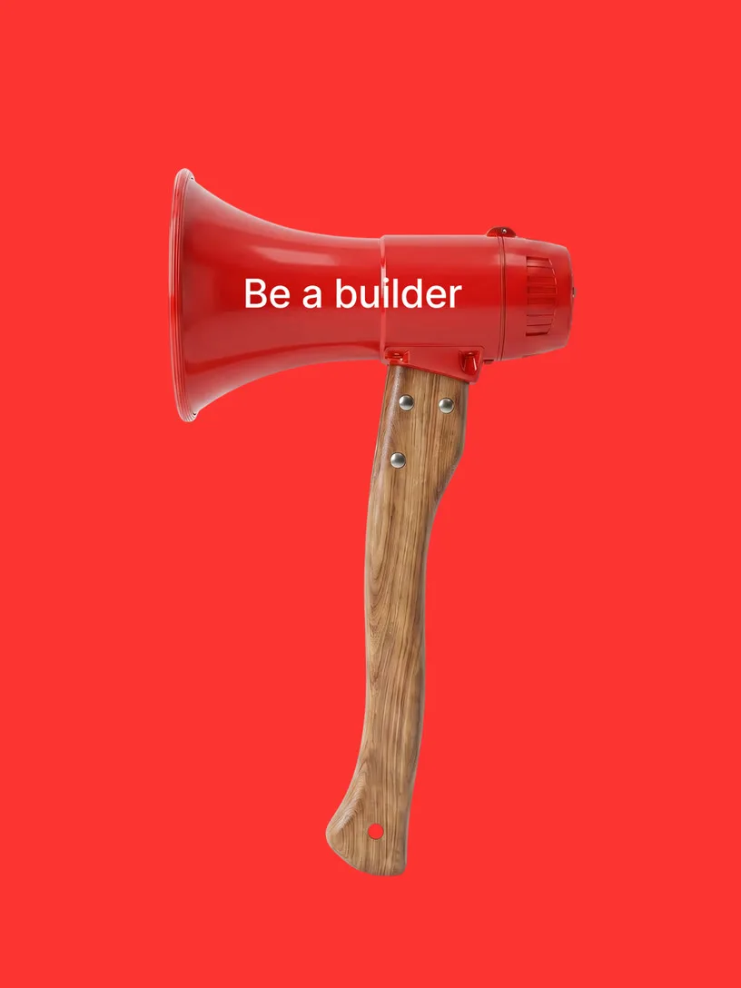
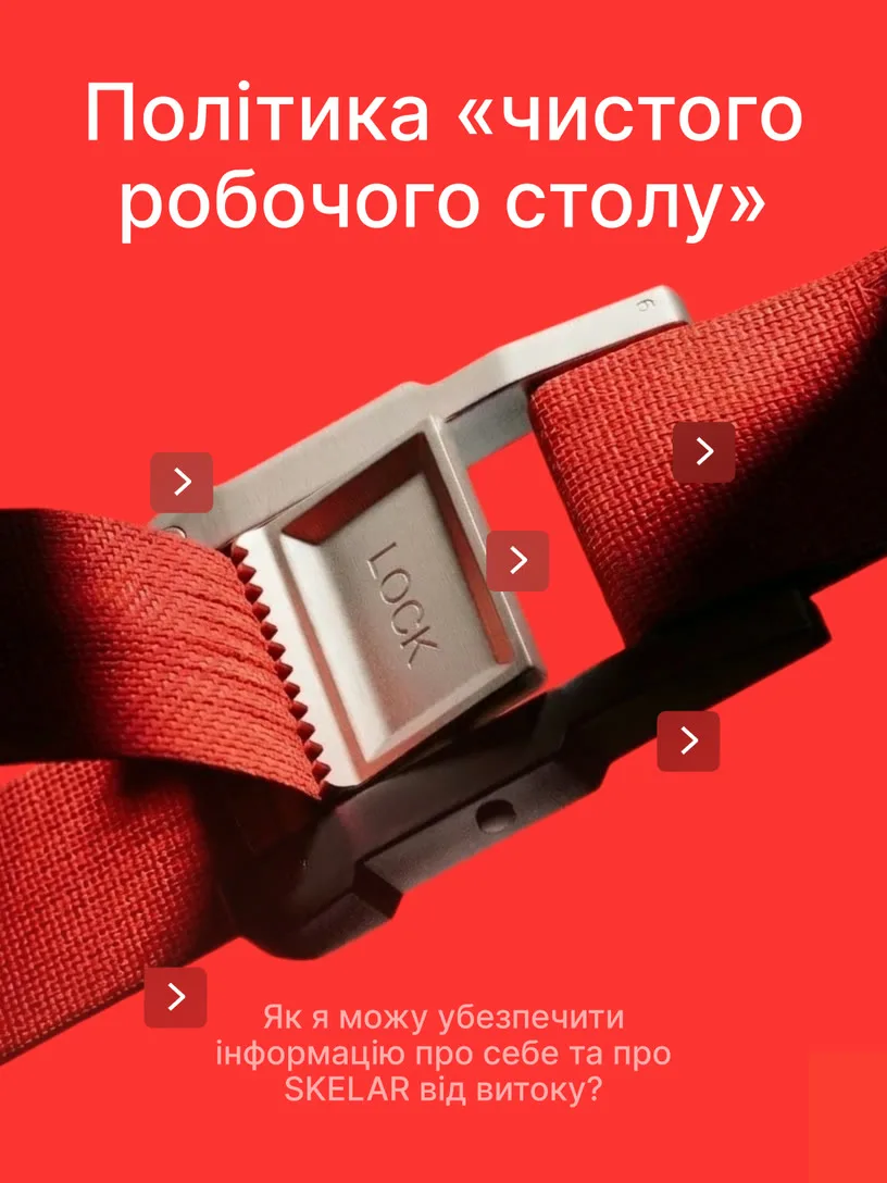
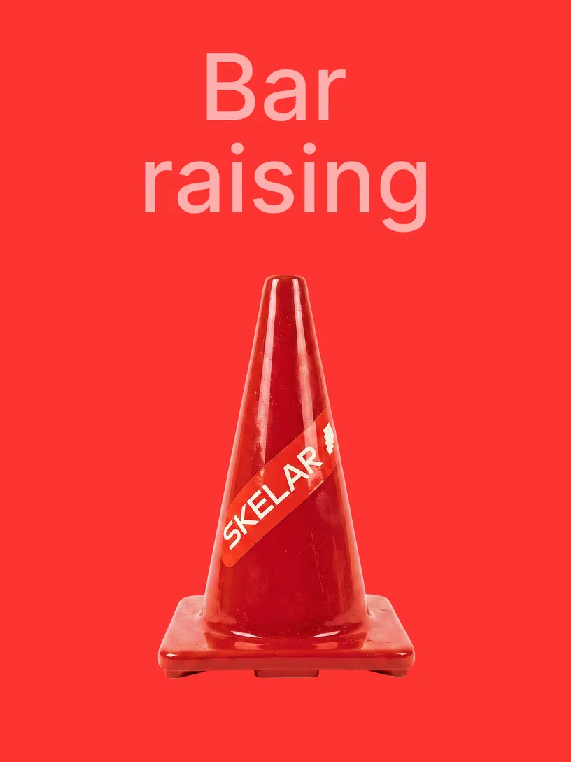


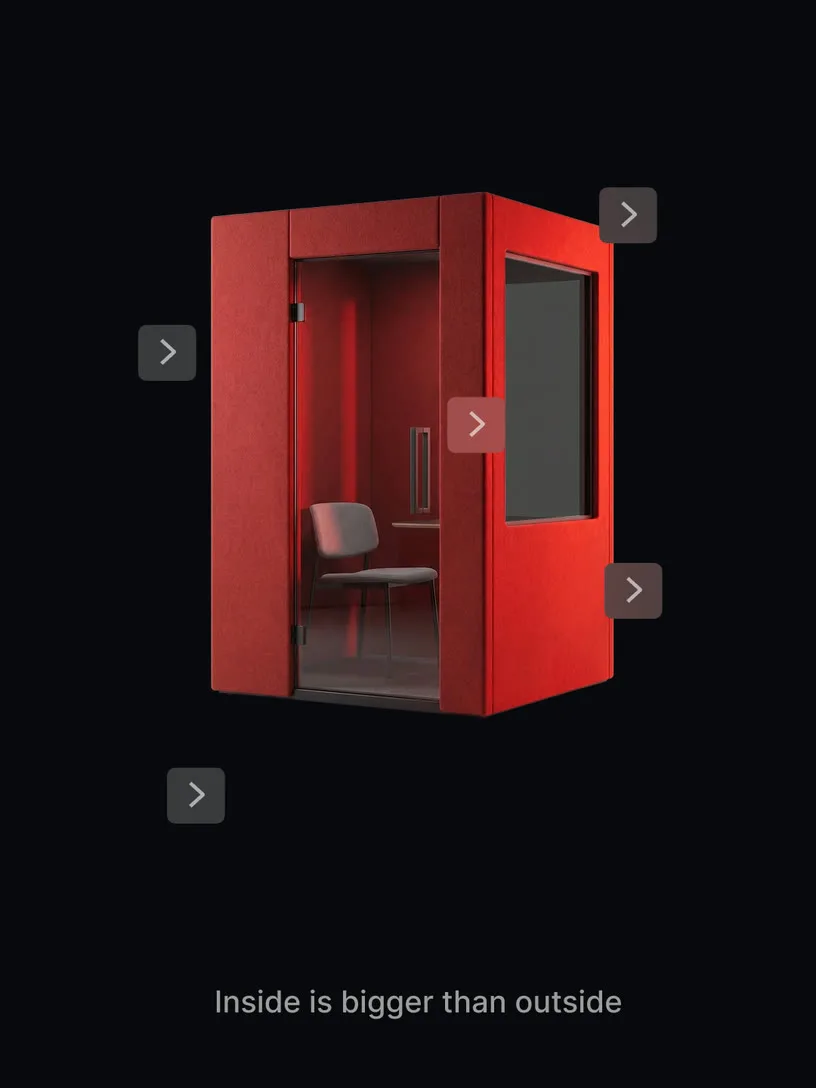
Symbolic objects
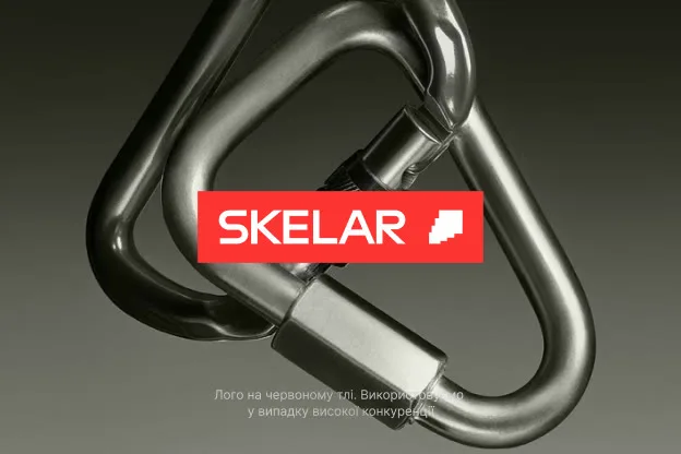
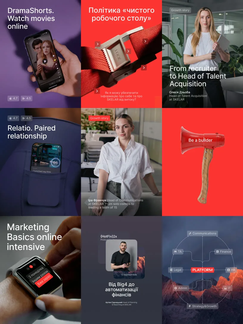
Metaphorical visuals built from realistic 3D objects — where the image reinforces a theme or headline through association, not literal illustration. A megaphone for a hiring post. A lock for a security policy. An empty red chair for an open role. The object carries the idea; the copy sharpens it. When an object can be red, it is. The brand color does the work before a word is read.





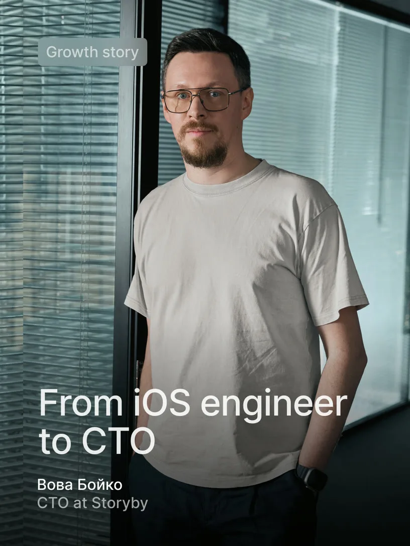
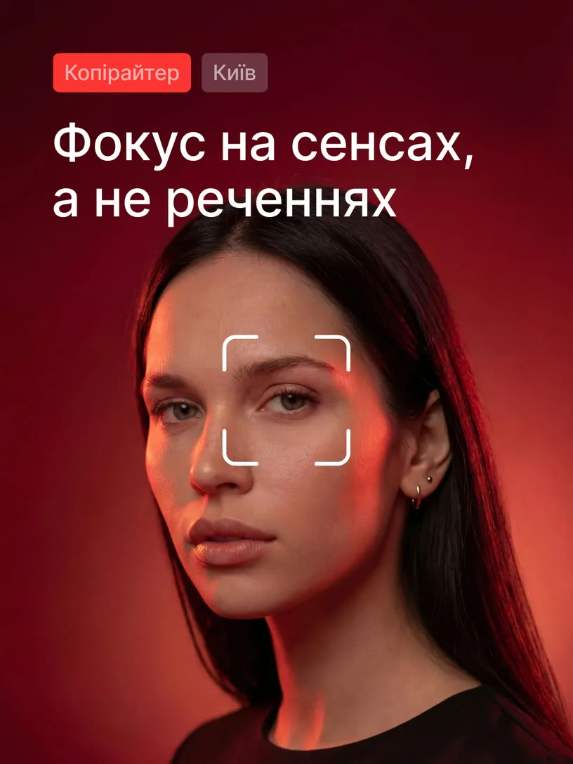






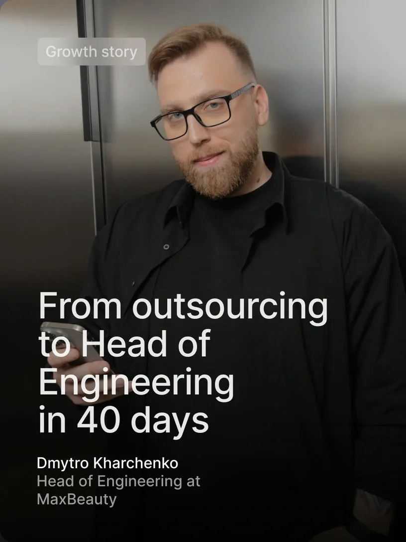
Hero shots
Because SKELAR is about people, the photography has to be too — not only generated, but real. Each portrait feels like someone was caught mid-thought, mid-task, in an office that doesn't perform for the camera. A little spontaneity, a little polish, mostly just honesty.
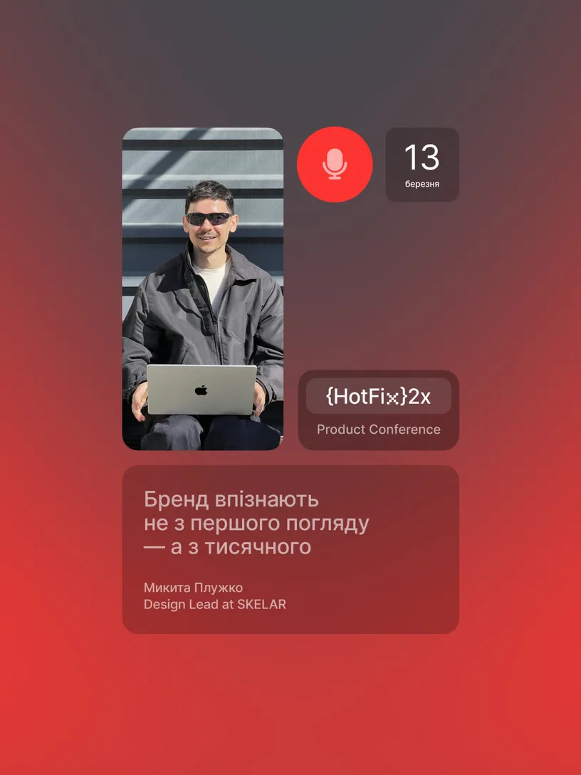
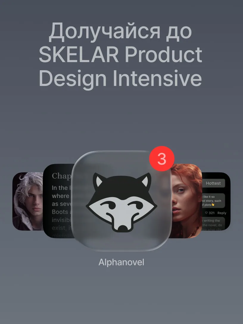


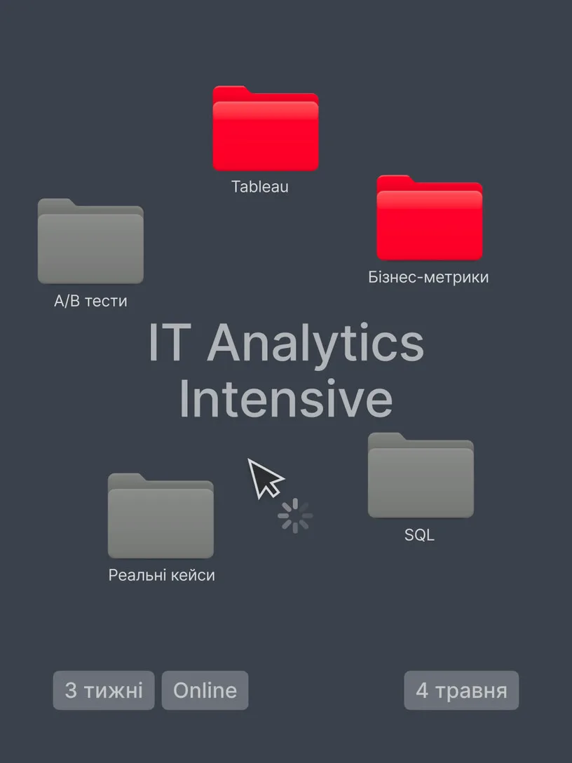


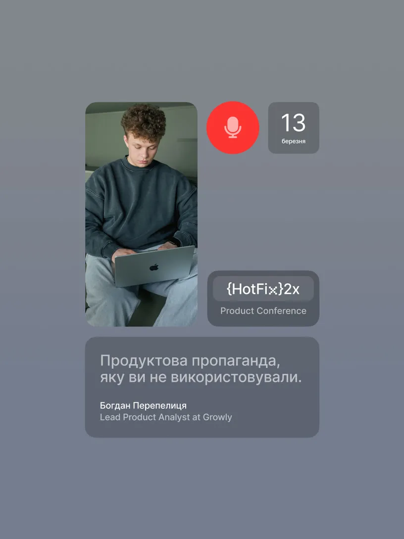
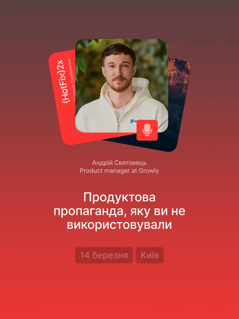
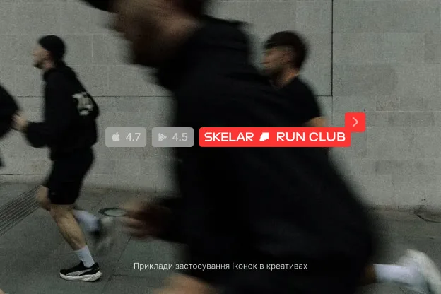
Interface overflow
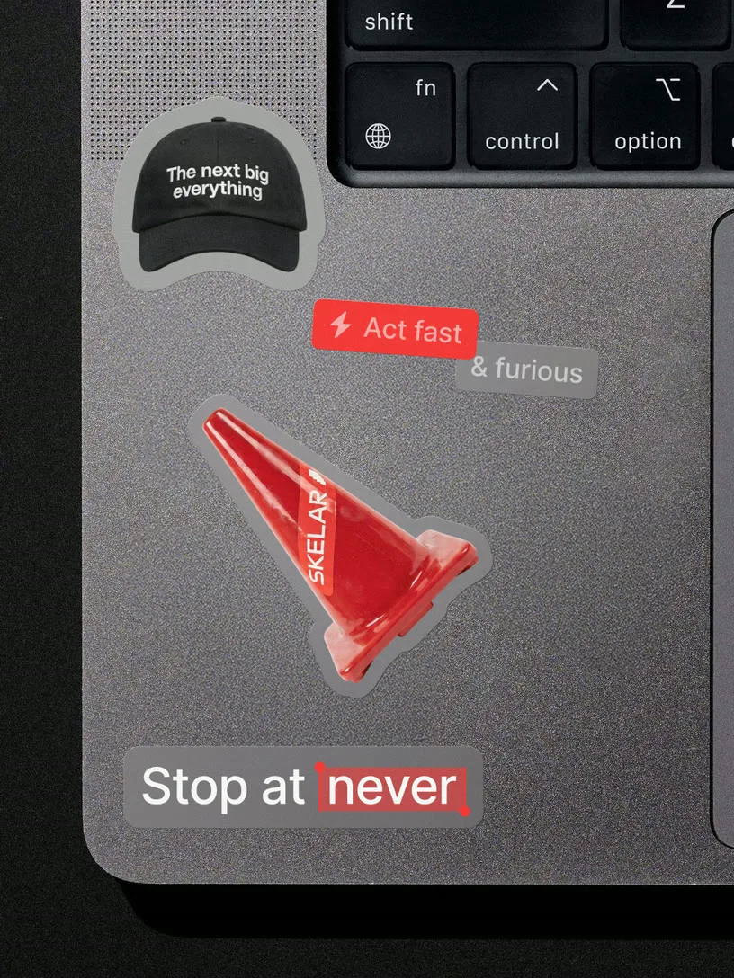
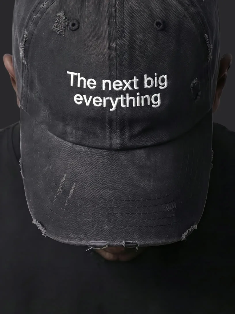
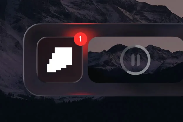
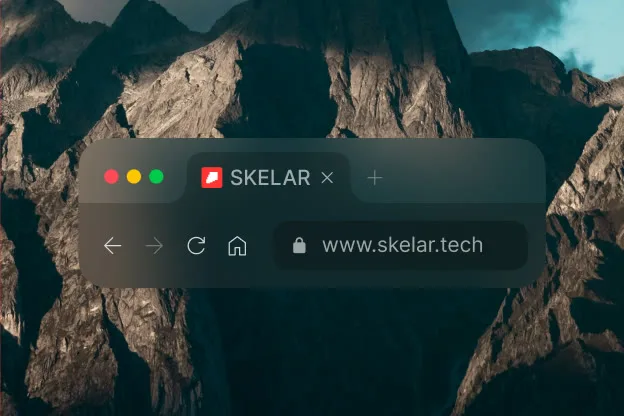
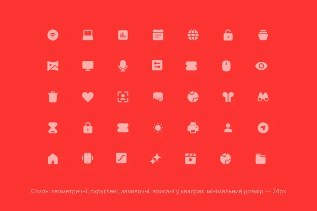
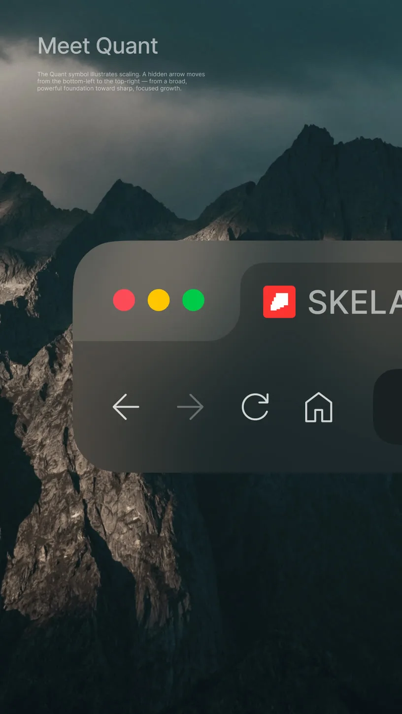
Every SKELAR project is digital — and the brand doesn't pretend otherwise. Interface aesthetics aren't borrowed for effect; they're the natural visual language of this world. What starts on screen doesn't stay there: UI fragments drift onto posts, live on merch. The digital made tactile.
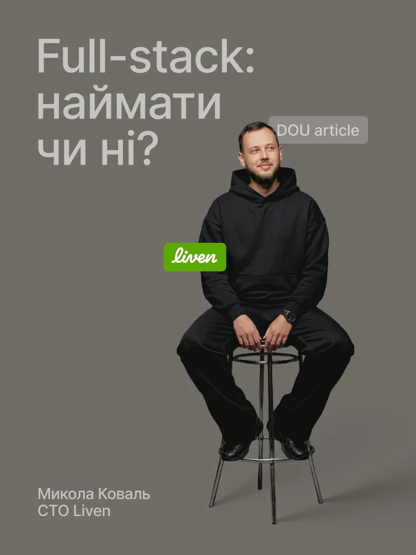
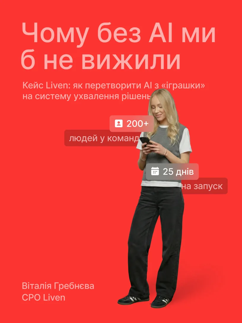
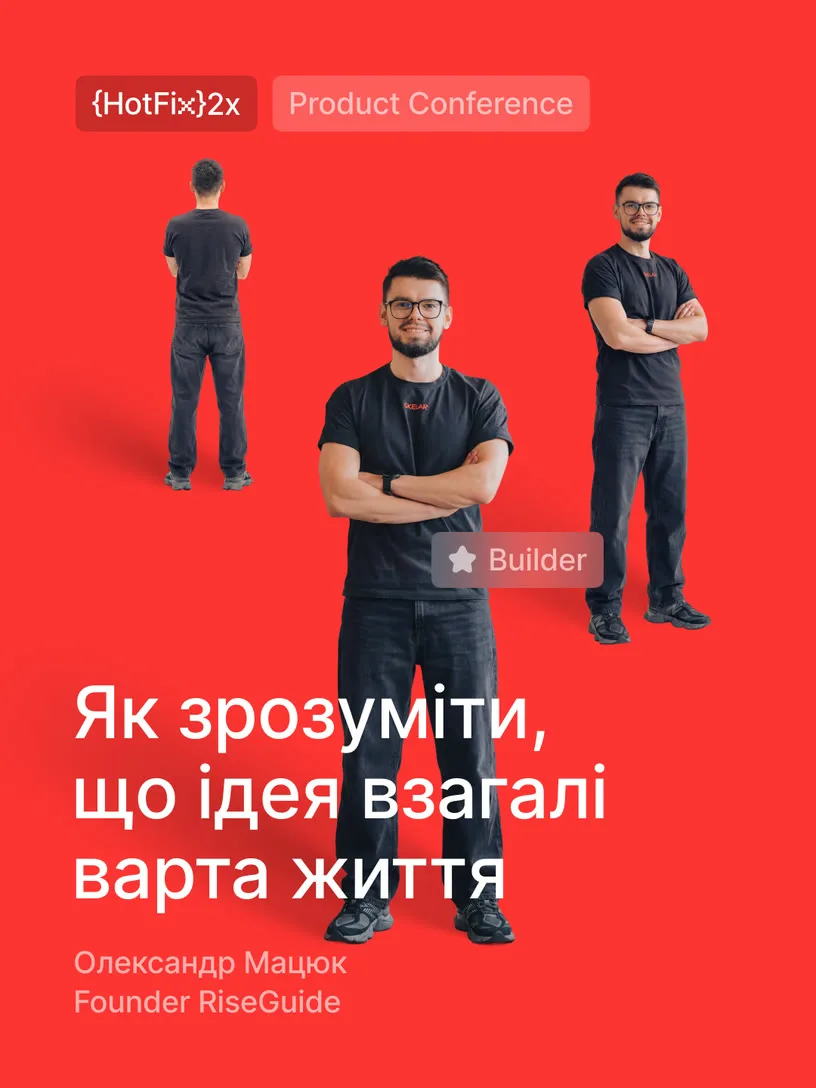

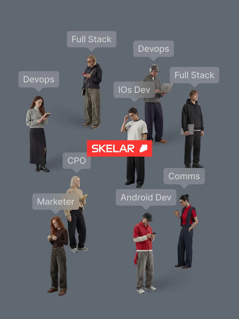
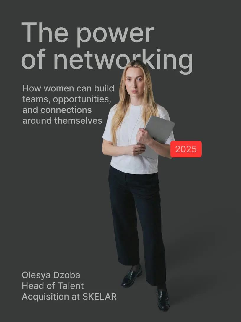
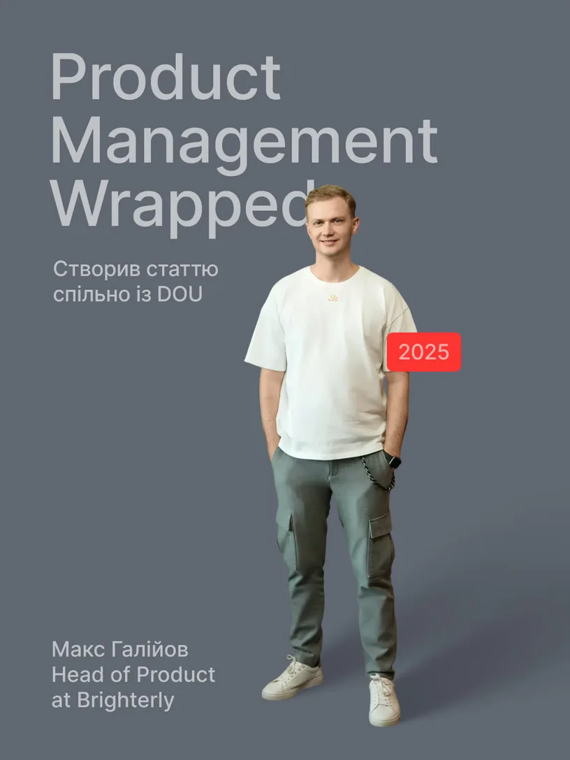
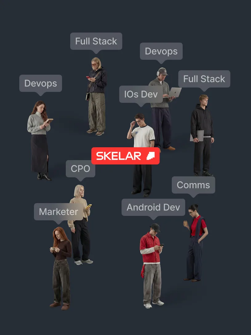
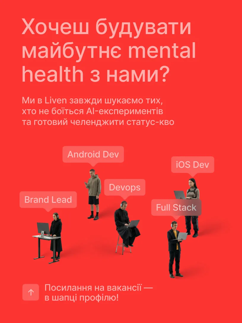
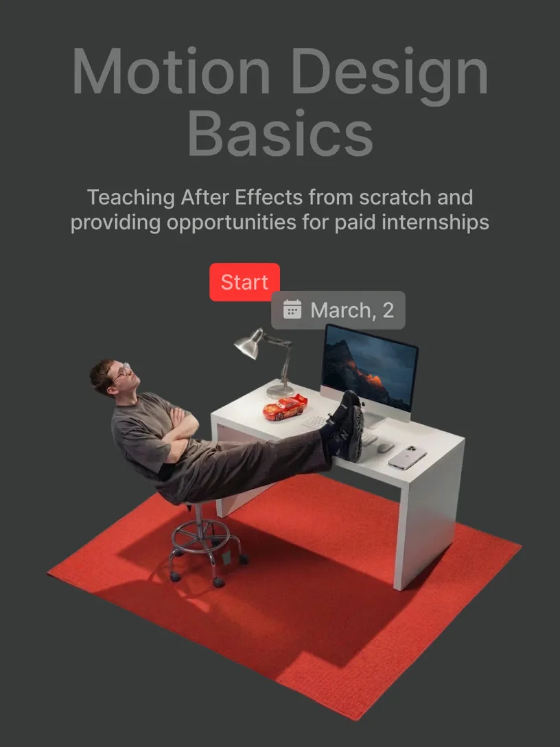
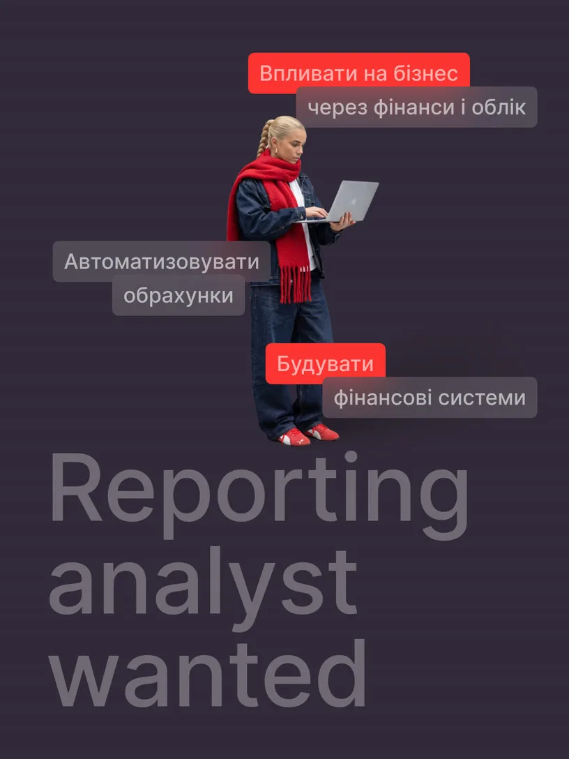

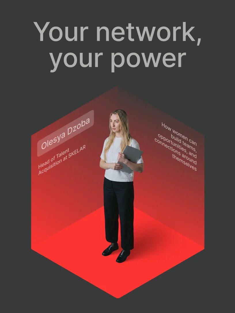
Team avatars
The format solves a specific task: how to keep visual variety in content without requiring a new photoshoot for every post. Each person becomes an avatar — built from someone real, styled with enough personality to be recognizable. There's a playfulness to it that doesn't sacrifice honesty. Scalable, repeatable, and still recognizably human and it never feels like a placeholder.
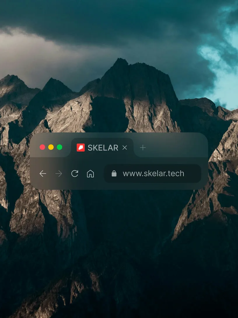

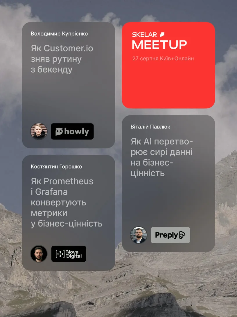
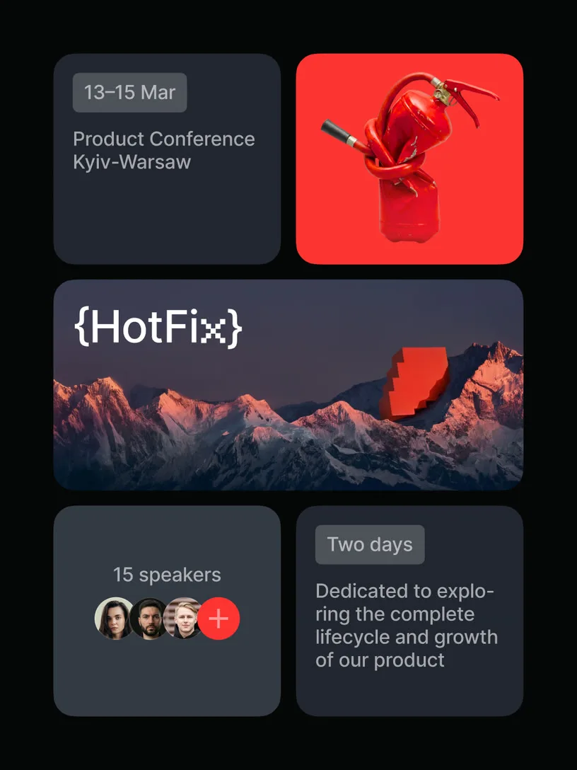
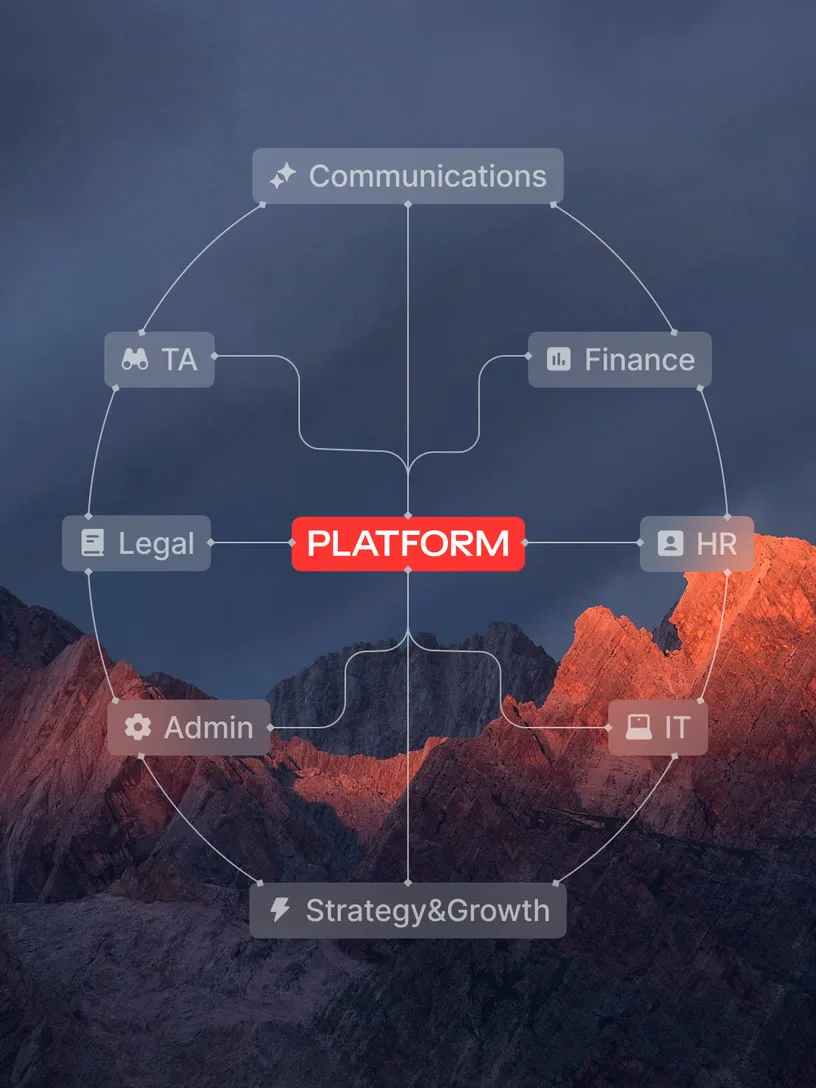
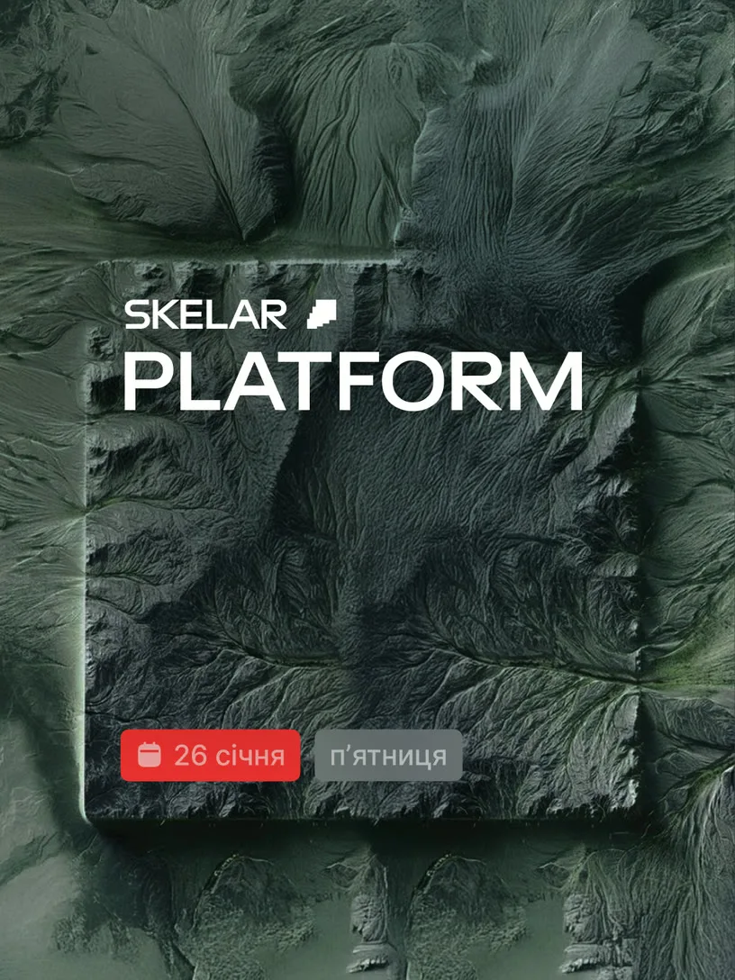
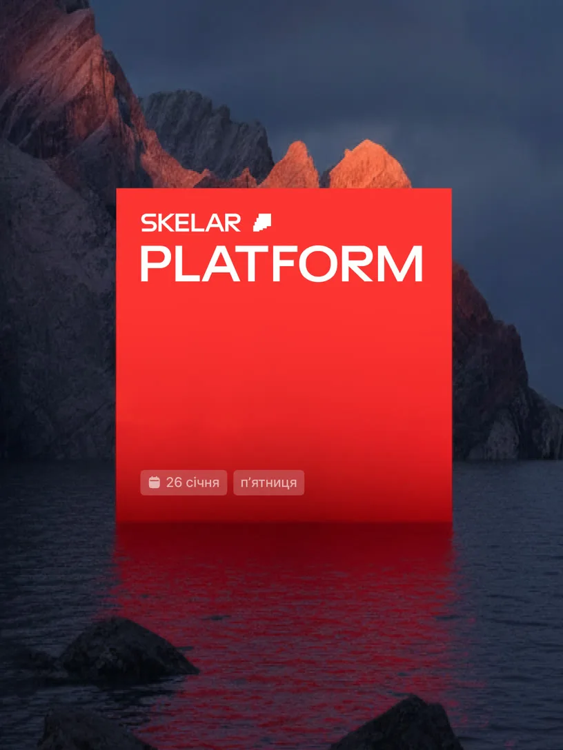
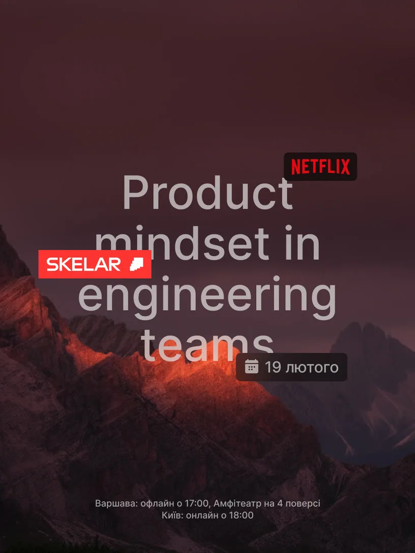
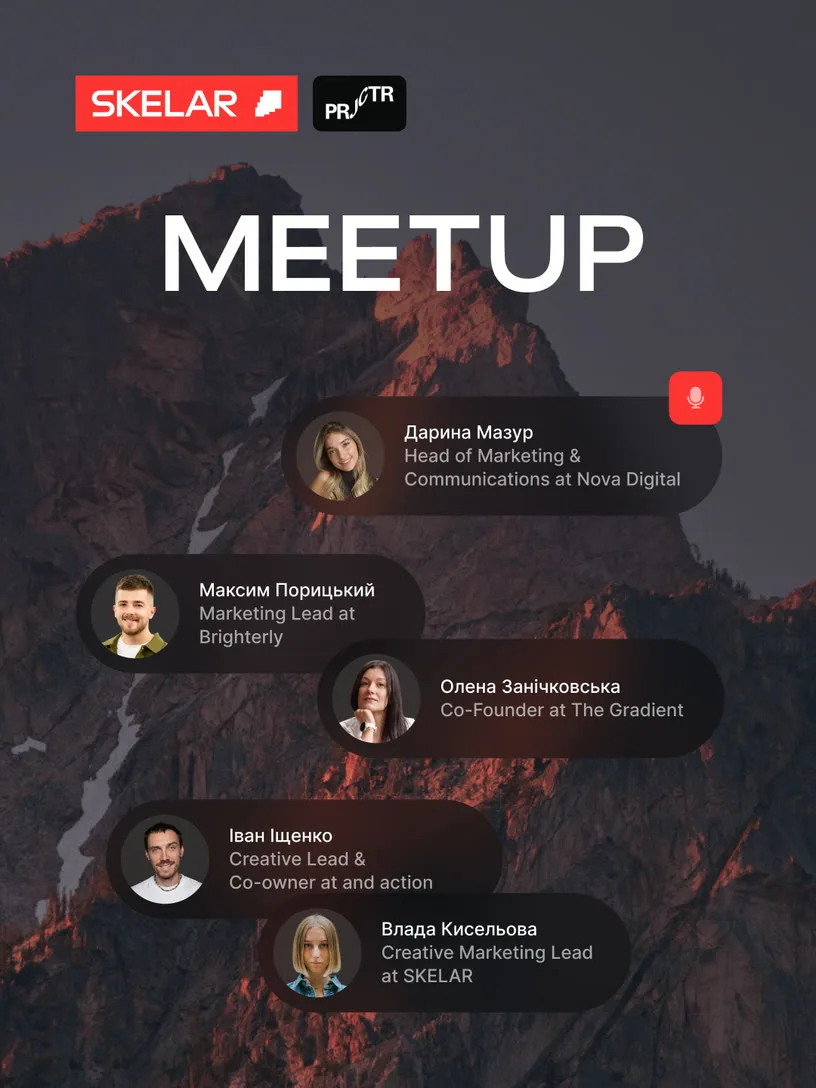
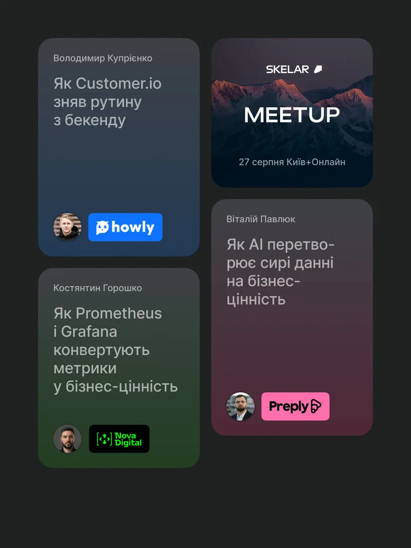
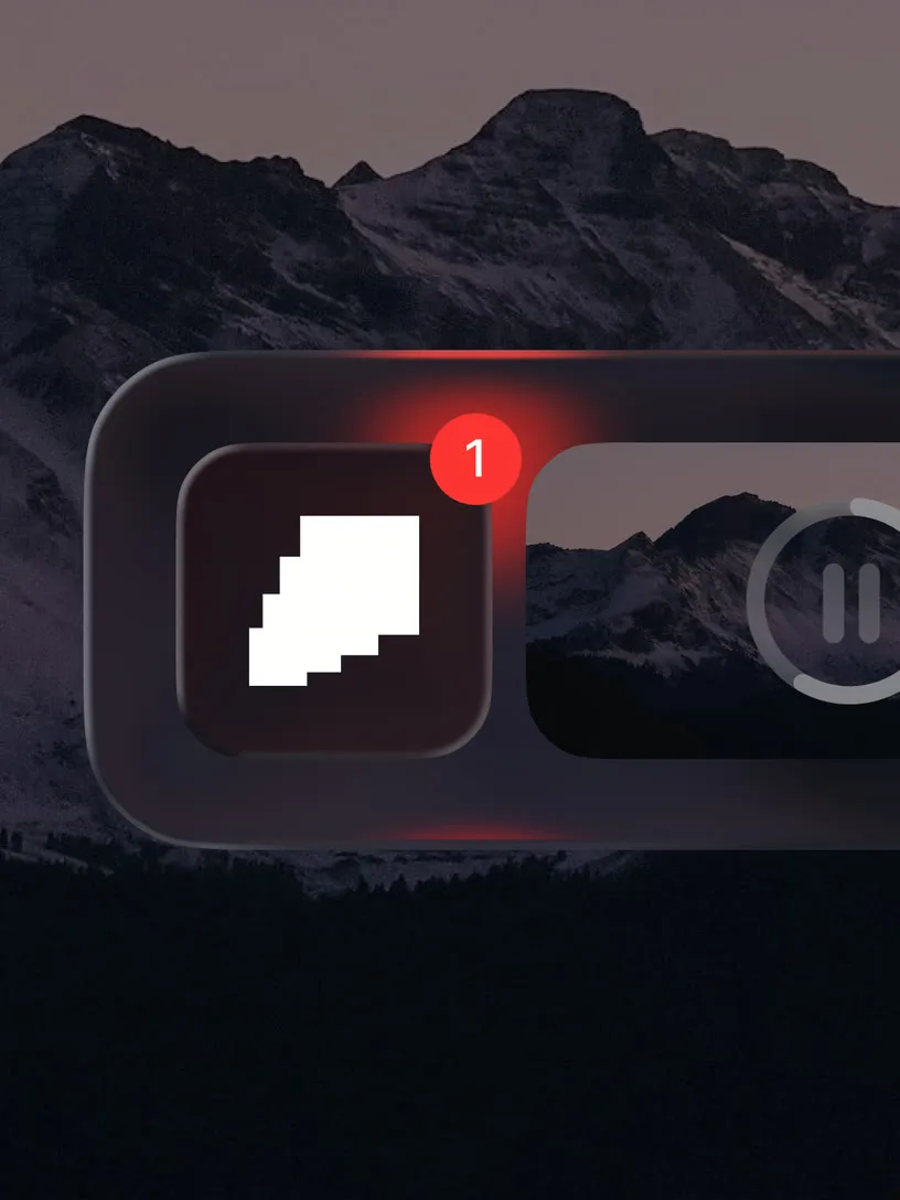
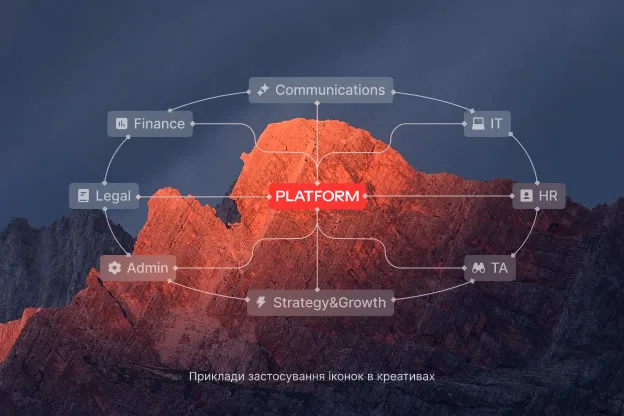
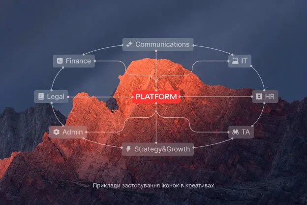
Rocky wallpapers
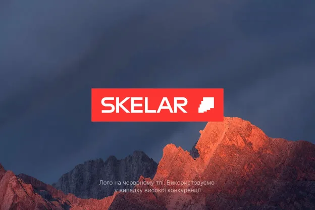
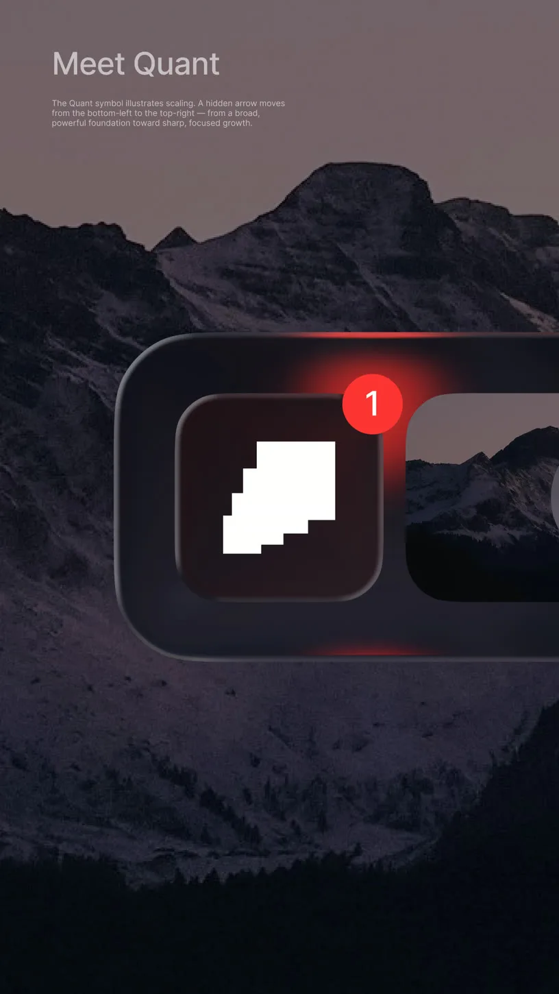
The rock in SKELAR's visual language was never an accident. It's legacy carried forward — the peak as a stand-in for ambition. People stop in front of mountains because something in them has to. We use that same pull: dark, textured landscapes that hold a scroll in place, where white text sits with weight instead of floating.
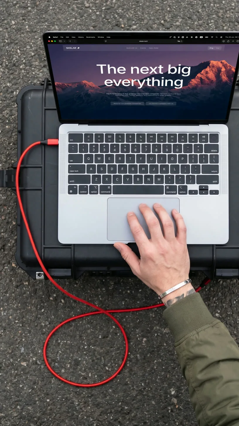
Our impact
A content library that eliminated guesswork — every team knows what category to reach for, what rules apply, and why
AI Ready design system. Atomic layouts, strict grid discipline, ready for agent-driven deployment at team scale
SKELAR got a face. Textured, unmistakably itself. Bold red, tech interface aesthetics, office-core vibes, and real SKELAR people
Stakeholders now take pride in the brand. The community noticed too — SKELAR looks like it's playing at a new level, because now it does
Credits
- Thank you SKELAR
- Vlad Ivchenko — COO at SKELAR
- Kyrylo Bondarev — Chief Vision Officer
- Max Okhrimenko — Investment Associate
- Iryna Franchuk — Head of Communications at SKELAR
- Andriiana Yartym — Content Manager at SKELAR
- Designers: Maksym Kurka, Denys Hurzhi, Olha Steblianka, Vlada Orel, Ihor Babariko
- Mykyta Pluzhko, Olena Nikulina — Art direction, Design
- Kateryna Titova — UI/UX Designer
- Kateryna Alatorceva — Frontend developer
More projects