Liven App
Rebranding the well-being app trusted by 5M+
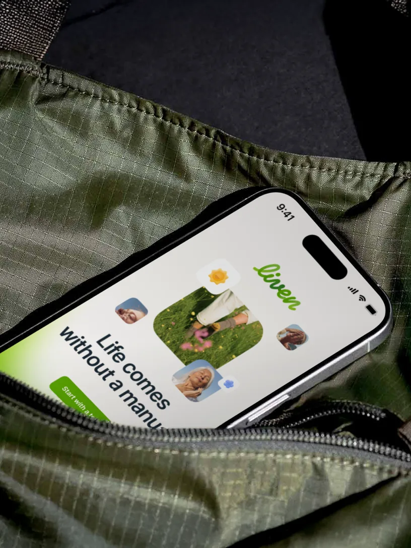
Life comes without a manual. Liven is an ecosystem that helps people gain self-observability and steer away from negative patterns on personal journey. Every single day, many people open Liven — each bringing their own story, mood, and need for support
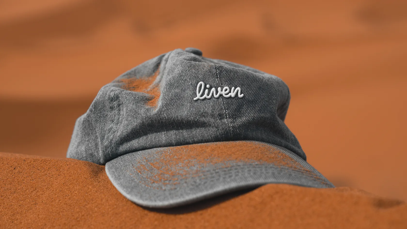
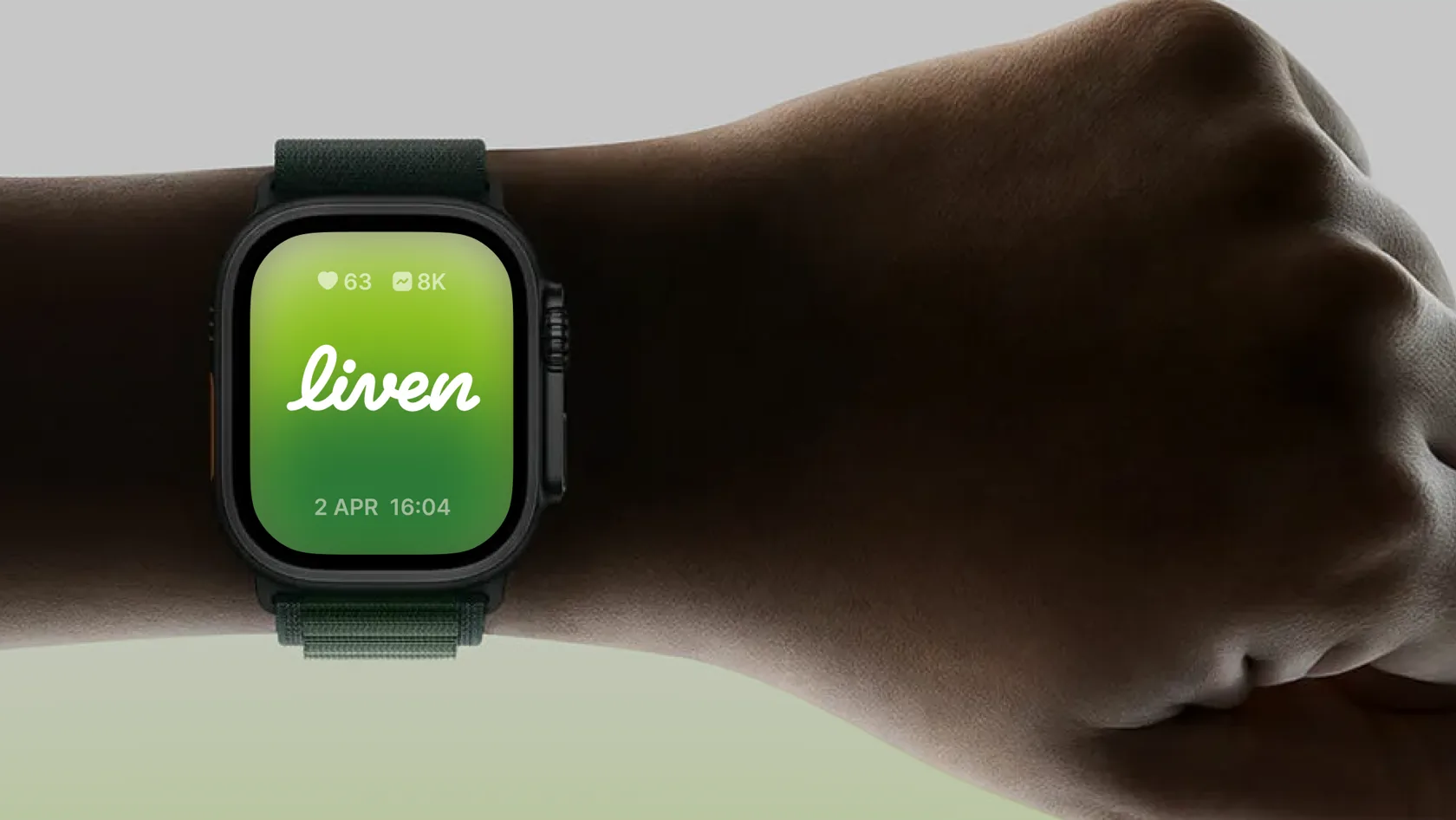
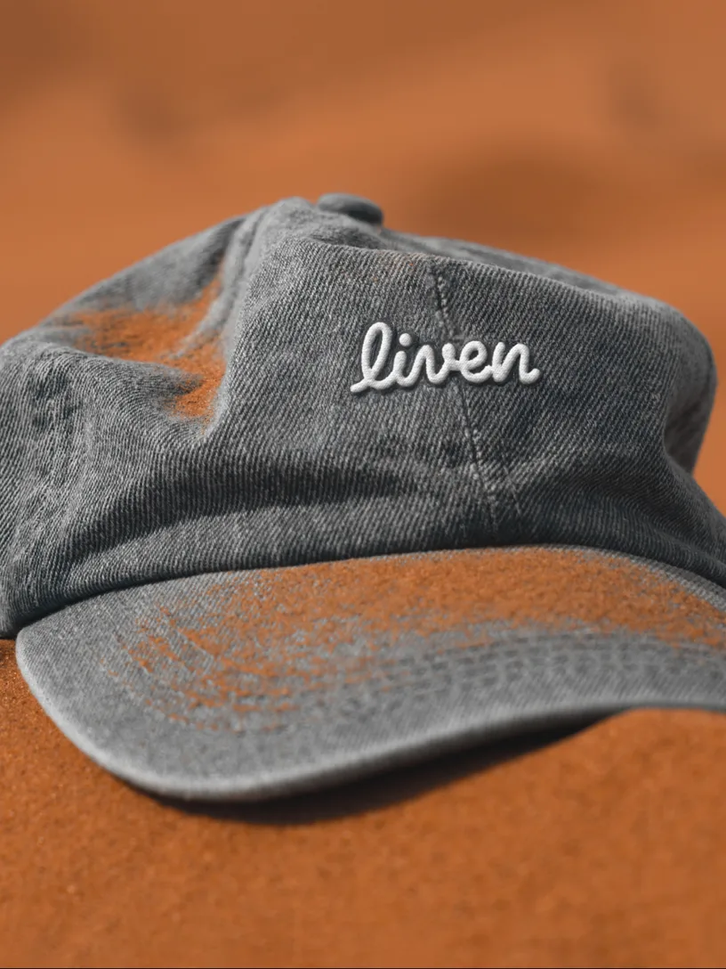
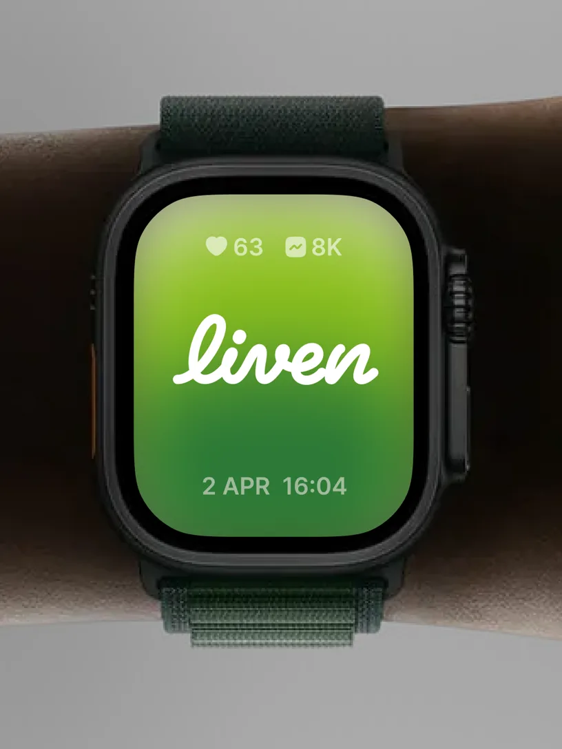
Handwritten Logo
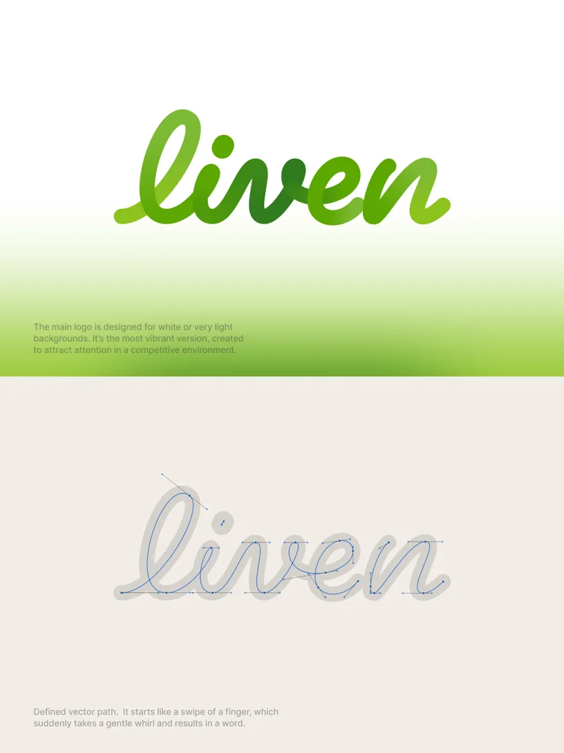
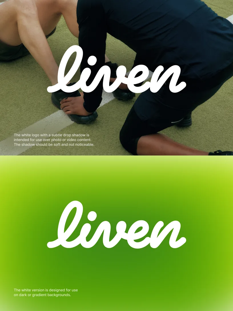
Liven’s name is handwritten, not typed. It’s inviting customers to slow down and take time for themselves. It starts like a swipe of a finger, which suddenly takes a gentle whirl and results in a word. Its inner glow is green, electric, enlivening like the summer sun in the woods by the lake. The new logo animation represents the flow of life, which ebbs and flows, and whirls to produce something beautiful
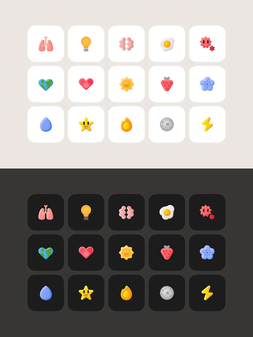
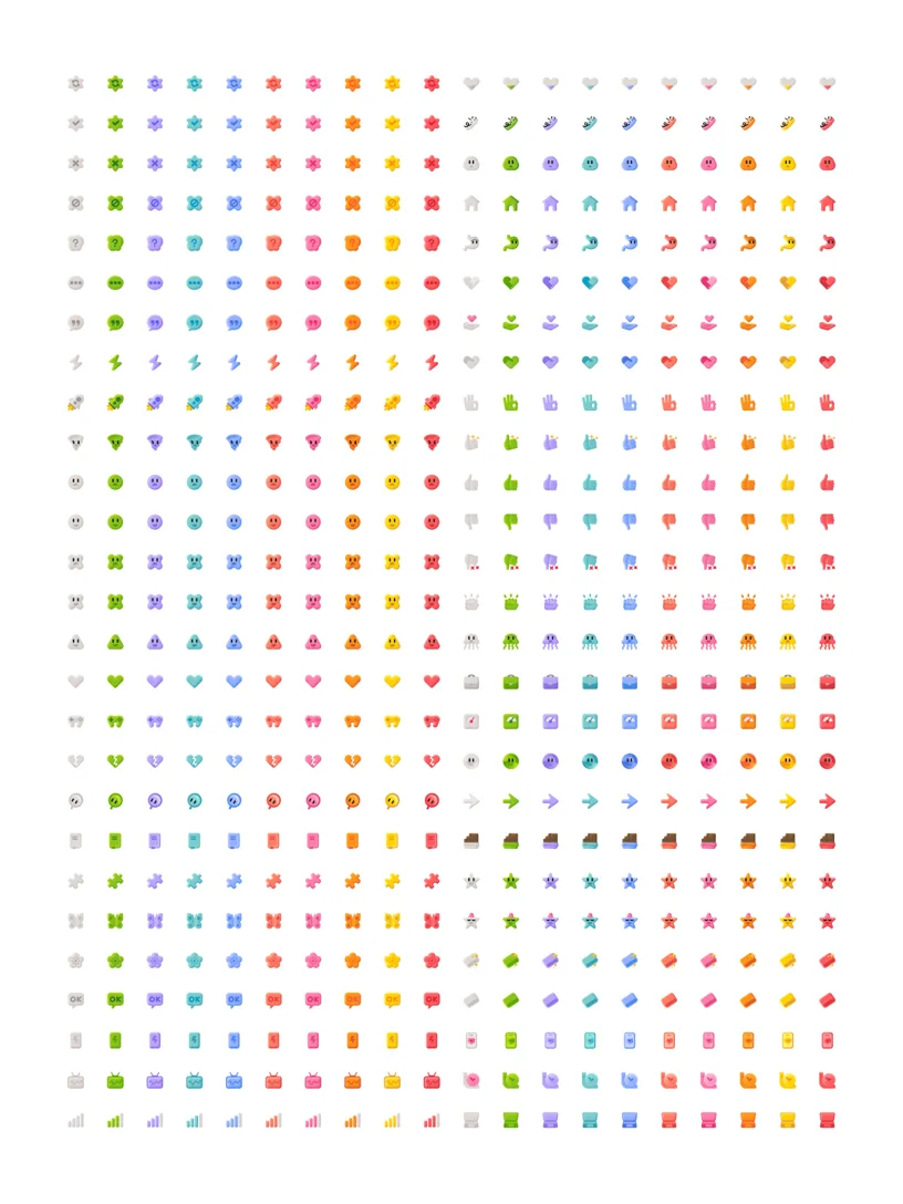
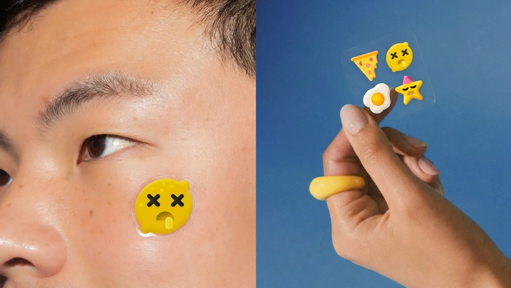
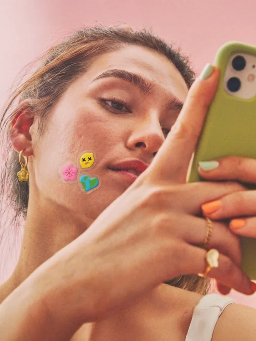
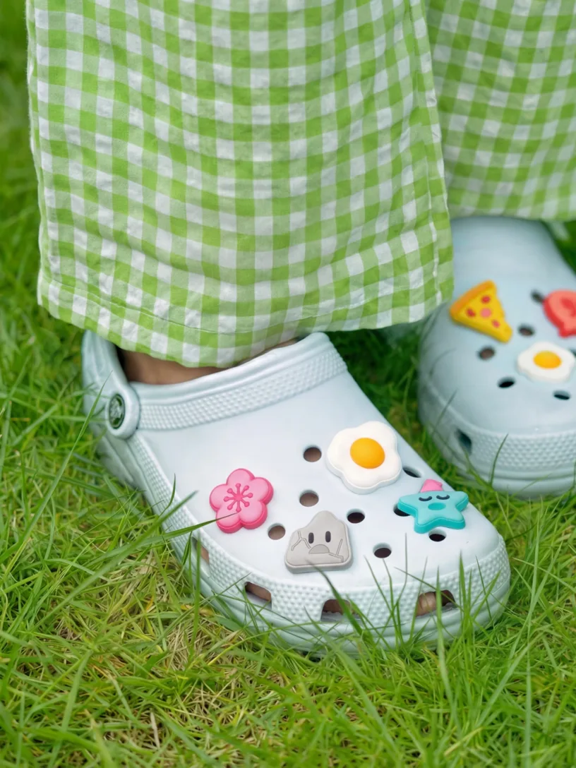
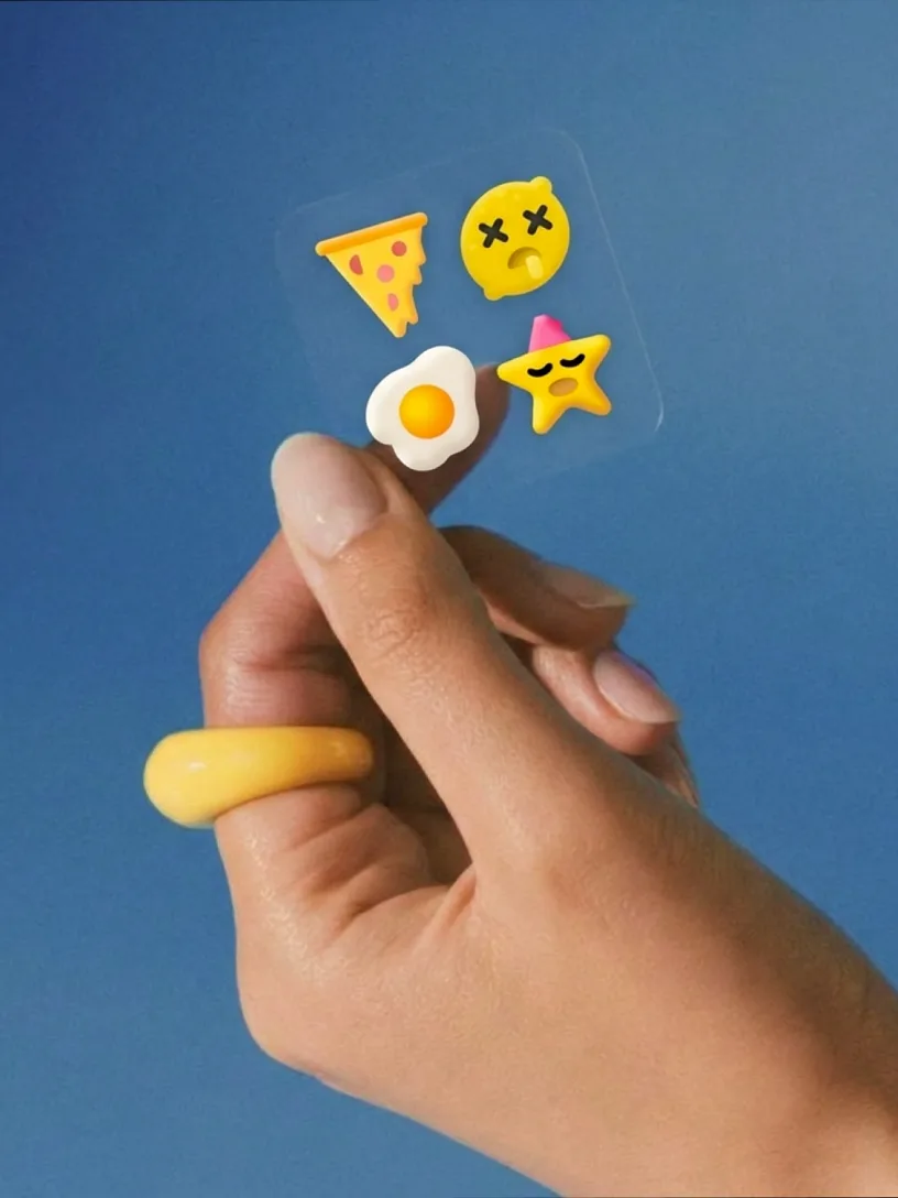
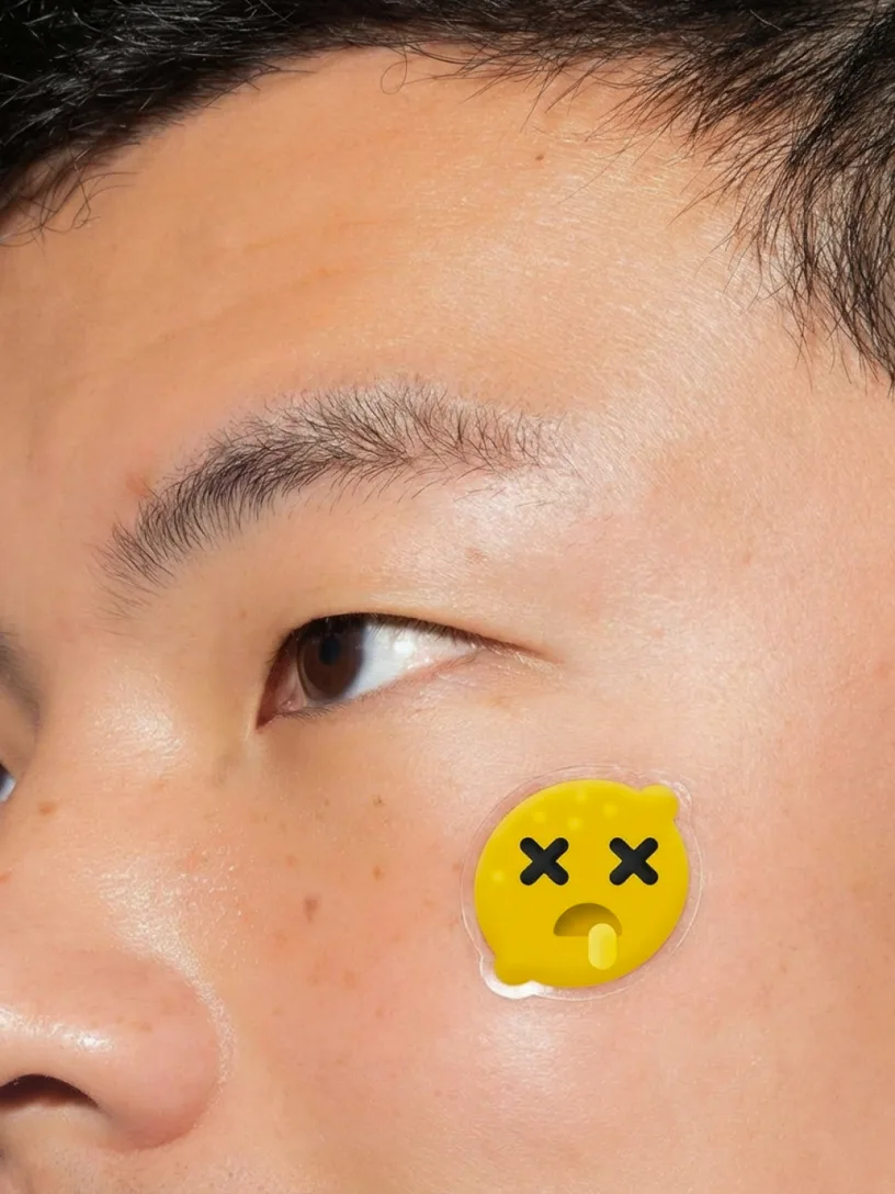
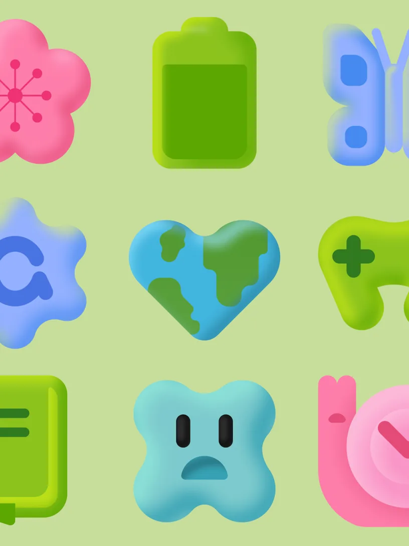
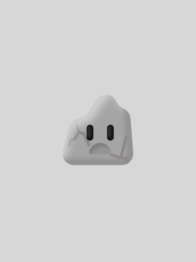
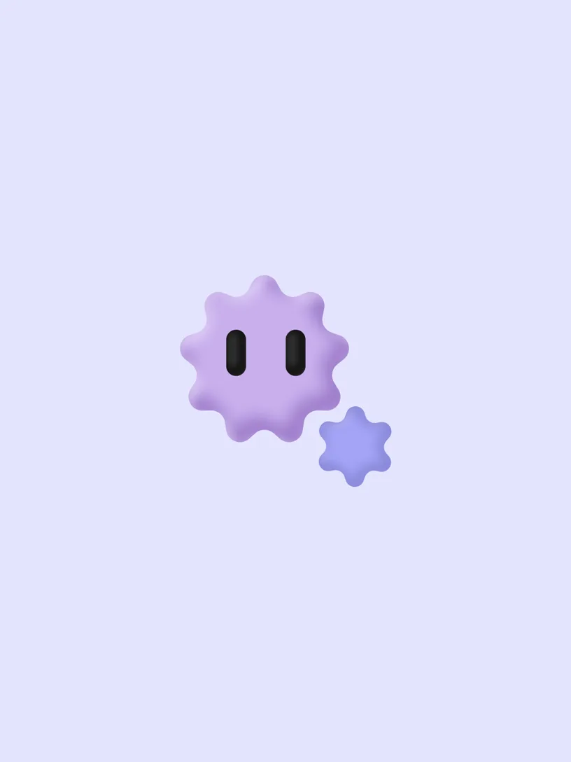
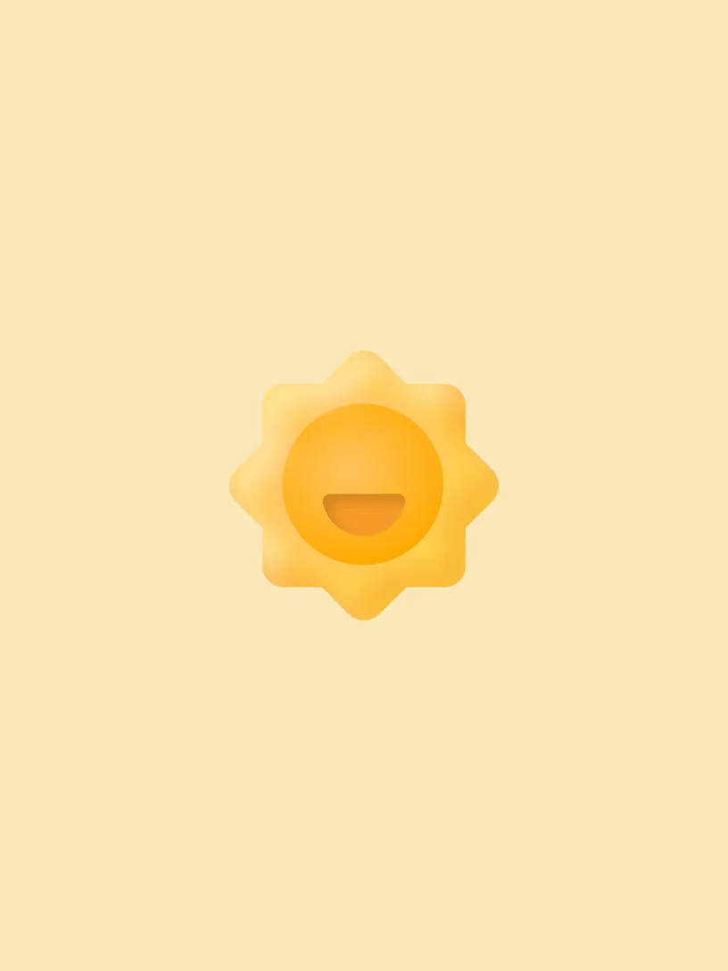
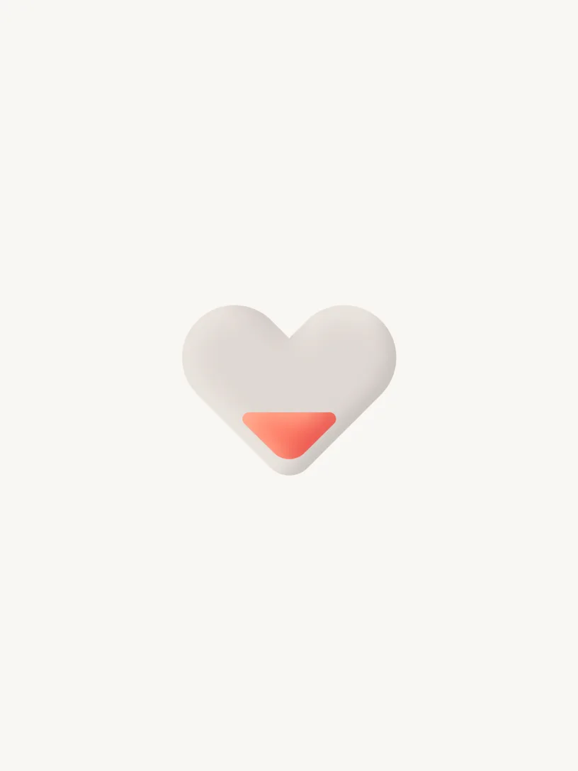
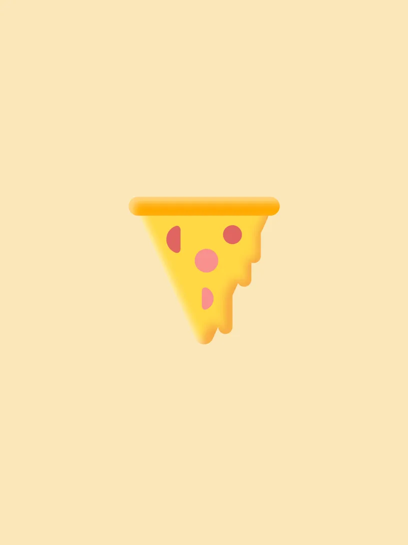
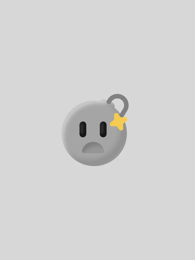
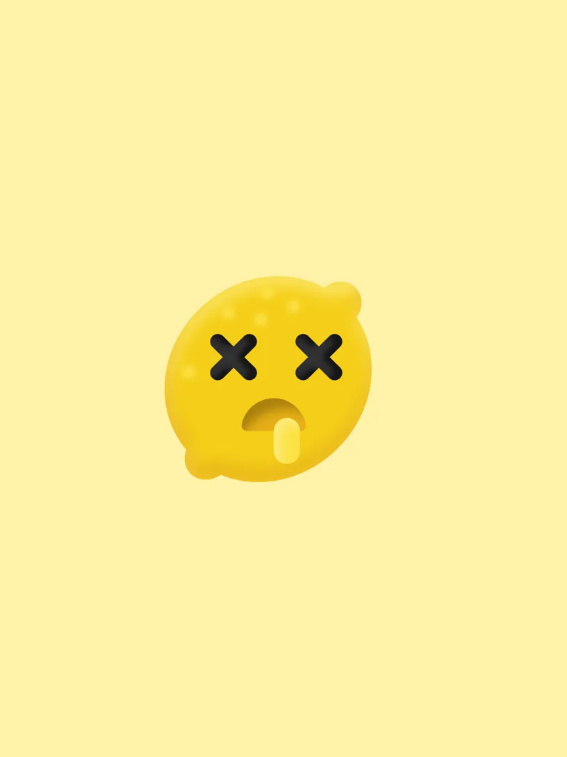
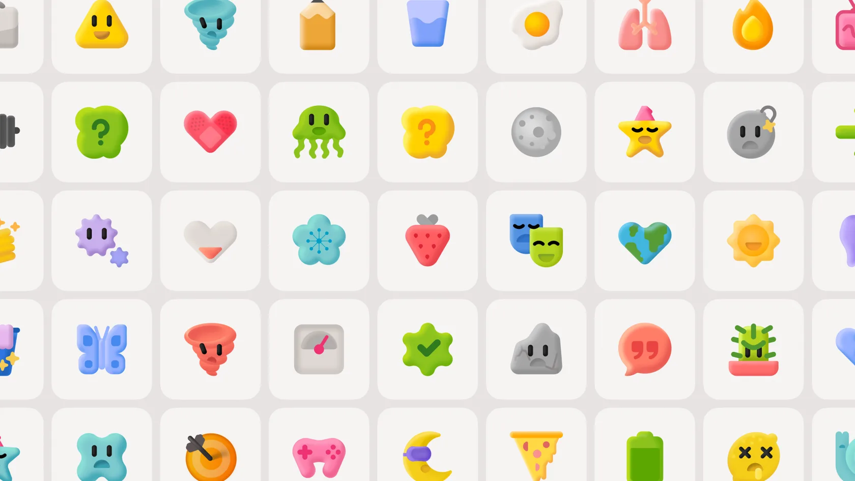
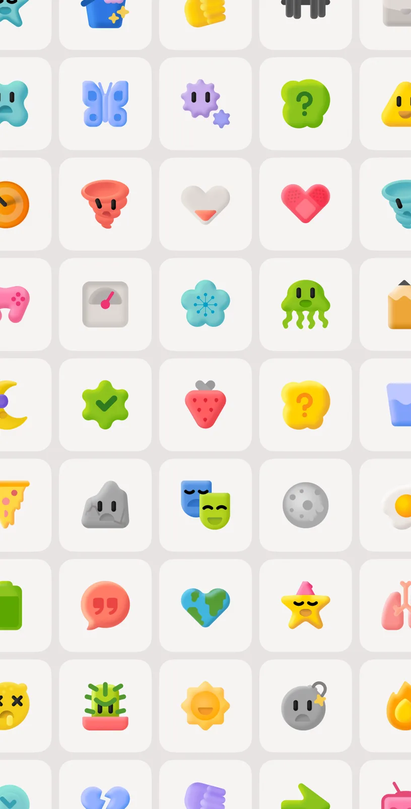
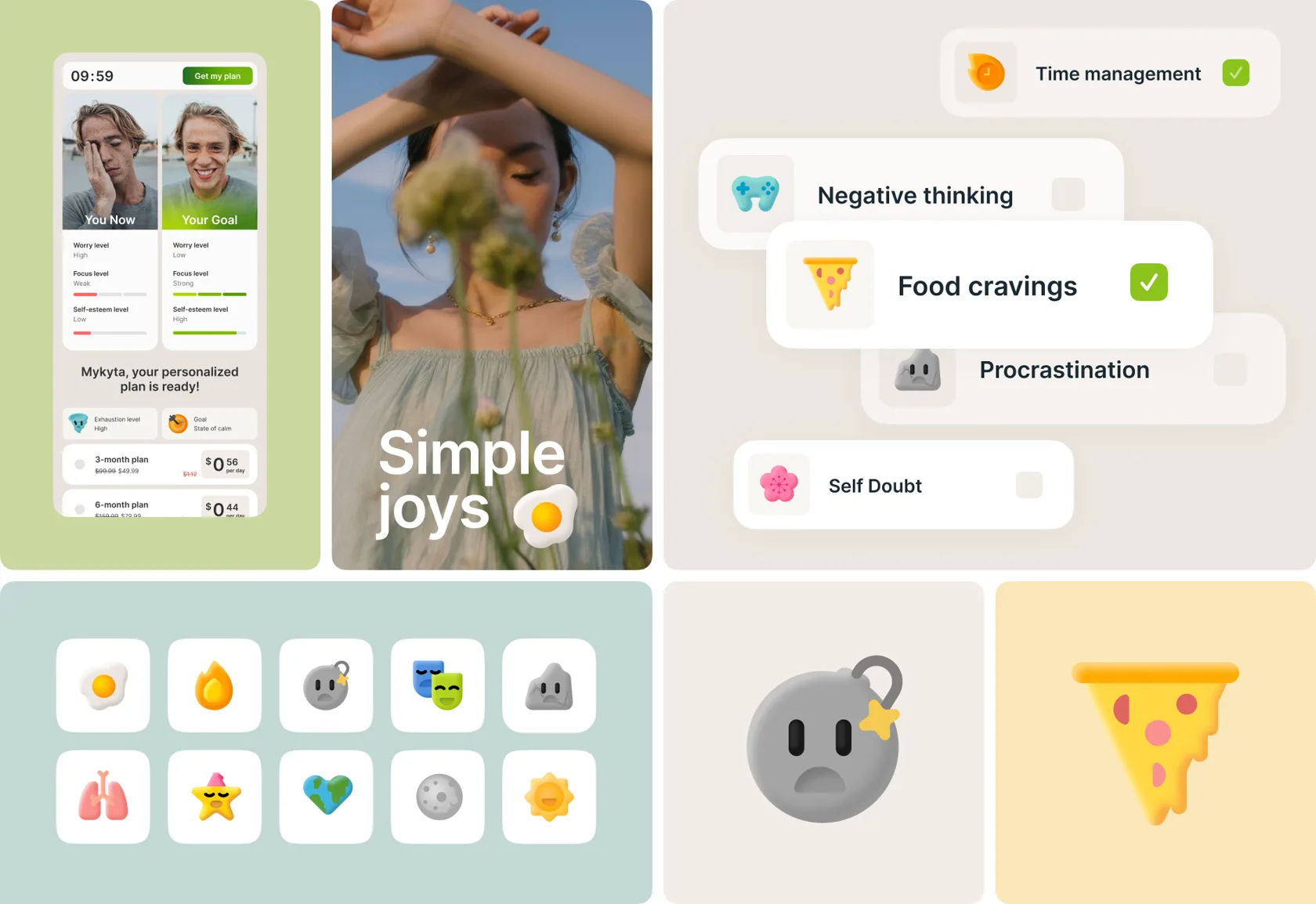
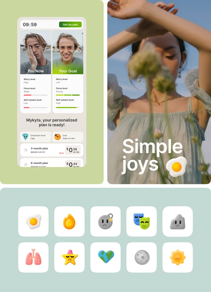
400+ Powerpuff emojis
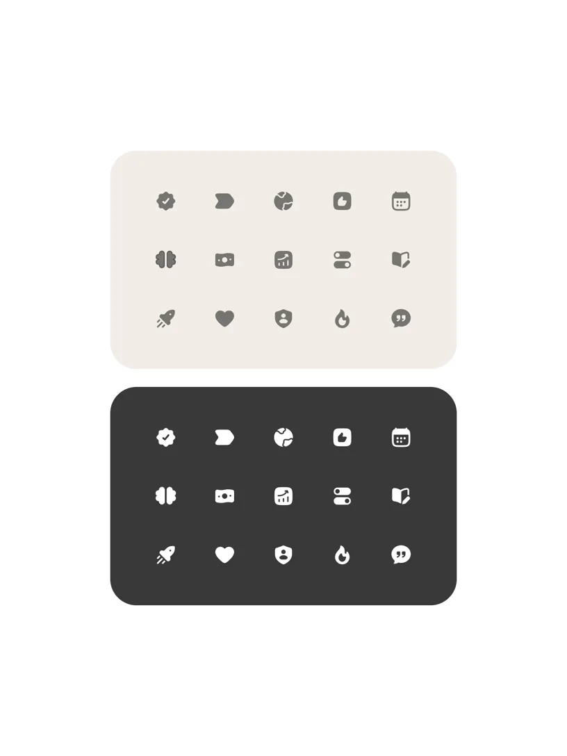
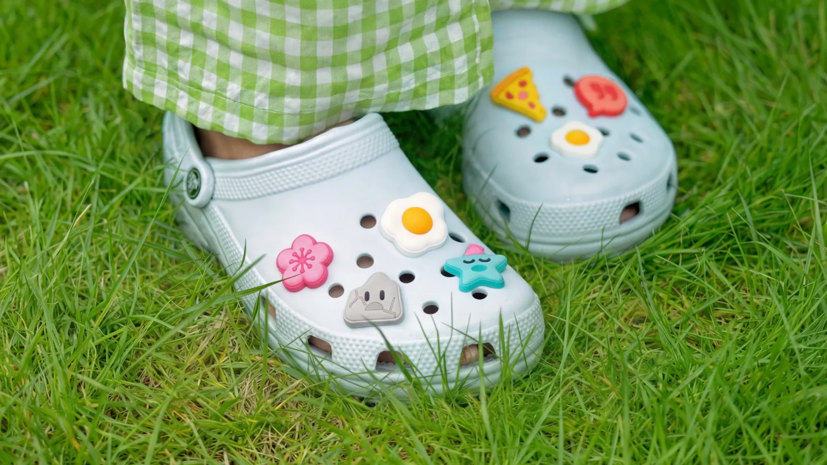
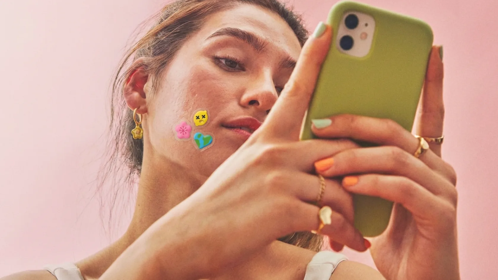
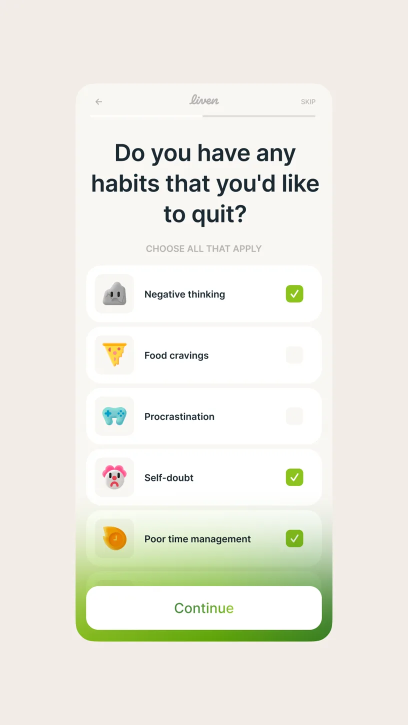
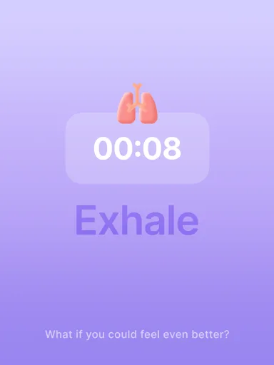
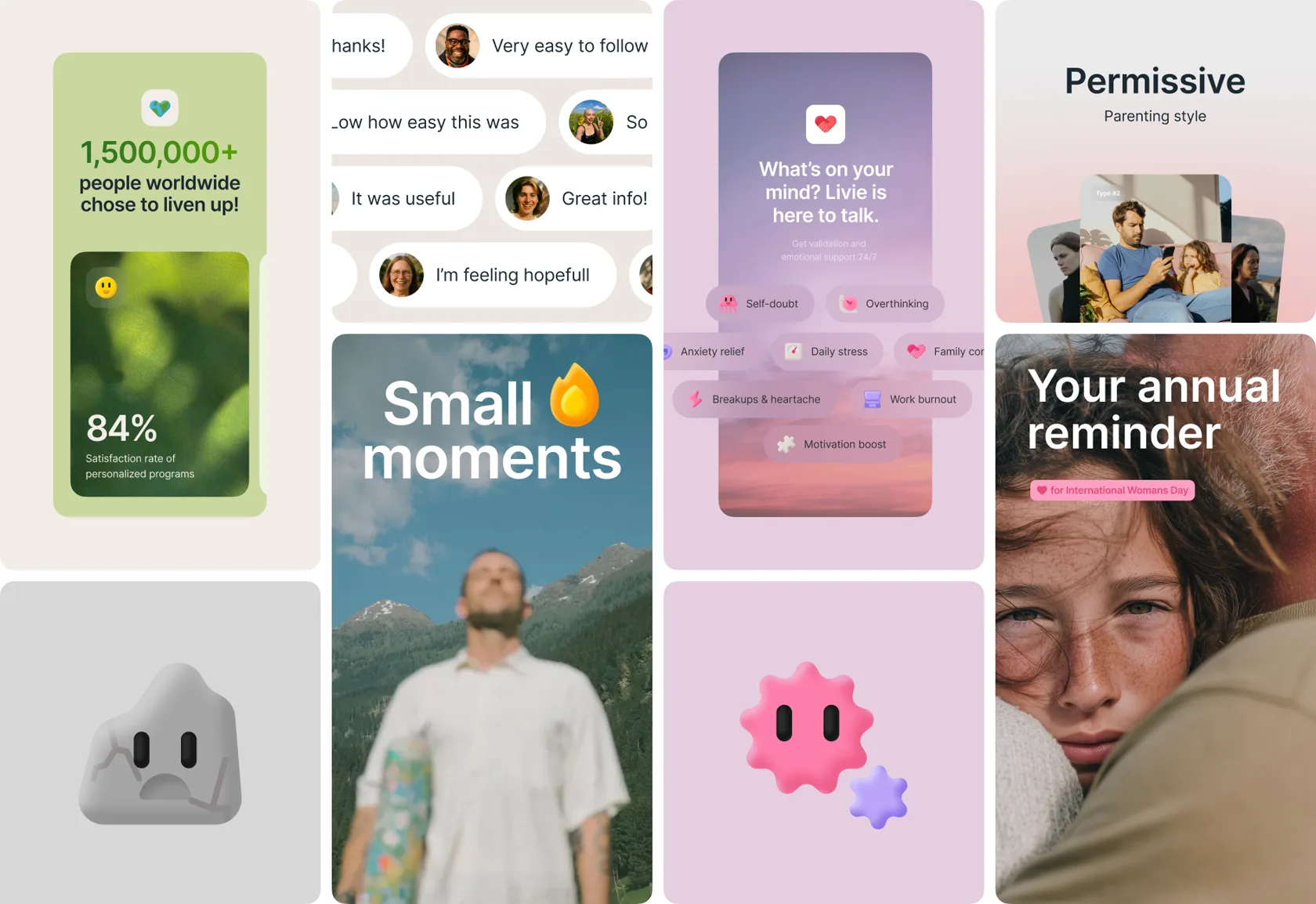
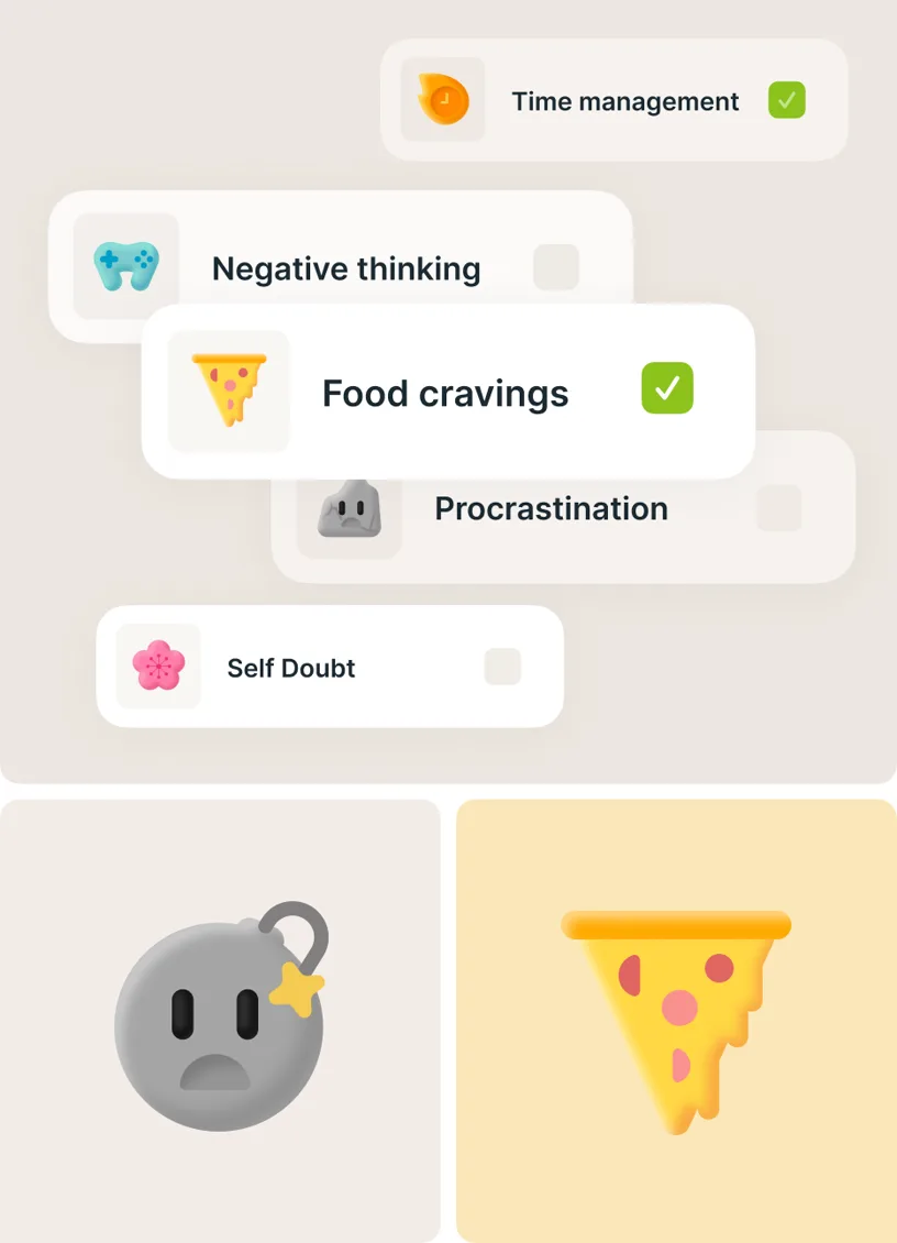
We use cute, colourful objects. We don’t do art-house snobbery — this is the space where we can intentionally work with “simple” images to stay clear and relatable. When illustrating problems, we focus on the positive side. For example, we show healthy lungs instead of a cigarette. Soft volume, naïve and simple geometry. Colours that look good in both light and dark settings


Ui Style Orderly System
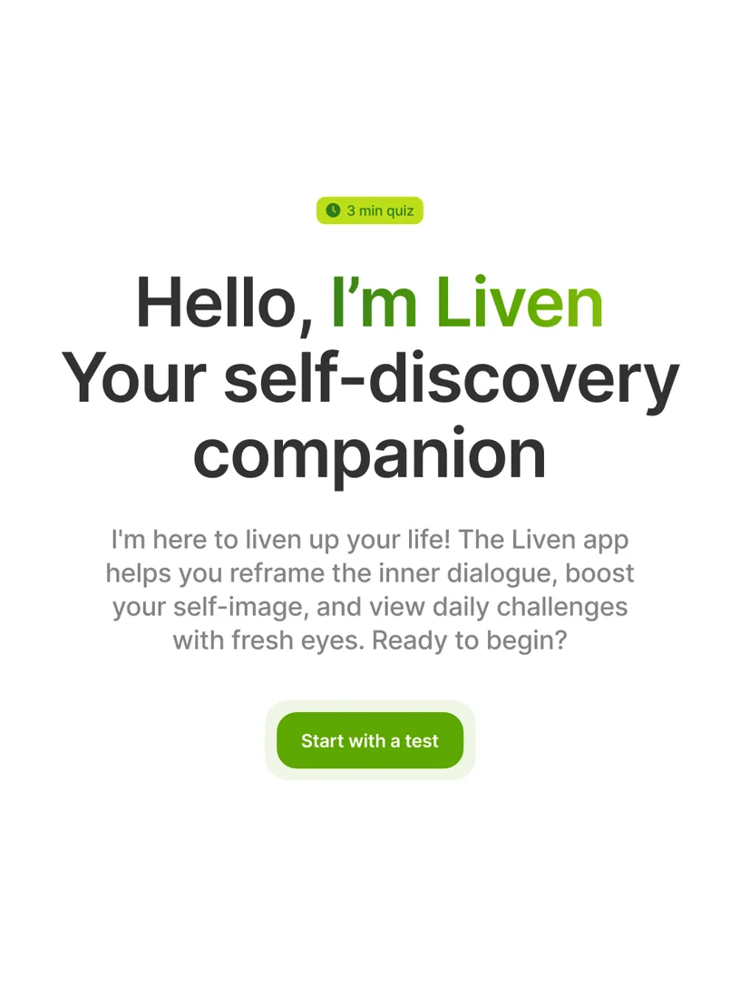
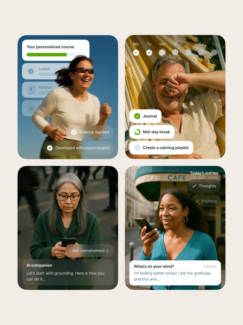
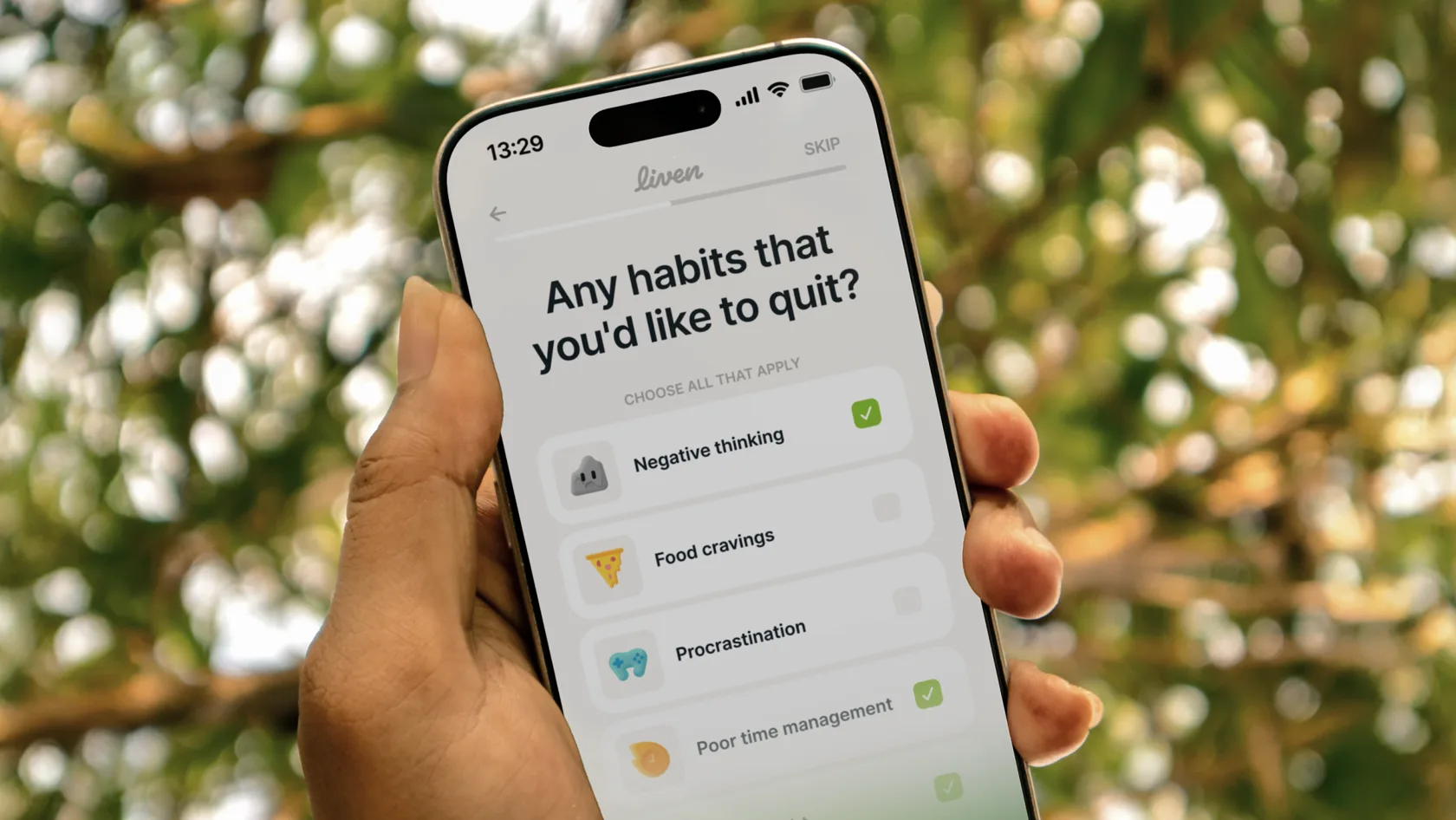
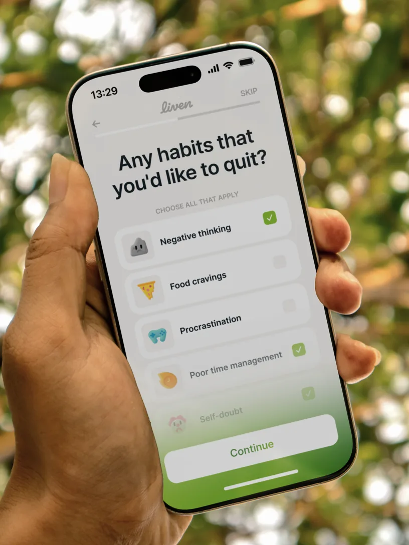
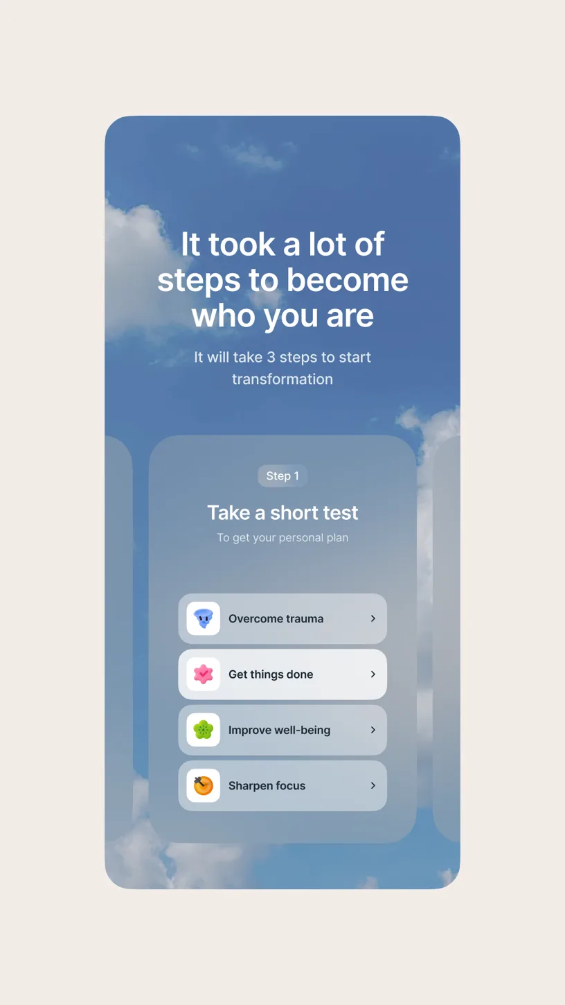
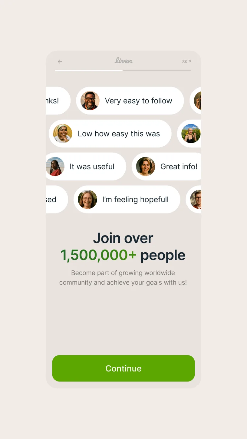
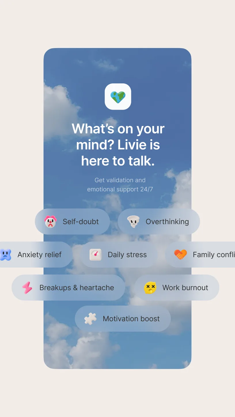
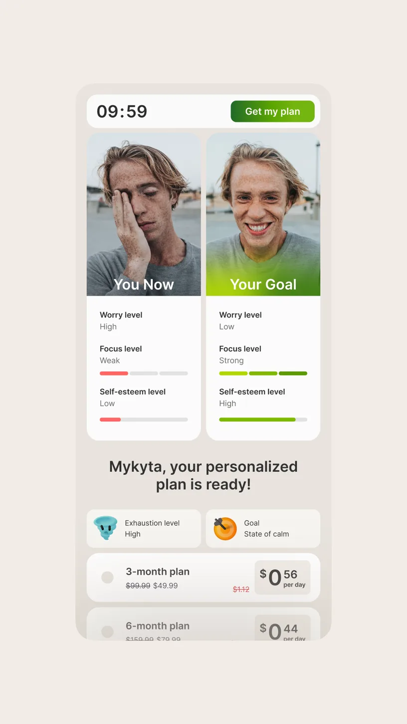
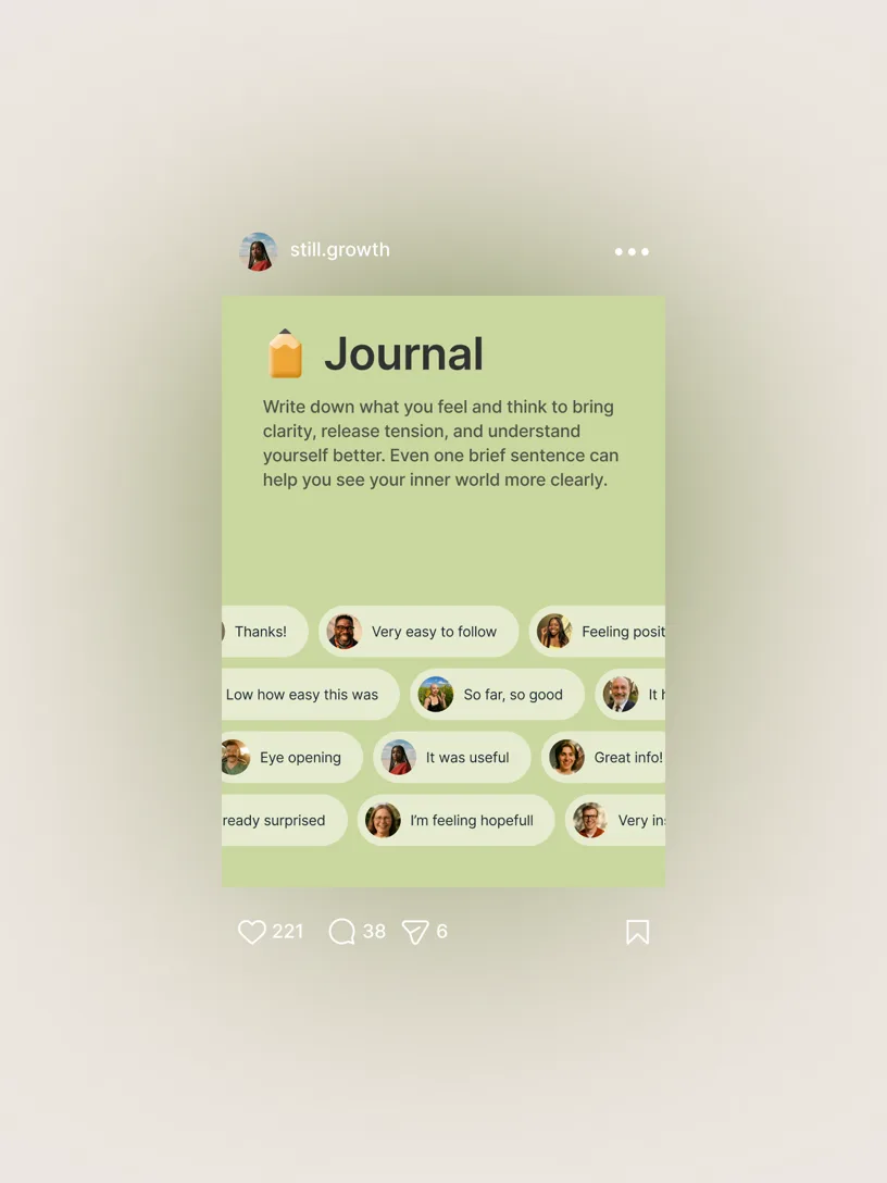
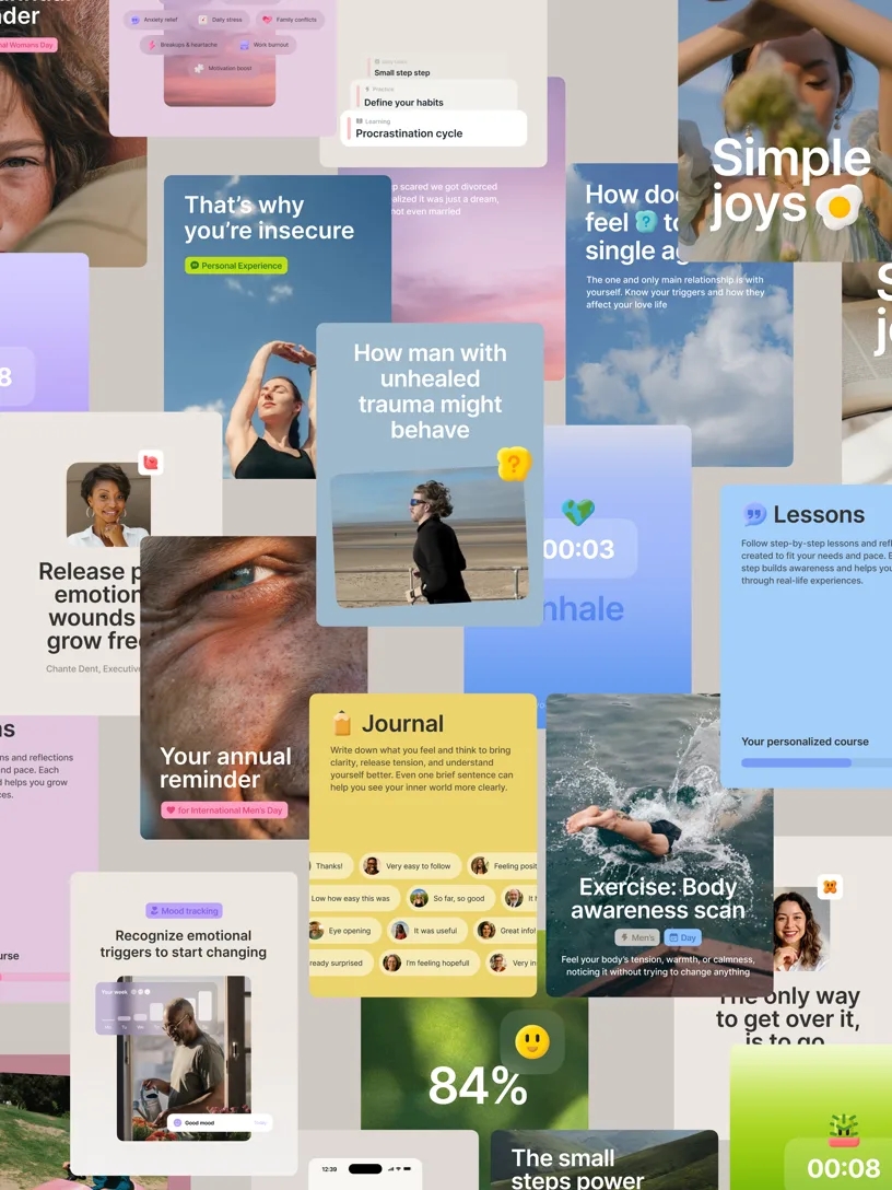
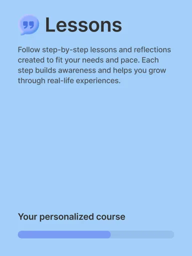
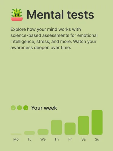
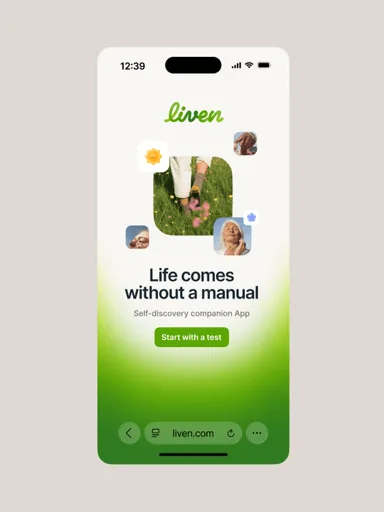
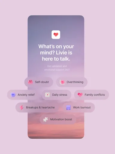
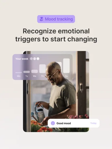
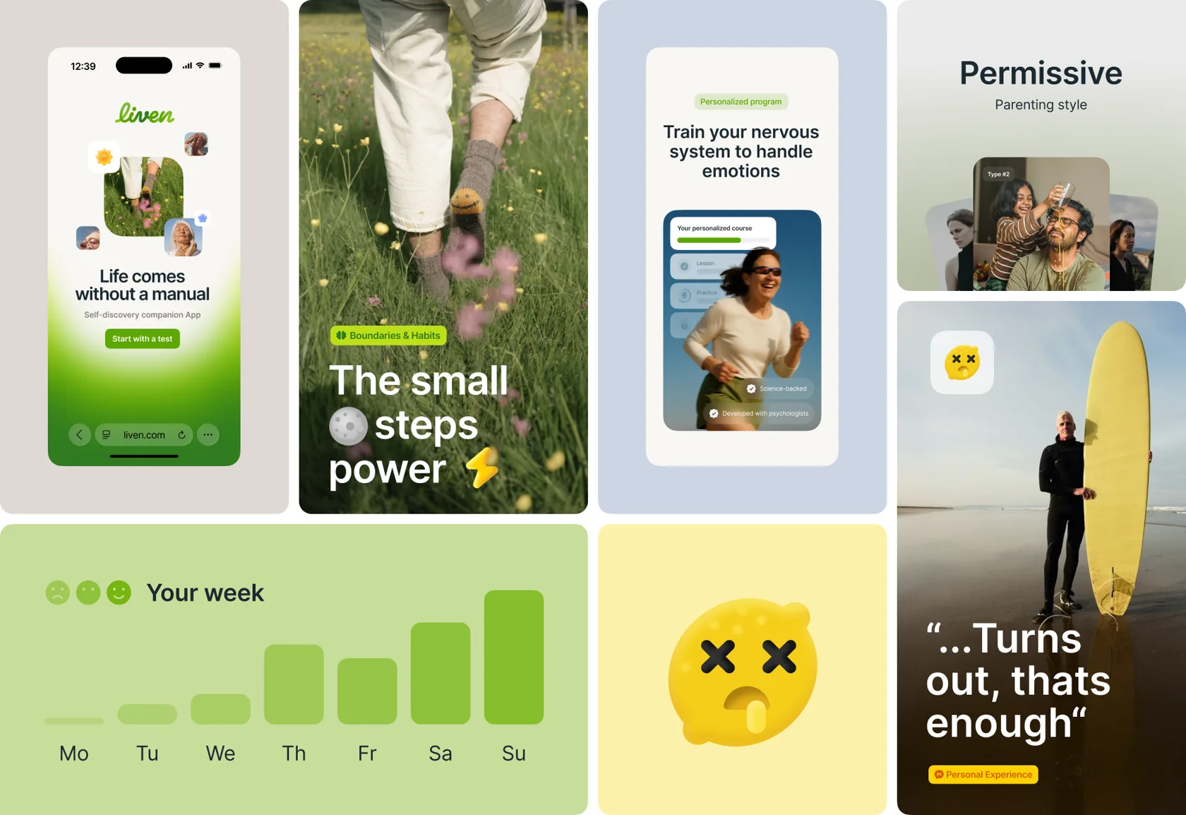
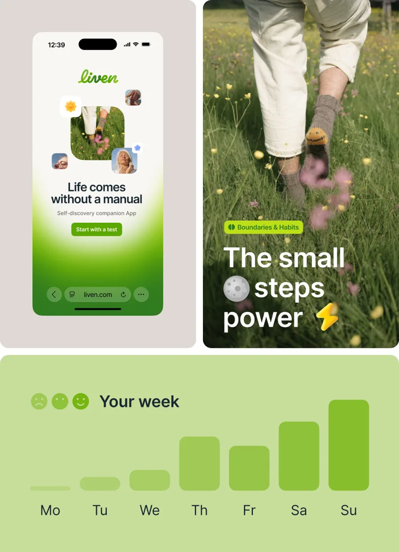
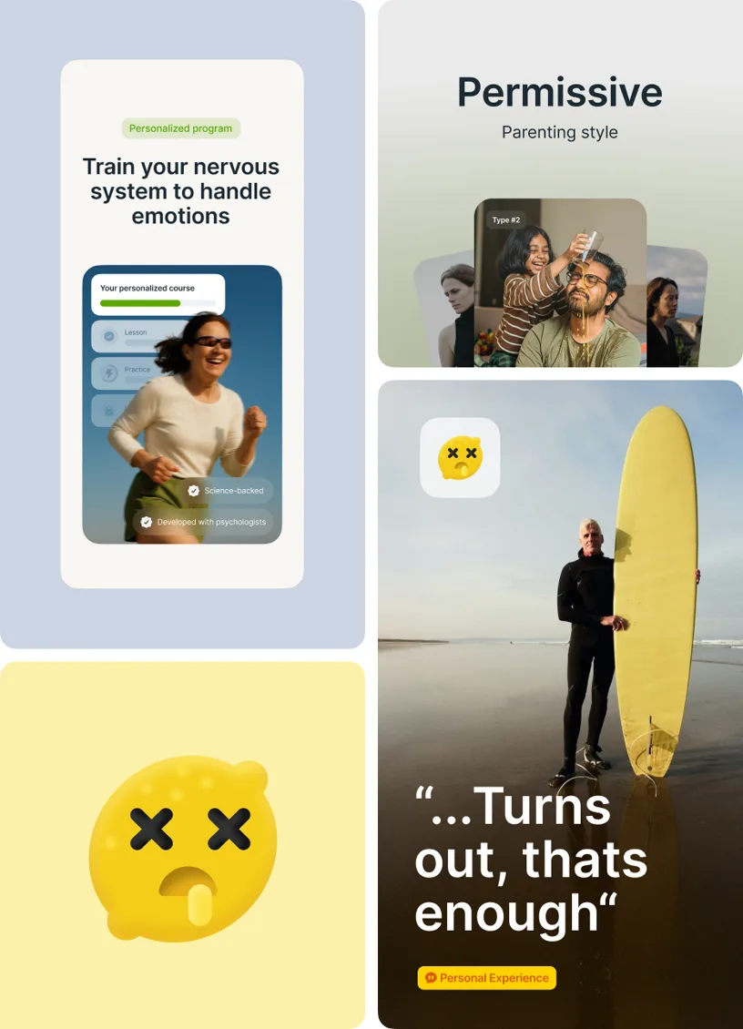
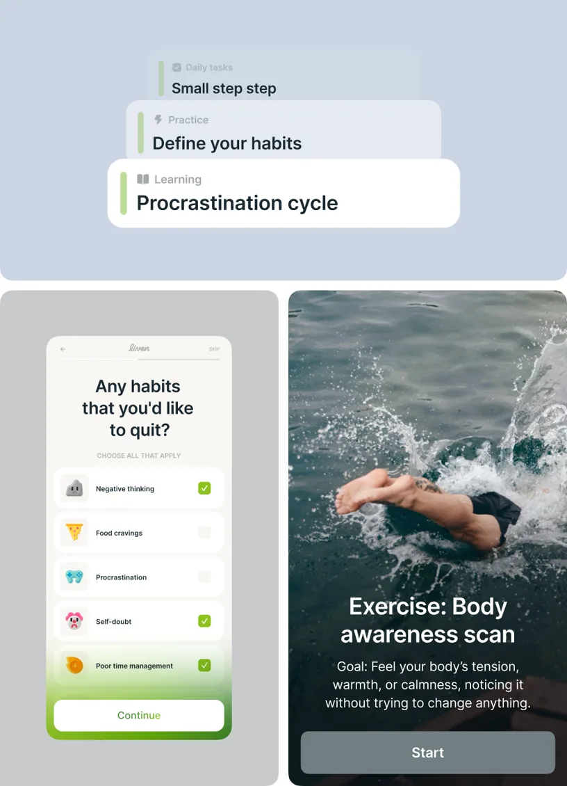
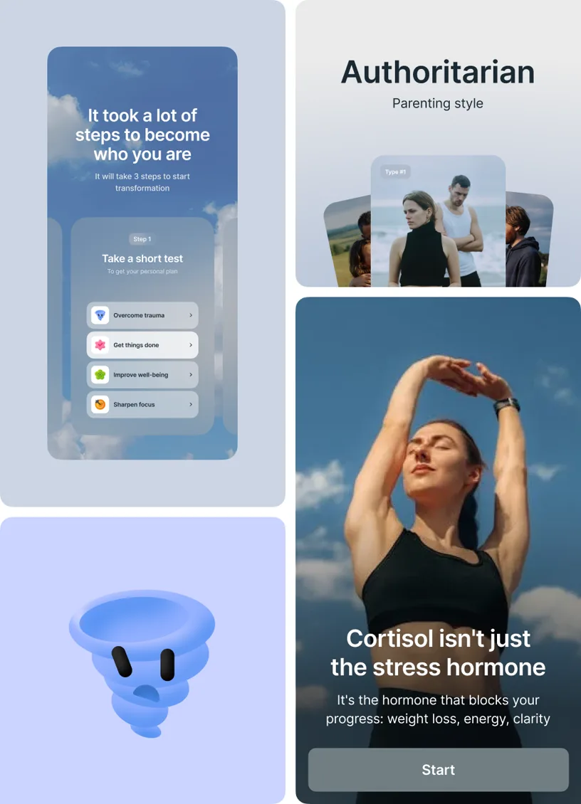
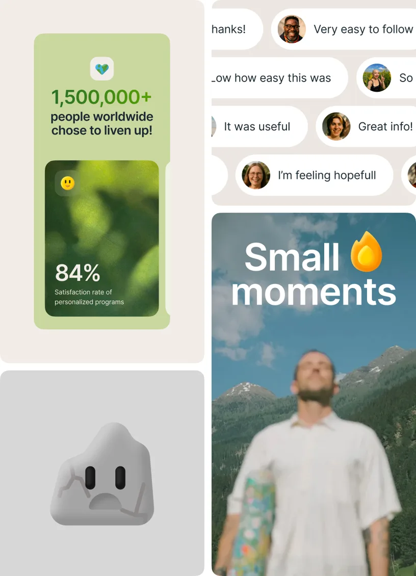
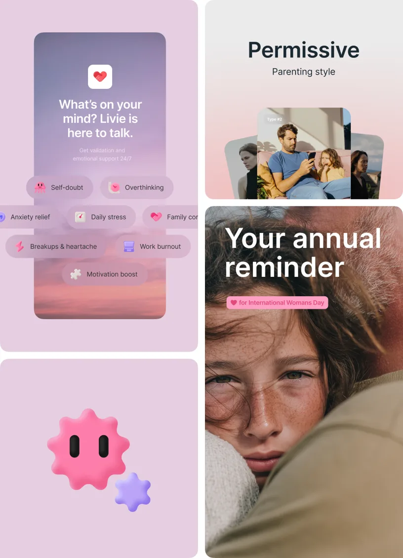
The interface feels calm and open. Built on friendliness and ease, we use generous white space and a clear structure to avoid a feeling of overwhelm. A warm summer green accent guides the user’s eye in a natural way. Modular blocks and reusable elements keep the system flexible and consistent across platforms. Recognisable quirks like powerpuff emojis and slice-of-life photography add vibrant moments of joy and invite users into the journey of self-discovery
SMM as Lifestyle Media
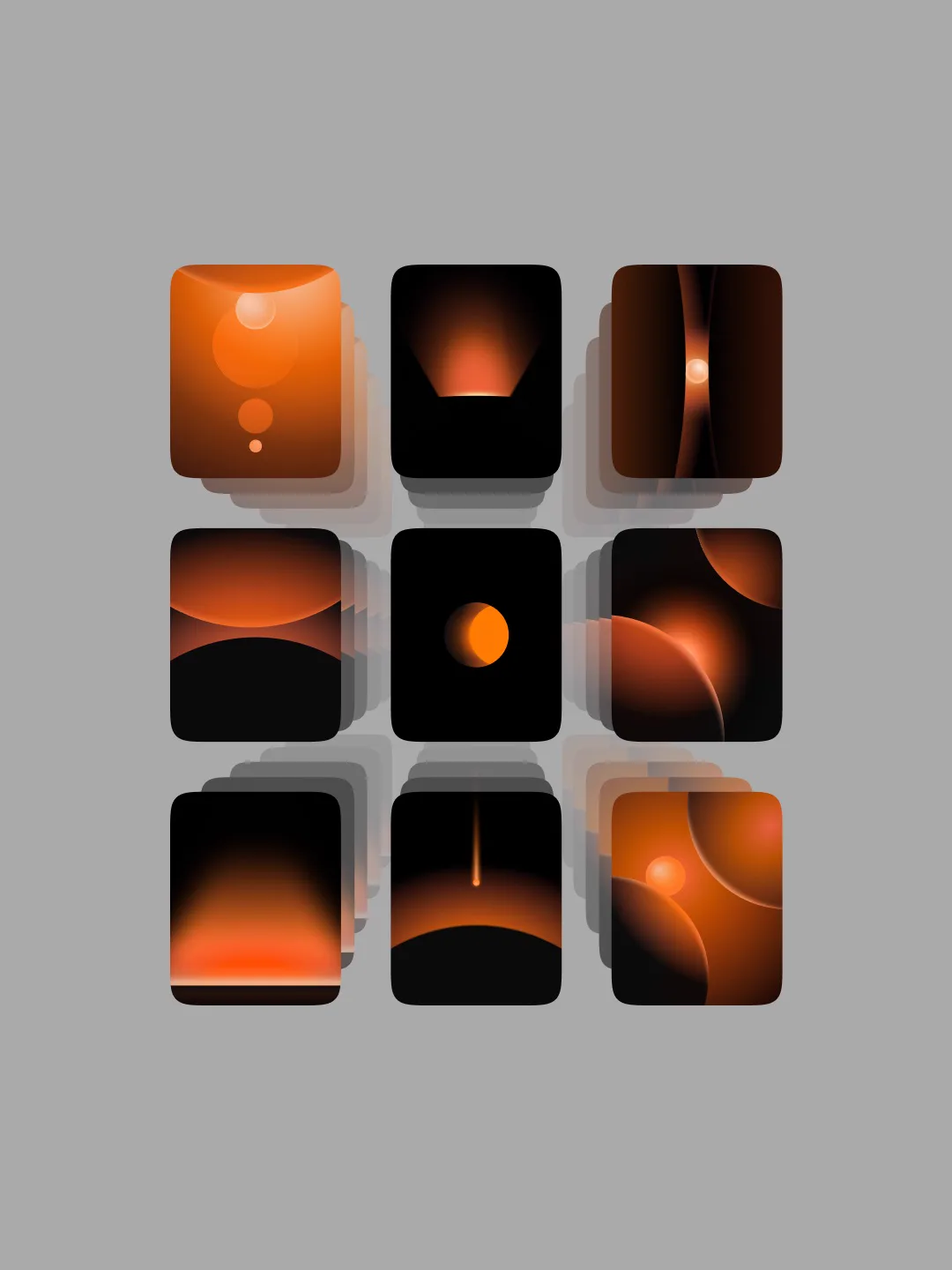
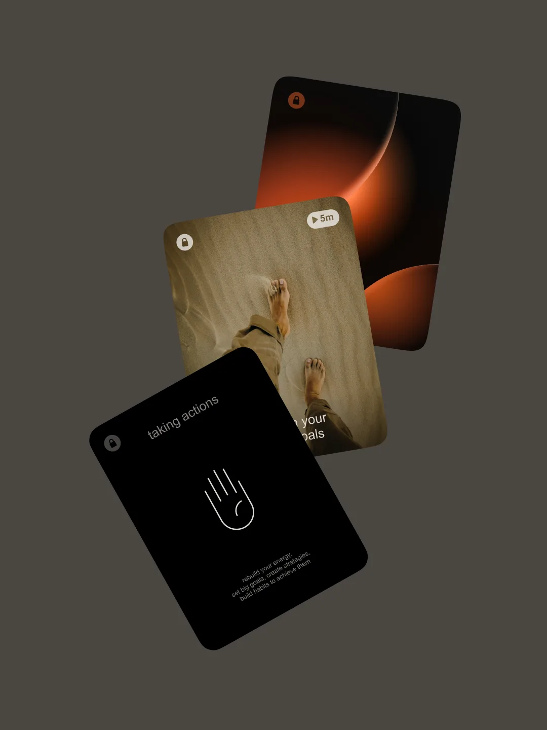
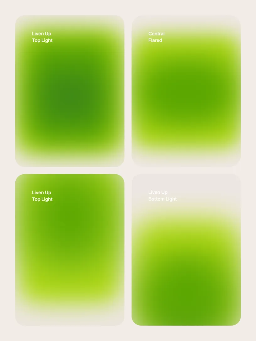
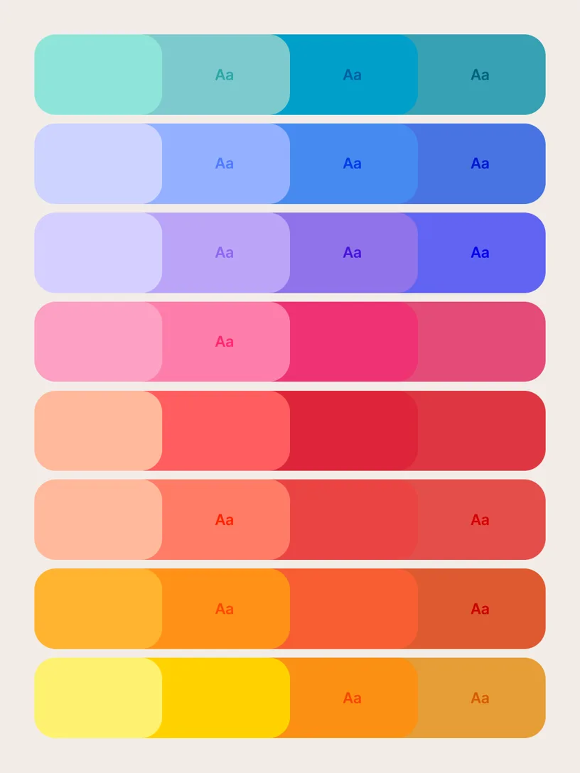
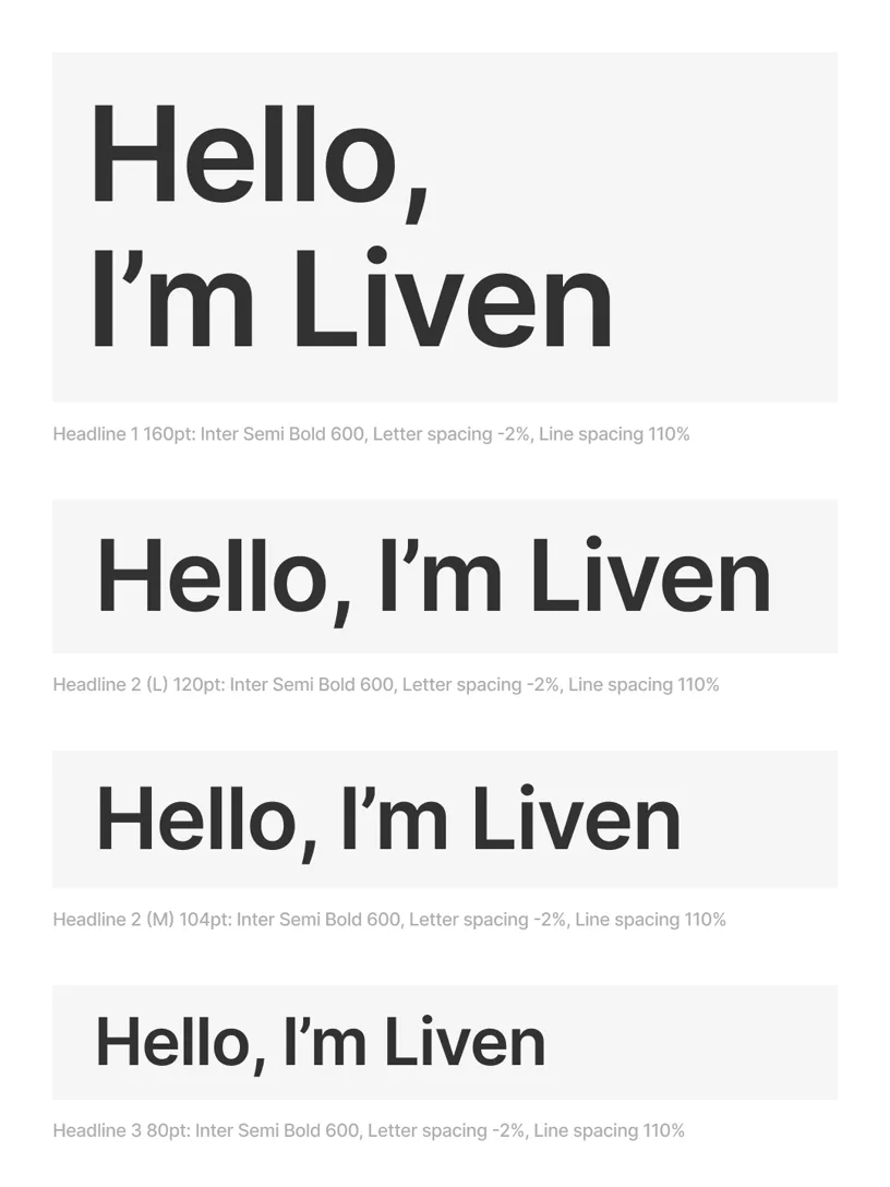
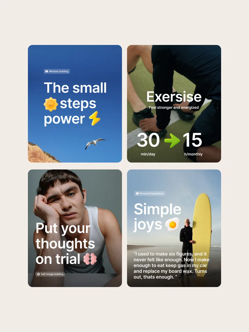
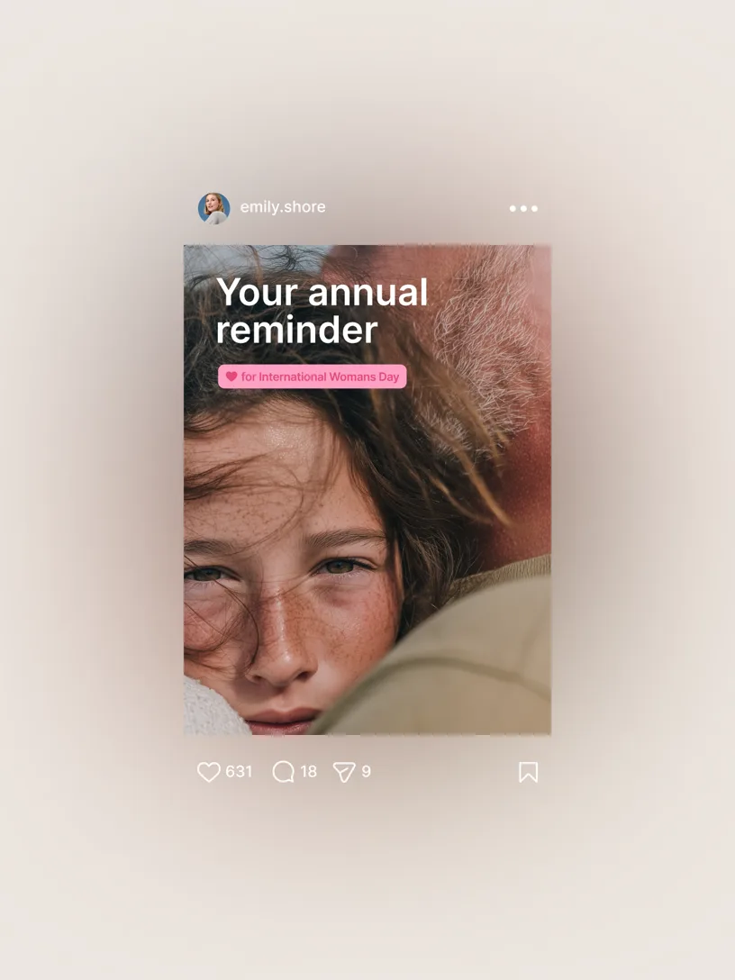
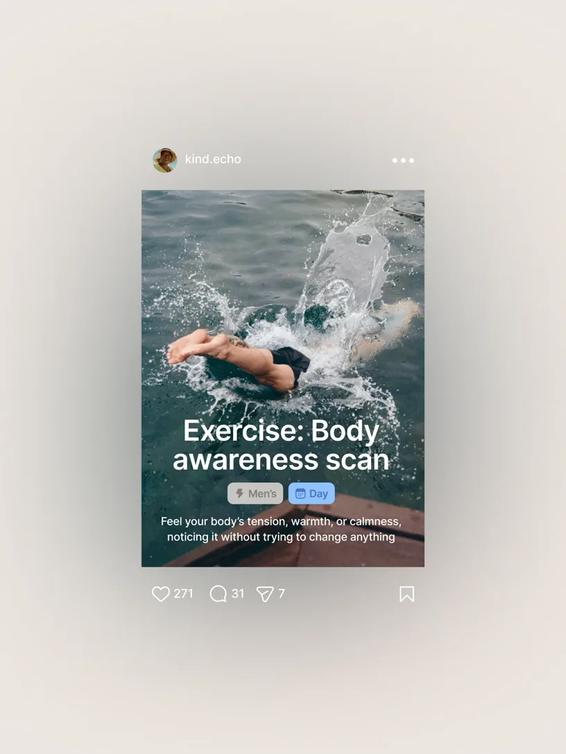
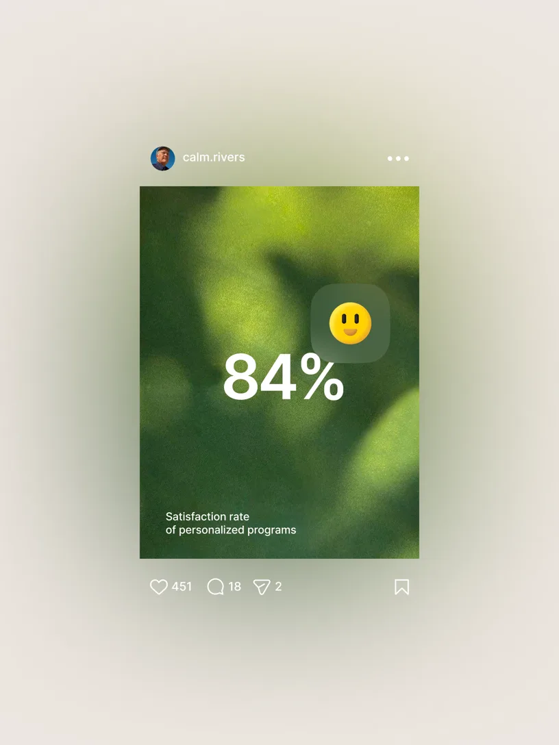
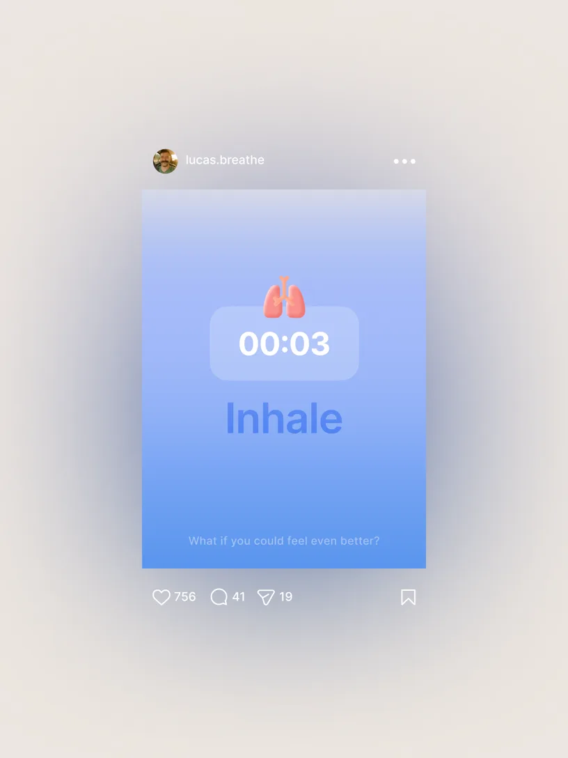
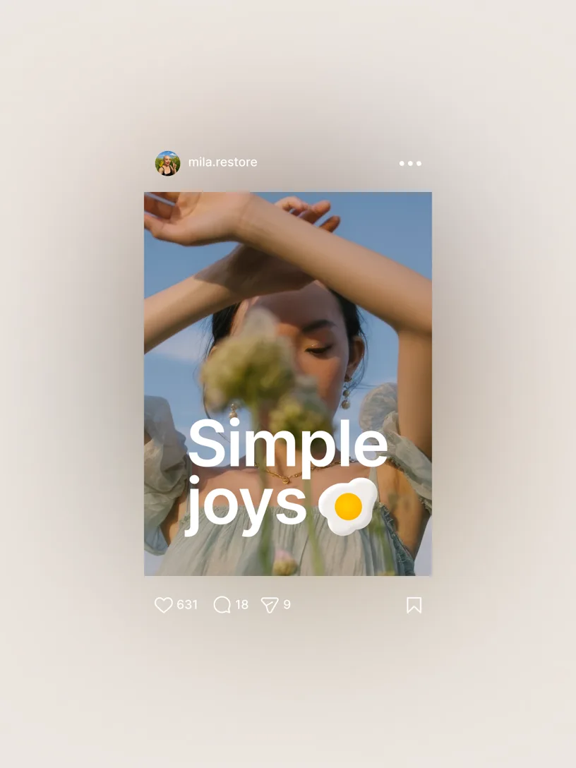
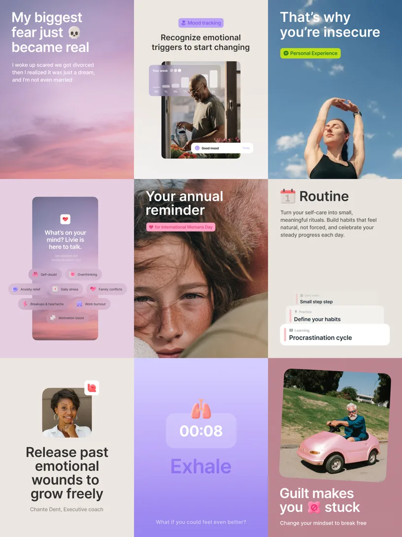
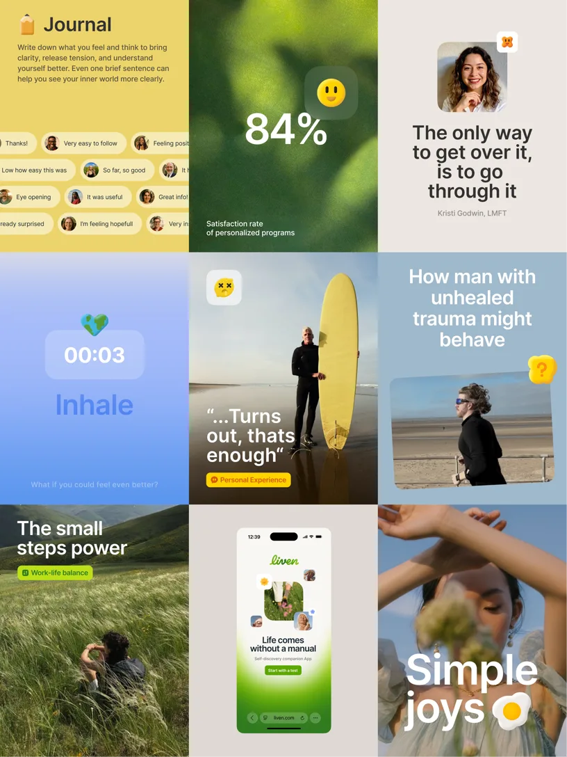
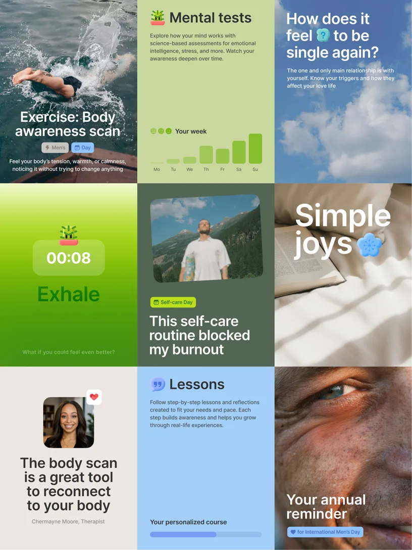
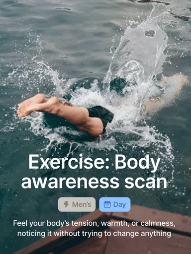
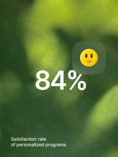
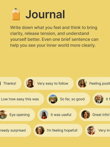
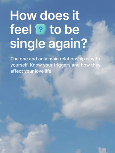
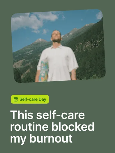
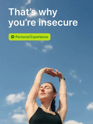
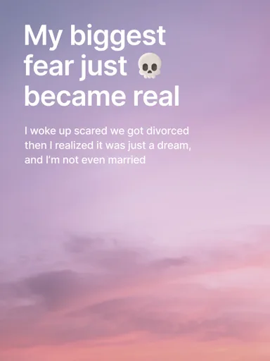
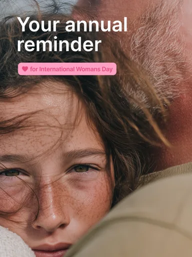
Liven’s SMM design expands our palette beyond green, using vibrant gradients to reflect the diverse moods of daily life. The typography is bold and clear, delivering insights with a friendly, modern touch. Through dynamic framing and a rich color system, we celebrate the energy of being present, showing that self-discovery is about noticing small joys and embracing every vibrant moment
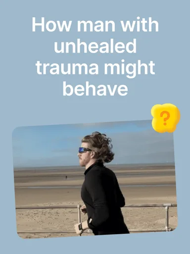
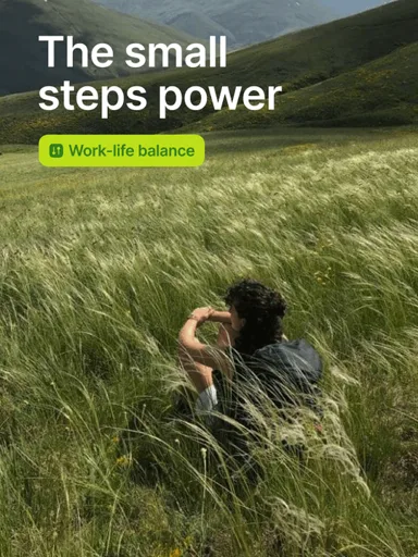
Slice-of-Life Photography
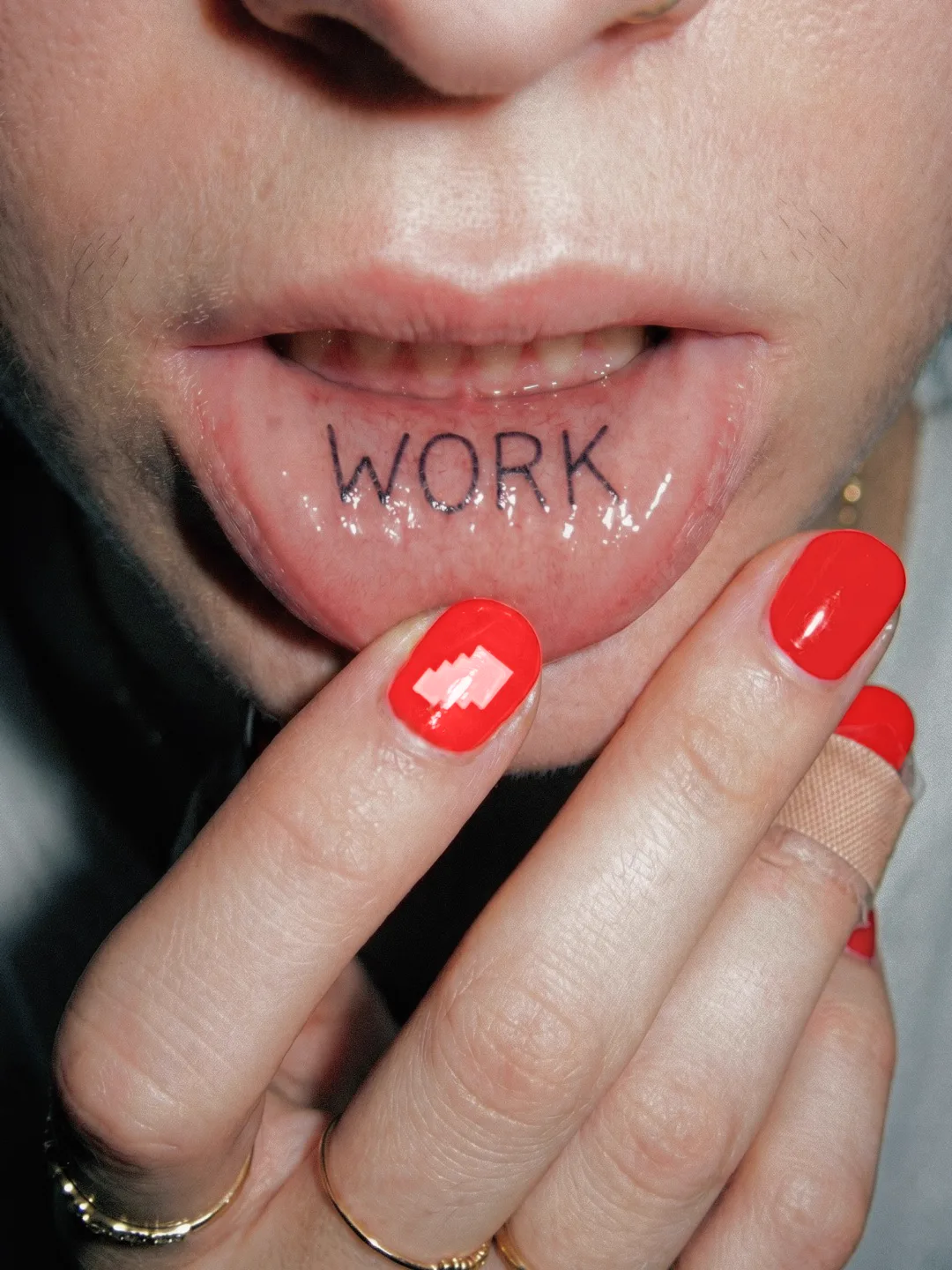
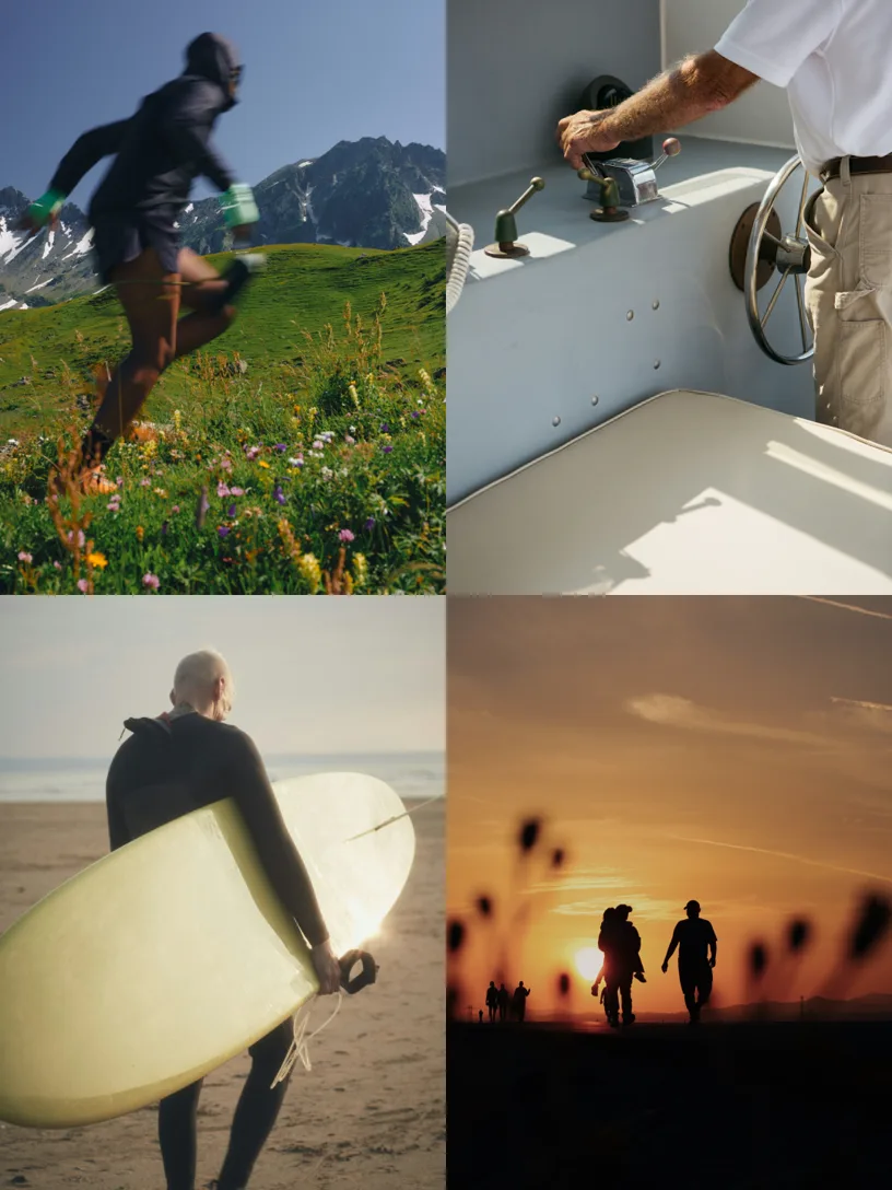
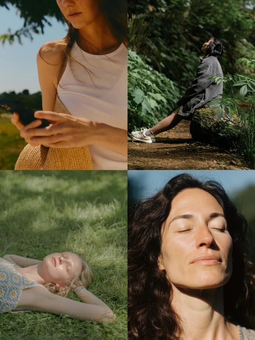
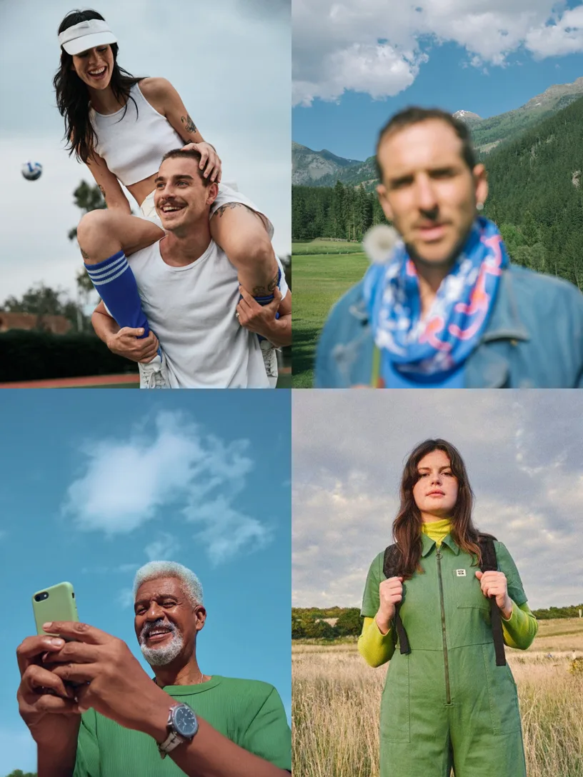
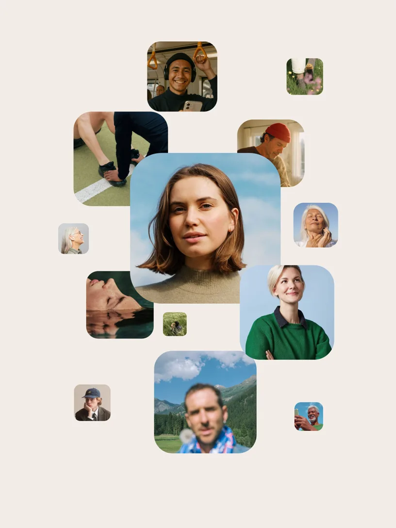
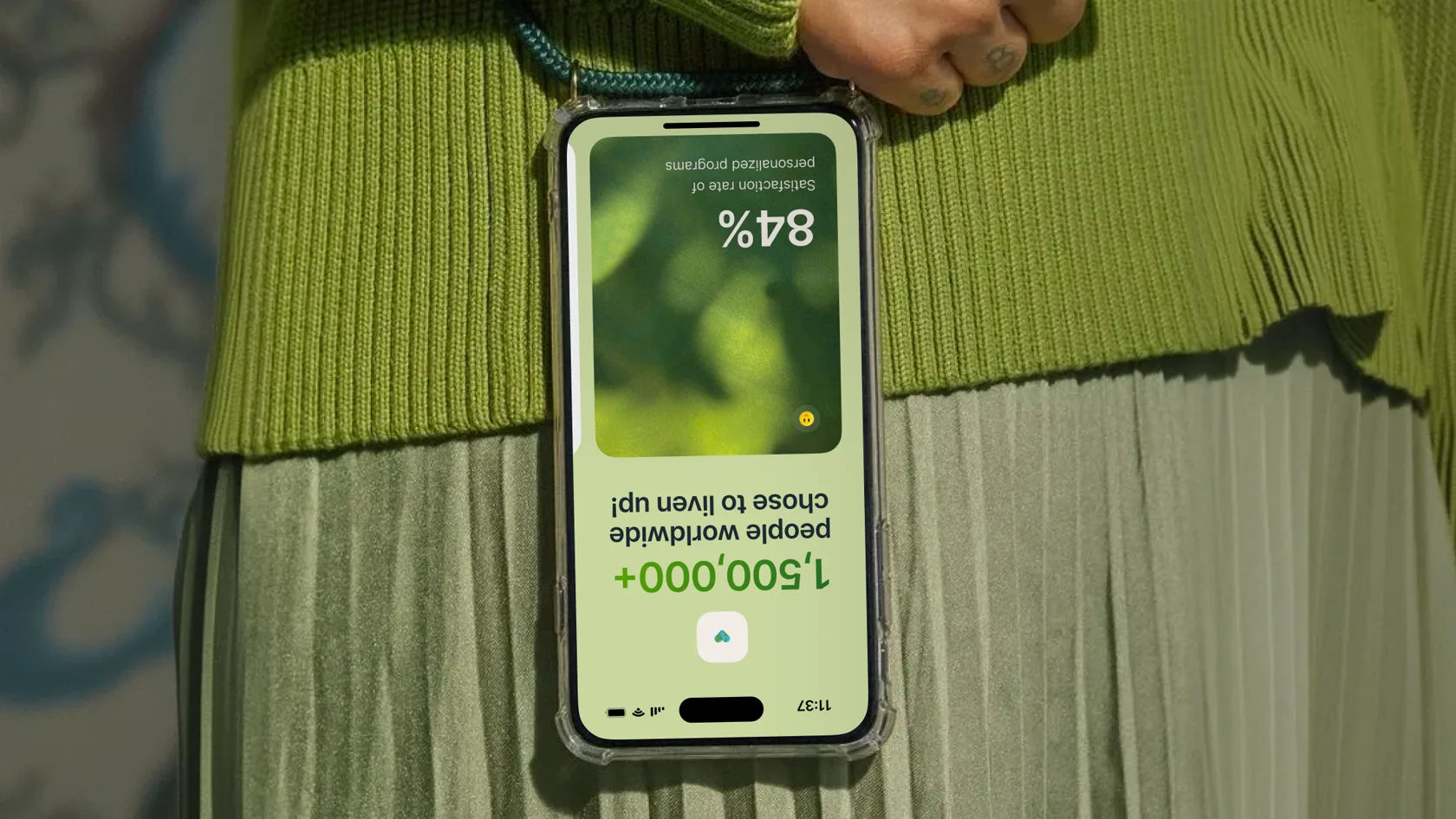
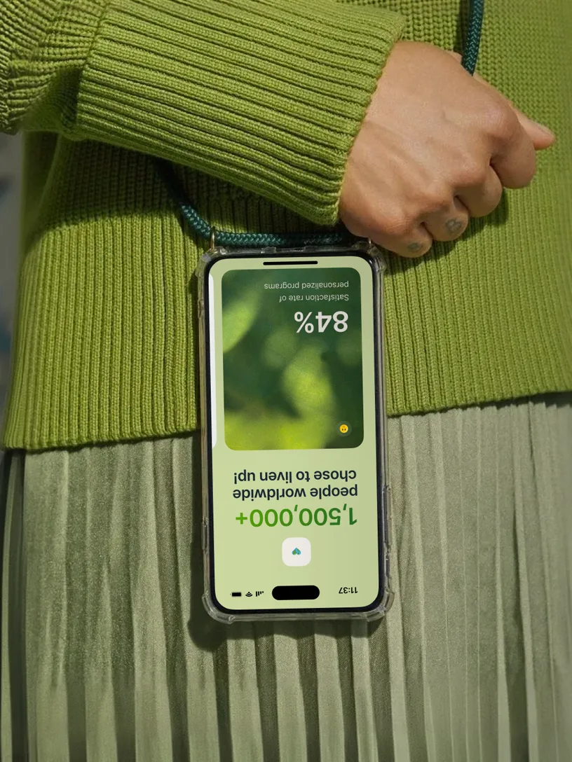
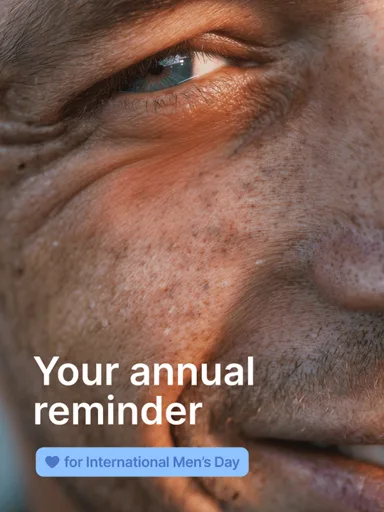
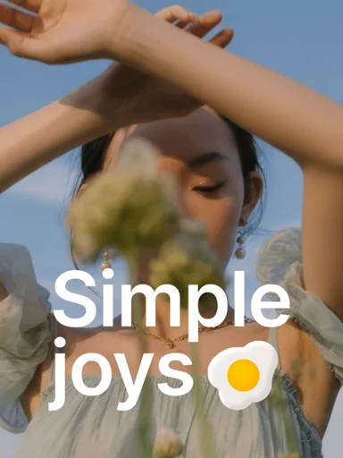
We show people acting effortlessly. Focus errors and natural imperfections reveal the beauty of imperfection. People are portrayed as heroes in moments of self-discovery, curious lifestyles, and simple rituals. We show a spectrum of emotions, ages, and ethnicities to represent real human experiences and remind viewers that self-discovery can take many forms. Our brand photography inspires people to enjoy the moment, appreciate small joys, and feel enlivened by life
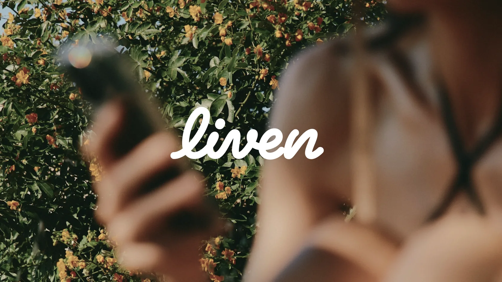
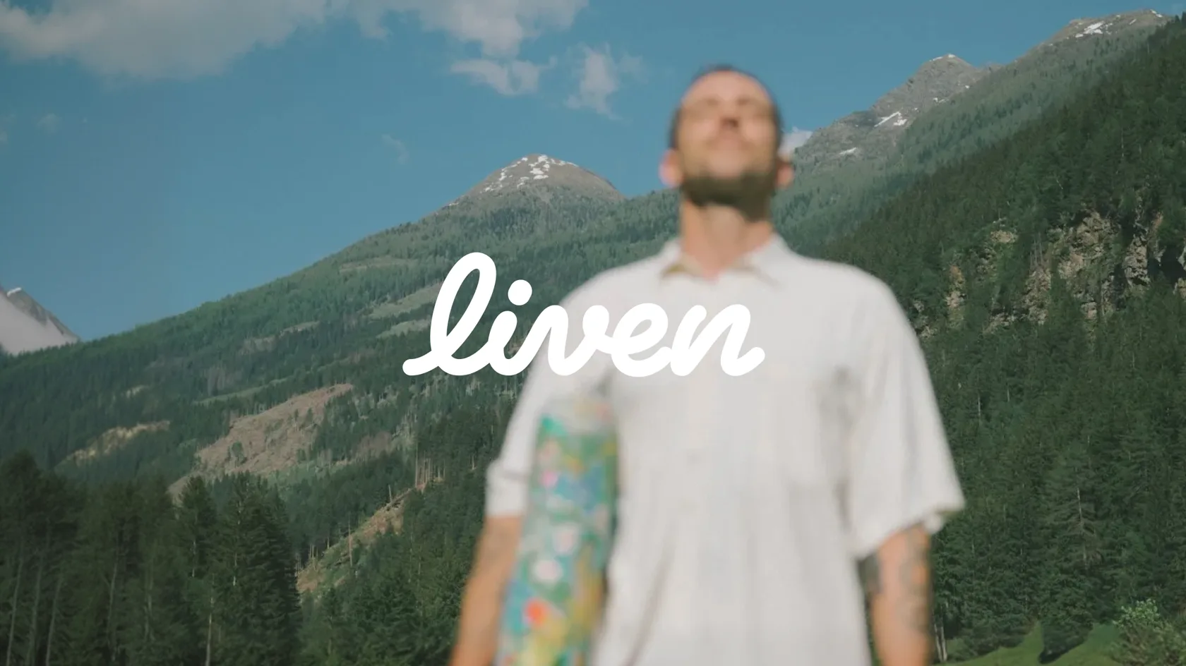
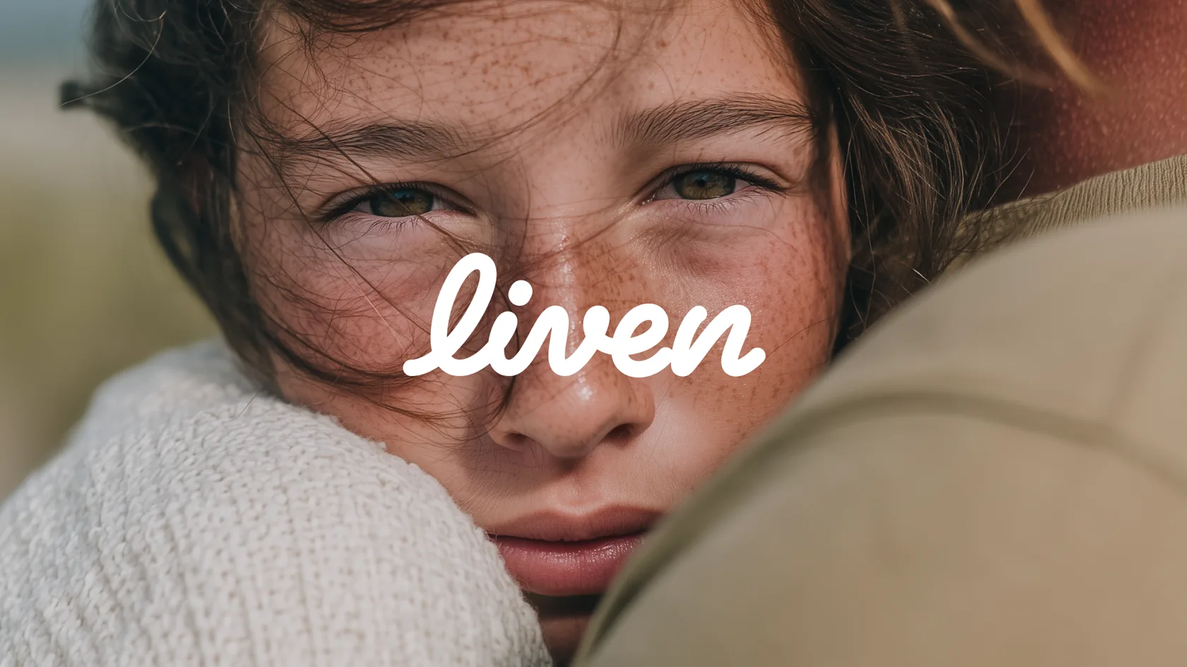
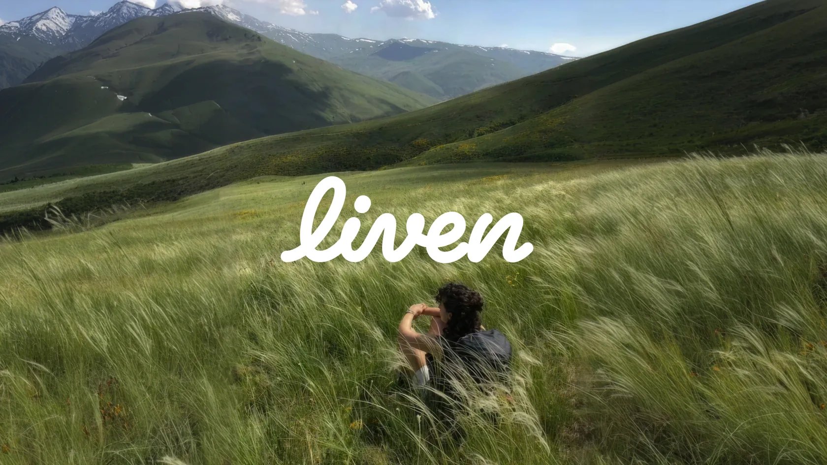
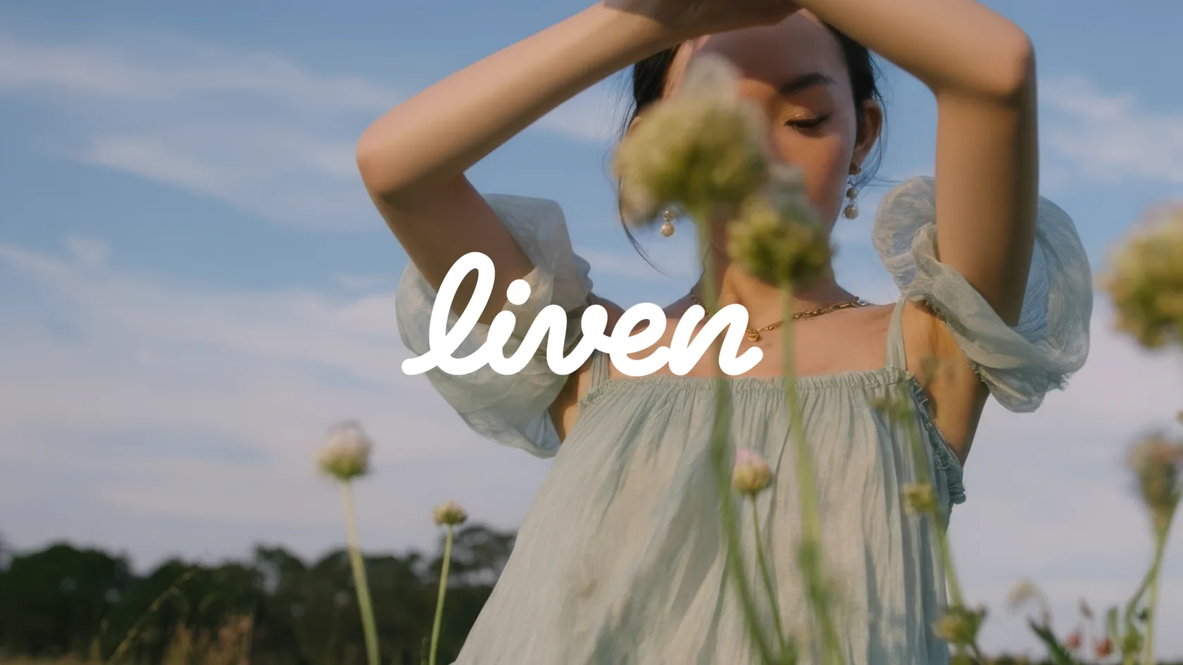
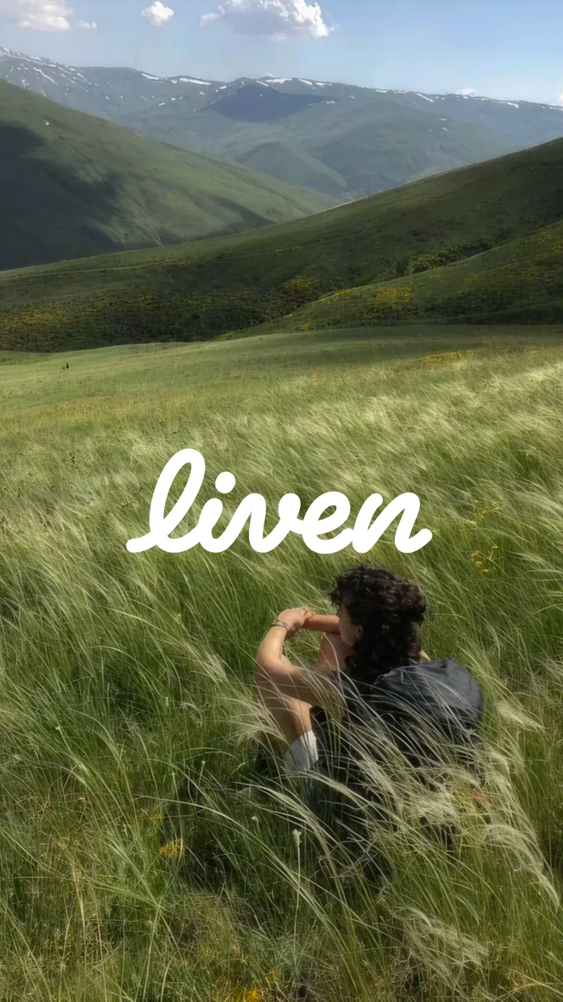
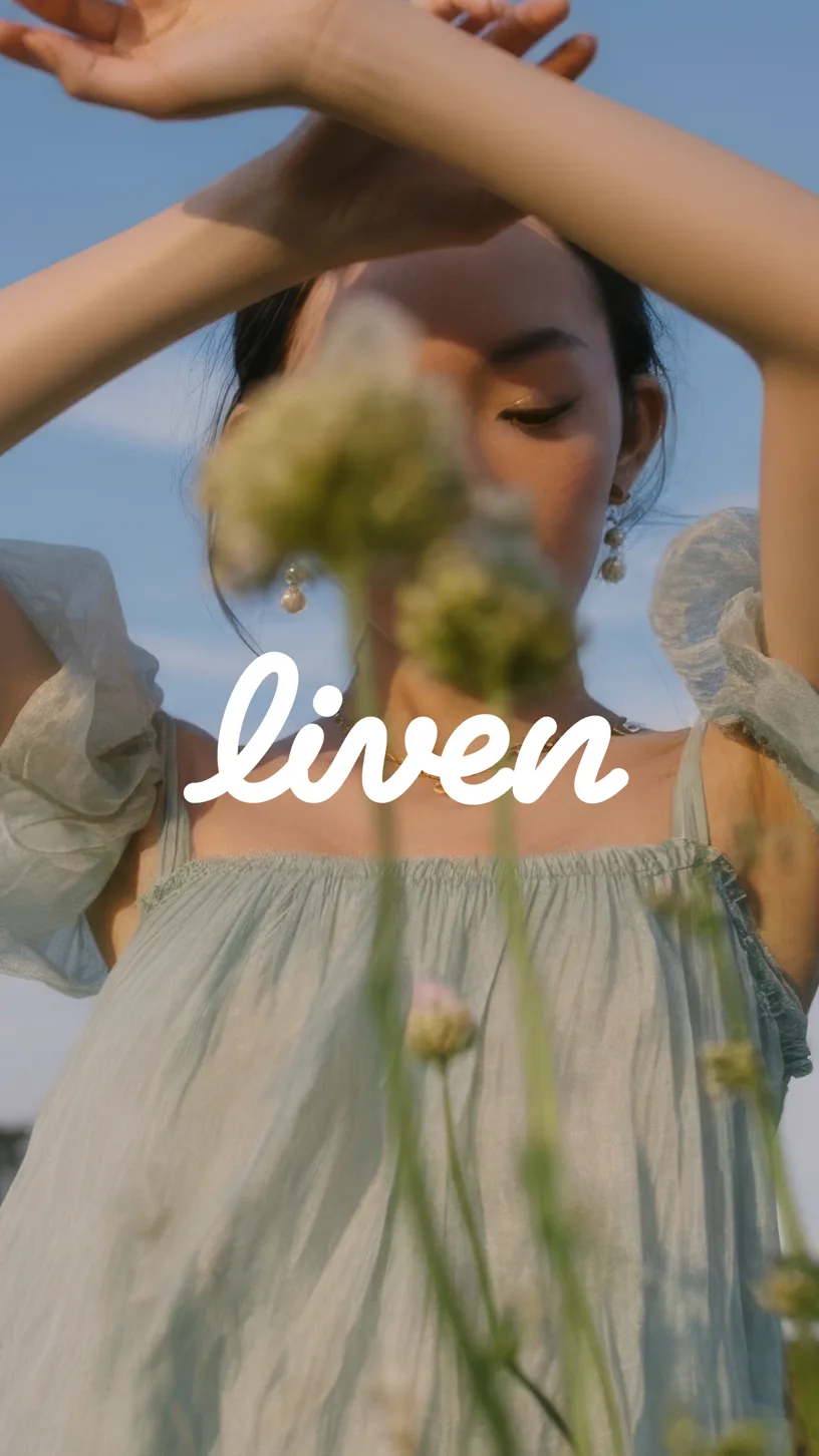
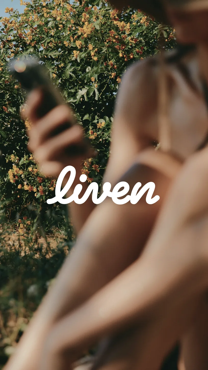
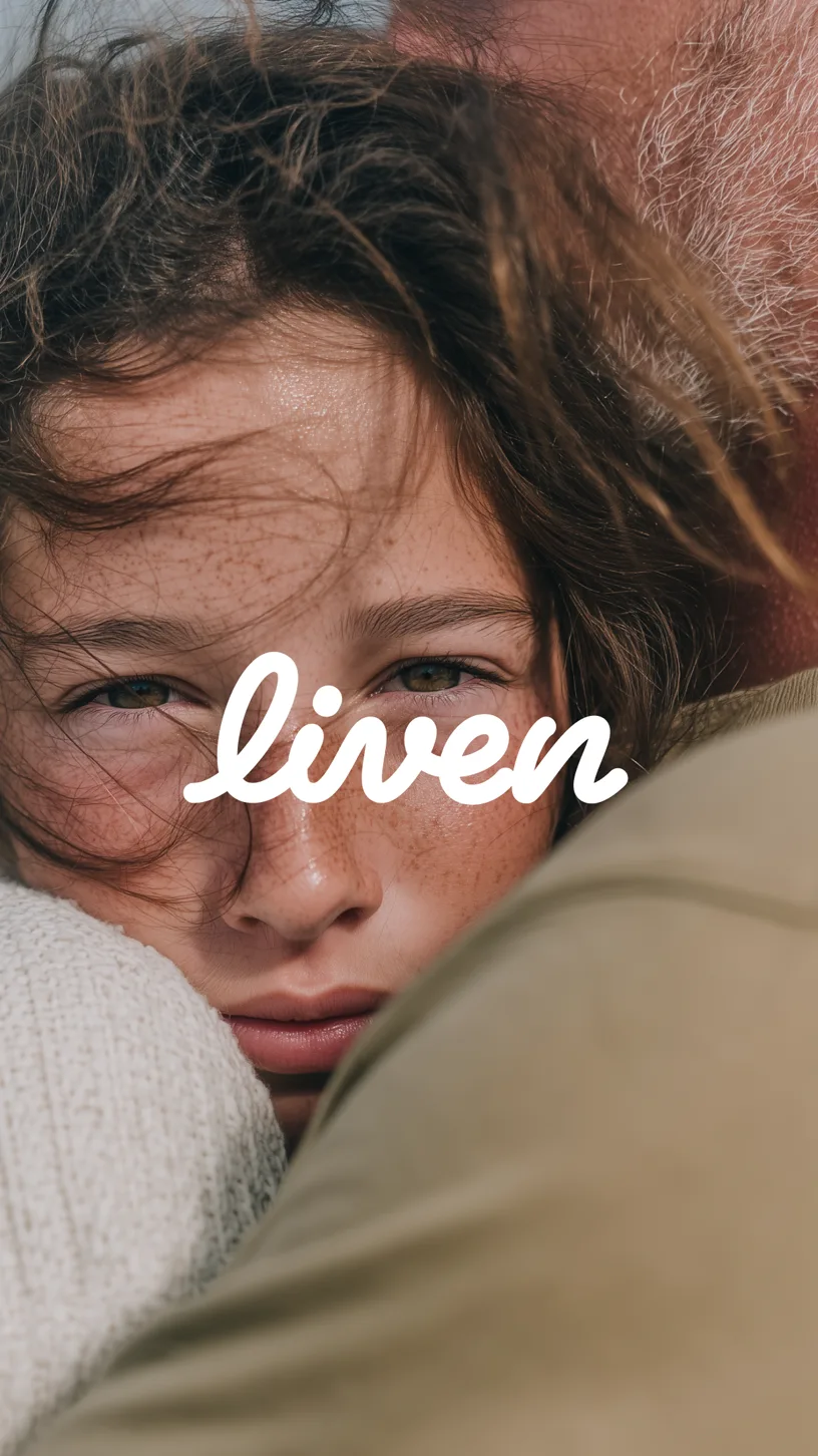
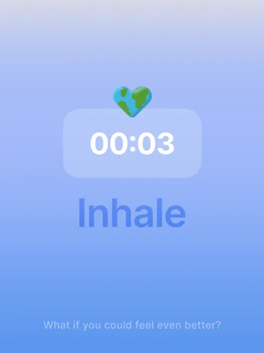
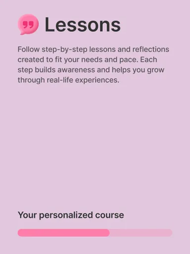
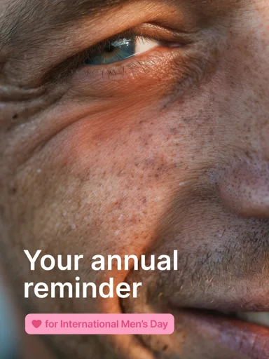

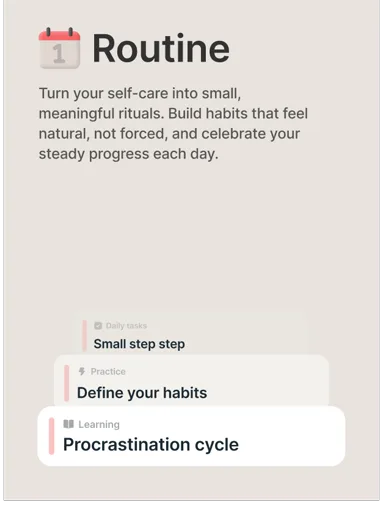
The Liven brand pulses with energy, crafted from the vibrance that celebrates the awakening of life
Liven [lai·vn] is a transitive verb. It means to enliven something, to lift spirits and moods. To liven something up is to make it more interesting and exciting

Our impact
We crafted a scalable brand identity built from clearly defined content and design
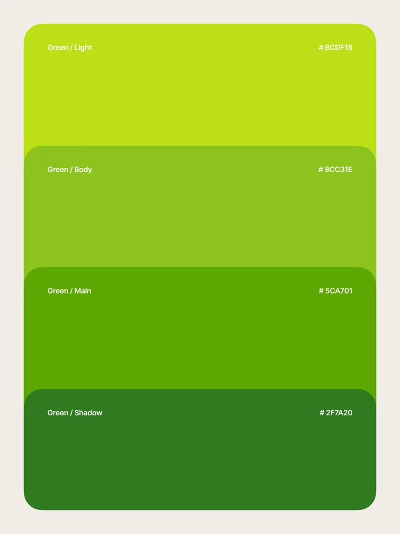
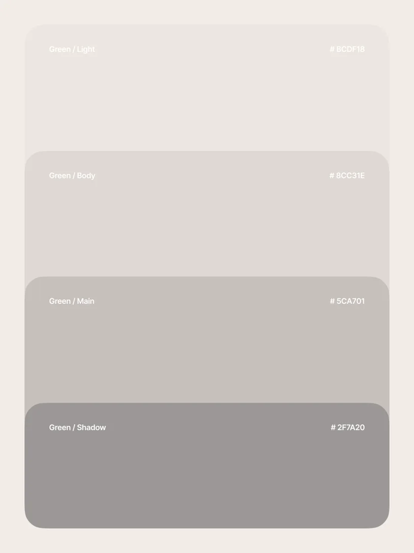
We made a summer green as the core color to express Liven’s energising character
We introduced recognisable quirks:
— slice-of-life photos
— powerpuff emojis
— vibrant gradients
We wrapped it all in a modular UI system made of reusable clear blocks and elements
Credits
- Stanislav Pashynskyi — Design Manager at Liven
- Kir Sopot — Creative Lead at Liven
- Alex Seleznov — CEO at Liven
- Valeria Synenko — CMO at Liven
- Yaroslav Kashchenko, Anastasiia Maksymovska, Yaroslav Liushnia — Designers at Liven
- Mykyta Pluzhko, Olena Nikulina — Art direction, Design
- Oleksandra Naidonova — Brand strategist
- Illia Soldatov, Kseniia Yashyna — Motion design
- Romana Ruban — Illustration
More projects